


The Art and Science of Making Words Easy to Read.
Imagine reading a book where every word is written in a different style.
Some letters are tiny.
Others are enormous.
Lines sit too close together.
Paragraphs feel cramped.
Headings barely stand out from body text.
The information might be valuable, but reading it becomes exhausting.
Now think about your favorite website, app, magazine, or book.
The text feels comfortable.
Headings guide your attention.
Paragraphs are easy to scan.
Important information stands out naturally.
You hardly notice the design.
You simply read.
That’s typography doing its job.
Most people focus on colors, images, animations, and layouts when discussing design. Yet typography often has a greater impact on how users experience content.
After all, a large portion of digital experiences still revolves around words.
And words need to be readable.
What Is Typography?
Typography is the practice of arranging text to make written content clear, readable, visually appealing, and easy to understand.
It involves decisions about:
- Fonts
- Typefaces
- Font sizes
- Line spacing
- Letter spacing
- Paragraph spacing
- Text hierarchy
- Alignment
- Visual balance
In simple terms, typography determines how text appears and how people experience it.
Good typography helps people read.
Poor typography gets in the way.
Why Typography Matters
Here’s the thing.
People often judge content before reading a single word.
The visual presentation creates an immediate impression.
A well-structured page feels trustworthy.
A cluttered page feels difficult.
The actual content may be identical.
Typography changes how people perceive it.
Think about receiving two resumes.
One is neatly organized and easy to scan.
The other looks crowded and chaotic.
The information might be similar.
The first one immediately feels more professional.
Typography influences perception long before comprehension begins.
Typography Is Everywhere
Once you start noticing typography, you’ll see it everywhere.
It’s present in:
- Websites
- Mobile apps
- Books
- Newspapers
- Packaging
- Billboards
- Software dashboards
- Smartwatch interfaces
- Restaurant menus
- Airport signage
Typography quietly shapes countless daily experiences.
Most people don’t consciously notice it.
They definitely notice when it fails.
A Brief Look at Typography History
Typography has existed for centuries.
Its roots stretch back to handwritten manuscripts and early printing presses.
The invention of movable type by Johannes Gutenberg changed how information was distributed.
Books became more accessible.
Publishing became faster.
Standardized letterforms emerged.
Over time, typography evolved from printed materials into digital interfaces.
Today, typography influences nearly every digital interaction we have.
The tools changed.
The goal remained surprisingly similar:
Help people consume information comfortably.
Typography Is More Than Choosing a Font
Many beginners assume typography simply means picking a font.
That’s only a small part of the process.
Good typography involves relationships between text elements.
For example:
- How large should headings be?
- How much space should separate paragraphs?
- How long should each line be?
- Which font weight creates emphasis?
- How should text adapt on mobile screens?
These decisions work together.
A beautiful font can still create a poor reading experience if other typography choices are weak.
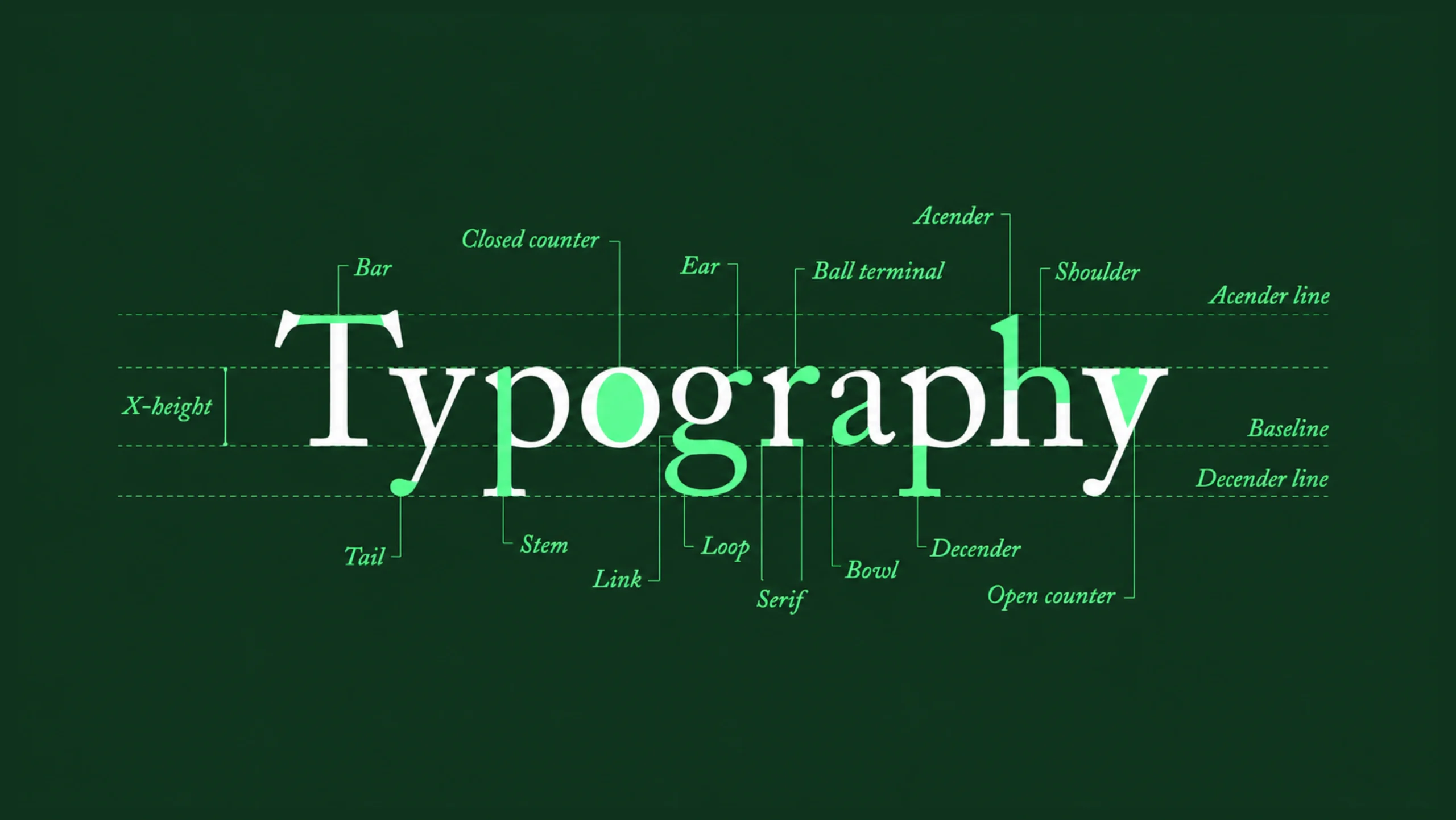
Understanding Typefaces and Fonts
People often use these terms interchangeably.
Technically, they aren’t identical.
Typeface
A typeface is a family of letter designs.
Examples include:
- Helvetica
- Inter
- Roboto
- Times New Roman
- Georgia
Font
A font is a specific variation within a typeface.
Examples include:
- Helvetica Bold
- Helvetica Light
- Helvetica Regular
In everyday conversation, most people simply say “font.”
That’s perfectly common.
Common Types of Typography
Different categories serve different purposes.
Let’s look at the major ones.
Serif Fonts
Serif fonts contain small decorative strokes at the ends of letters.
Examples include:
- Times New Roman
- Georgia
- Garamond
These fonts often feel traditional, formal, and established.
They’re commonly used in books and editorial content.
Sans-Serif Fonts
Sans-serif fonts remove decorative strokes.
Examples include:
- Inter
- Roboto
- Helvetica
- Arial
These fonts often feel modern, clean, and digital-friendly.
Many websites and apps rely on them.
Monospace Fonts
Each character occupies the same amount of horizontal space.
Examples include:
- Courier
- Consolas
- Monaco
Developers frequently encounter monospace fonts in code editors.
Display Fonts
Display fonts are highly decorative.
They attract attention and create personality.
They’re typically used for:
- Headlines
- Branding
- Advertising
Using them for long paragraphs can quickly reduce readability.
Key Typography Concepts Every Designer Should Know
Typography contains several foundational concepts.
These influence how content feels and performs.
Font Size
Font size determines readability.
Text that’s too small becomes difficult to read.
Text that’s too large can feel awkward.
Finding balance matters.
Line Height
Line height refers to vertical spacing between lines of text.
Proper spacing improves readability.
Crowded text often feels overwhelming.
Letter Spacing
Letter spacing controls the distance between characters.
Small adjustments can dramatically affect legibility.
Font Weight
Font weight refers to thickness.
Examples include:
- Light
- Regular
- Medium
- Bold
Weight helps establish hierarchy.
Alignment
Text can be:
- Left aligned
- Center aligned
- Right aligned
- Justified
Most digital products rely heavily on left-aligned text because it supports easier reading.
Hierarchy
Hierarchy helps users identify what matters most.
Headings, subheadings, and body text create structure.
Without hierarchy, content becomes difficult to scan.
Typography and Readability
Readability is one of typography’s primary goals.
People rarely read every word on a page.
They scan.
They skim.
They jump between sections.
Good typography supports these behaviors.
Several factors influence readability:
- Font choice
- Font size
- Contrast
- Line length
- Spacing
- Visual hierarchy
When these elements work together, reading feels effortless.
When they don’t, users leave.
Typography in User Interface Design
Typography plays a major role in UI design.
Think about a banking app.
Users need to quickly identify:
- Balances
- Transactions
- Buttons
- Alerts
- Account details
Typography helps establish importance.
Large text attracts attention.
Smaller text provides supporting information.
Bold text highlights actions.
Typography creates order.
Without it, interfaces become confusing.
Typography in User Experience Design
Typography doesn’t only affect appearance.
It affects experience.
A well-designed interface can still fail if the text is difficult to read.
Good typography improves:
- Comprehension
- Navigation
- Accessibility
- Task completion
- User confidence
People often associate typography with aesthetics.
Its influence on usability is equally important.
The Relationship Between Typography and White Space
Typography and white space work together constantly.
One without the other rarely succeeds.
A beautiful font packed into crowded paragraphs loses effectiveness.
Generous spacing improves readability and focus.
Think of typography as conversation.
White space provides pauses.
Without pauses, communication becomes exhausting.
The same thing happens visually.
Common Typography Mistakes
Even experienced designers occasionally make typography mistakes.
Let’s explore some common ones.
Using Too Many Fonts
Multiple fonts often create visual chaos.
Many successful designs use one or two font families.
That’s enough.
Poor Contrast
Light gray text on a white background might look elegant.
It often becomes difficult to read.
Readability should remain a priority.
Tiny Text Sizes
Small text may save space.
Users may struggle to read it.
Especially on mobile devices.
Weak Hierarchy
If headings and body text look similar, users struggle to scan content.
Structure becomes unclear.
Excessive Line Length
Long lines make reading difficult.
Readers lose their place more easily.
Moderate line lengths improve comfort.
Typography and Brand Identity
Typography influences brand perception.
Luxury brands often use elegant typography.
Technology companies frequently favor clean, modern fonts.
News organizations rely on typography that supports long-form reading.
The chosen typography becomes part of a brand’s personality.
It’s similar to tone of voice.
The words matter.
The presentation matters too.
Typography in Modern Product Design
Today’s digital products contain enormous amounts of content.
Think about:
- SaaS dashboards
- Project management tools
- Healthcare systems
- Financial platforms
- E-commerce websites
Typography helps organize complexity.
Without it, information becomes overwhelming.
With it, users can understand content more quickly.
That difference can dramatically affect product success.
Typography and Accessibility
Accessible typography benefits everyone.
Several practices improve accessibility:
- Adequate font sizes
- Strong color contrast
- Clear hierarchy
- Readable line spacing
- Legible font choices
Accessibility isn’t only about compliance.
It’s about helping more people consume information comfortably.
Good typography contributes significantly.
Typography in the Age of AI
AI tools can now generate layouts, websites, interfaces, and marketing materials in seconds.
Typography remains a major factor in quality.
AI can suggest font pairings.
It can generate hierarchies.
It can analyze readability.
Human judgment still plays a major role.
Typography involves context.
Audience expectations.
Brand personality.
Communication goals.
Technology helps.
Thoughtful design remains important.
A Useful Analogy
Think of typography as the voice of written content.
Two people can read the same sentence.
One sounds clear and confident.
The other sounds rushed and difficult to follow.
The words remain identical.
The delivery changes everything.
Typography works the same way.
It shapes how content feels before readers fully absorb its meaning.
Final Thoughts
Typography is the practice of arranging text to improve readability, communication, usability, and visual appeal.
It influences how users consume information across websites, mobile apps, books, software, dashboards, advertisements, and countless other experiences.
Good typography helps people focus.
It supports comprehension.
It creates hierarchy.
It strengthens accessibility.
And it quietly improves almost every interaction involving written content.
The best typography often goes unnoticed.
Readers simply enjoy the experience.
And that’s usually the goal.
Frequently Asked Questions (FAQs)
What is typography?
Typography is the practice of arranging text through font selection, sizing, spacing, hierarchy, and layout to improve readability and communication.
Why is typography important in design?
Typography helps users read content more easily, understand information faster, and navigate interfaces more effectively.
What is the difference between a font and a typeface?
A typeface is a family of letter designs, while a font is a specific style or variation within that family, such as bold or regular.
What are the main types of fonts?
The main categories include serif, sans-serif, monospace, and display fonts.
How does typography affect user experience?
Typography influences readability, accessibility, information hierarchy, comprehension, and overall usability.
What are common typography mistakes?
Common mistakes include using too many fonts, poor contrast, weak hierarchy, small text sizes, and inadequate spacing between lines or paragraphs.