


What It Is, Why It Matters, and How It Guides User Attention.
Imagine walking into a supermarket where every product is displayed in exactly the same way.
Every shelf has the same size labels.
Every sign uses the same font size.
Every promotion looks identical.
Nothing stands out.
Nothing feels important.
Finding what you need becomes surprisingly difficult.
Now imagine a different store.
Large signs point to major departments.
Discount offers grab your attention immediately.
Popular products sit at eye level.
Important information appears larger and easier to spot.
The experience feels effortless.
You know where to look.
You know what matters.
That’s visual hierarchy in action.
It’s quietly guiding your attention.
And it plays the same role in websites, mobile apps, software, presentations, advertisements, and virtually every visual experience we encounter.
What Is Visual Hierarchy?
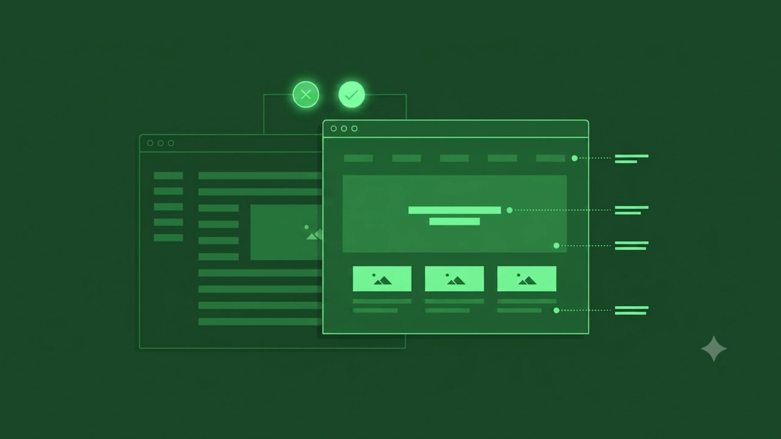
Visual hierarchy is the arrangement of design elements in a way that communicates their relative importance.
It helps users understand:
- What to look at first
- What to look at next
- What actions matter most
- How information is organized
Through visual cues, designers create a path for the eyes to follow.
Without visual hierarchy, users must figure everything out on their own.
With visual hierarchy, the interface does much of the work for them.
Why Visual Hierarchy Matters
Here’s the thing.
People don’t read screens the way they read books.
Most users scan.
They move quickly.
They jump between headings, images, buttons, and key pieces of information.
Research in UX has shown this repeatedly.
Users are constantly making decisions about where to focus.
Visual hierarchy helps answer that question.
It reduces mental effort.
It creates direction.
It helps people process information faster.
A Simple Everyday Example
Imagine reading a newspaper.
The largest headline appears at the top.
Subheadings appear below it.
Body text follows afterward.
Images support the story.
You naturally understand what deserves attention first.
Nobody needs to explain the reading order.
The design communicates it.
That’s visual hierarchy.
And although newspapers have existed for centuries, the same principles still influence modern digital products.
The Main Purpose of Visual Hierarchy
At its core, visual hierarchy helps prioritize information.
Every screen contains competing elements.
Buttons compete with headlines.
Images compete with text.
Menus compete with content.
Visual hierarchy helps establish order.
Without it, everything competes equally for attention.
When everything feels important, nothing feels important.
How Visual Hierarchy Works
Visual hierarchy uses design principles to influence where people look.
Certain elements naturally attract attention faster than others.
For example:
- Larger objects attract attention before smaller ones.
- Bright colors attract attention before neutral colors.
- High contrast attracts attention before low contrast.
- Images attract attention before plain text.
Designers combine these principles to create intentional visual flow.
The goal isn’t forcing attention.
The goal is guiding it.
The Psychology Behind Visual Attention
Human brains constantly filter information.
If we paid equal attention to everything around us, daily life would feel overwhelming.
Instead, our brains prioritize.
We notice:
- Movement
- Contrast
- Size differences
- Faces
- Color changes
- Patterns
Visual hierarchy takes advantage of these natural tendencies.
Rather than fighting human perception, it works alongside it.
Good design often feels intuitive because it aligns with how people naturally process information.
Key Elements of Visual Hierarchy
Several design tools help establish hierarchy.
Let’s explore the most common ones.
Size
Size is one of the strongest visual signals.
Larger elements typically attract attention first.
Think about a homepage hero section.
The headline is usually larger than the supporting text.
The designer is communicating:
“This is the most important information.”
Users understand that message instantly.
Color
Colour creates emphasis.
Bright or contrasting colors often stand out.
This is why many call-to-action buttons use distinctive colors.
The button isn’t physically larger.
Its color increases visibility.
Attention follows contrast.
Typography
Typography plays a major role in hierarchy.
Designers use different font sizes, weights, and styles to create structure.
For example:
- Headlines
- Subheadings
- Body text
- Captions
Each level communicates a different degree of importance.
Strong typography improves readability and comprehension.
Contrast
Contrast helps elements stand apart.
Examples include:
- Dark text on a light background
- Bright buttons on neutral pages
- Bold headings above regular text
Without contrast, interfaces often feel flat and difficult to scan.
Spacing
Interestingly, space can be as powerful as visible elements.
Spacing helps isolate content and create focus.
When designers surround an element with whitespace, it often gains importance.
The absence of clutter creates emphasis.
Position
People naturally pay attention to certain areas first.
Depending on layout and culture, users often begin scanning from the top of a page.
Important information frequently appears near the top because of this behavior.
Placement influences visibility.
Imagery
Images attract attention quickly.
Faces are especially powerful.
Humans naturally notice other humans.
This tendency often influences landing page design, advertising, and marketing campaigns.
Images can reinforce hierarchy when used thoughtfully.
Visual Hierarchy in UI Design
User Interface design relies heavily on visual hierarchy.
Imagine opening a banking application.
You immediately need answers to questions like:
- What’s my account balance?
- Where can I transfer money?
- How do I pay a bill?
A well-designed interface highlights these actions.
A poorly designed interface forces users to search.
Visual hierarchy helps users complete tasks more efficiently.
Visual Hierarchy in UX Design
Visual hierarchy is often discussed within UI design.
Its impact extends directly into UX.
Why?
Because users make decisions based on what they notice.
If important information goes unnoticed, the experience suffers.
A strong hierarchy can improve:
- Navigation
- Task completion
- Conversion rates
- Accessibility
- User satisfaction
The visual layer influences the overall experience.
Common Examples of Visual Hierarchy
Let’s look at some familiar examples.
E-Commerce Product Page
The hierarchy often follows this pattern:
- Product image
- Product name
- Price
- Purchase button
- Product details
Users quickly understand what matters most.
News Website
The hierarchy typically emphasizes:
- Breaking news headline
- Featured image
- Story summary
- Supporting articles
Readers know where to begin.
Landing Page
A common hierarchy might include:
- Main headline
- Supporting copy
- Call-to-action button
- Social proof
- Additional details
Each layer guides the user deeper into the experience.
Benefits of Strong Visual Hierarchy
Organizations invest significant effort into visual hierarchy because the benefits are substantial.
Faster Information Processing
Users understand content more quickly.
Better User Engagement
Important actions become easier to discover.
Improved Conversion Rates
Clear calls to action often receive more attention.
Reduced Cognitive Load
Users spend less energy figuring out where to focus.
Better Accessibility
Clear structure supports a wider range of users and abilities.
Stronger Brand Perception
Organized interfaces often appear more trustworthy and professional.
Common Visual Hierarchy Mistakes
Even experienced designers occasionally create hierarchy problems.
Let’s explore a few common ones.
Everything Is Competing for Attention
This is perhaps the most common issue.
Multiple bright colors.
Several large headings.
Too many highlighted elements.
Users don’t know where to look first.
The design becomes noisy.
Weak Contrast
Low contrast often makes important content harder to notice.
Users may miss critical information entirely.
Poor Typography Structure
If headlines, subheadings, and body text appear too similar, content becomes difficult to scan.
Readers lose orientation.
Excessive Clutter
Too many elements packed together can overwhelm users.
Hierarchy becomes less effective.
Spacing matters.
A lot.
Inconsistent Patterns
When importance shifts unpredictably across screens, users struggle to build familiarity.
Consistency improves clarity.
Visual Hierarchy and Accessibility
Good hierarchy supports accessibility.
Screen readers, cognitive accessibility considerations, and visual impairments all benefit from clear structure.
Large headings.
Logical organization.
Readable typography.
Strong contrast.
These elements help more people access information effectively.
Accessibility and visual hierarchy often work hand in hand.
Visual Hierarchy in Modern Product Design
Modern SaaS products, mobile apps, and AI platforms rely heavily on hierarchy.
Consider a project management dashboard.
Users need to quickly identify:
- Tasks
- Deadlines
- Notifications
- Team activity
Without hierarchy, the dashboard becomes overwhelming.
With hierarchy, users can focus on what matters most.
The same principle applies to healthcare software, financial platforms, educational products, and enterprise systems.
How AI Is Influencing Visual Hierarchy
Artificial intelligence is beginning to influence interface design in interesting ways.
AI tools can:
- Generate layouts
- Suggest visual structures
- Analyze user attention patterns
- Predict engagement areas
- Personalize interfaces
Yet the underlying principle remains unchanged.
People still need guidance.
They still scan.
They still prioritize information visually.
Technology evolves.
Human perception remains surprisingly consistent.
A Common Misconception
Many people assume visual hierarchy is purely about making things bigger.
Size matters.
It’s only one piece of the puzzle.
Hierarchy emerges from a combination of:
- Size
- Color
- Contrast
- Position
- Typography
- Spacing
- Imagery
A small element can become highly visible if other design choices support it.
Good hierarchy isn’t about making everything larger.
It’s about making priorities clear.
Final Thoughts
Visual hierarchy is the practice of arranging design elements to communicate importance and guide user attention.
It helps people understand where to look, what to read, and what actions to take.
Through tools such as size, color, contrast, typography, spacing, and positioning, designers create visual pathways that make information easier to process.
Without hierarchy, interfaces often feel confusing and overwhelming.
With strong hierarchy, users move through experiences naturally and confidently.
The best visual hierarchy often goes unnoticed.
Users simply find what they need.
And sometimes, that’s the strongest compliment a design can receive.
Frequently Asked Questions (FAQs)
What is visual hierarchy?
Visual hierarchy is the arrangement of design elements in a way that communicates importance and guides users through content in a meaningful order.
Why is visual hierarchy important in UI design?
Visual hierarchy helps users identify important information quickly, improves usability, and makes interfaces easier to understand and navigate.
What elements create visual hierarchy?
Common elements include size, color, contrast, typography, spacing, positioning, imagery, and visual weight.
How does visual hierarchy affect user experience?
Strong hierarchy reduces confusion, improves task completion, decreases cognitive effort, and helps users process information more efficiently.
What is the difference between visual hierarchy and information architecture?
Information architecture focuses on organizing content and structure, while visual hierarchy focuses on presenting that content visually to guide attention.
Can visual hierarchy improve conversion rates?
Yes. Clear visual hierarchy helps users notice important calls to action, understand content faster, and complete desired actions more easily, which can positively influence conversions.