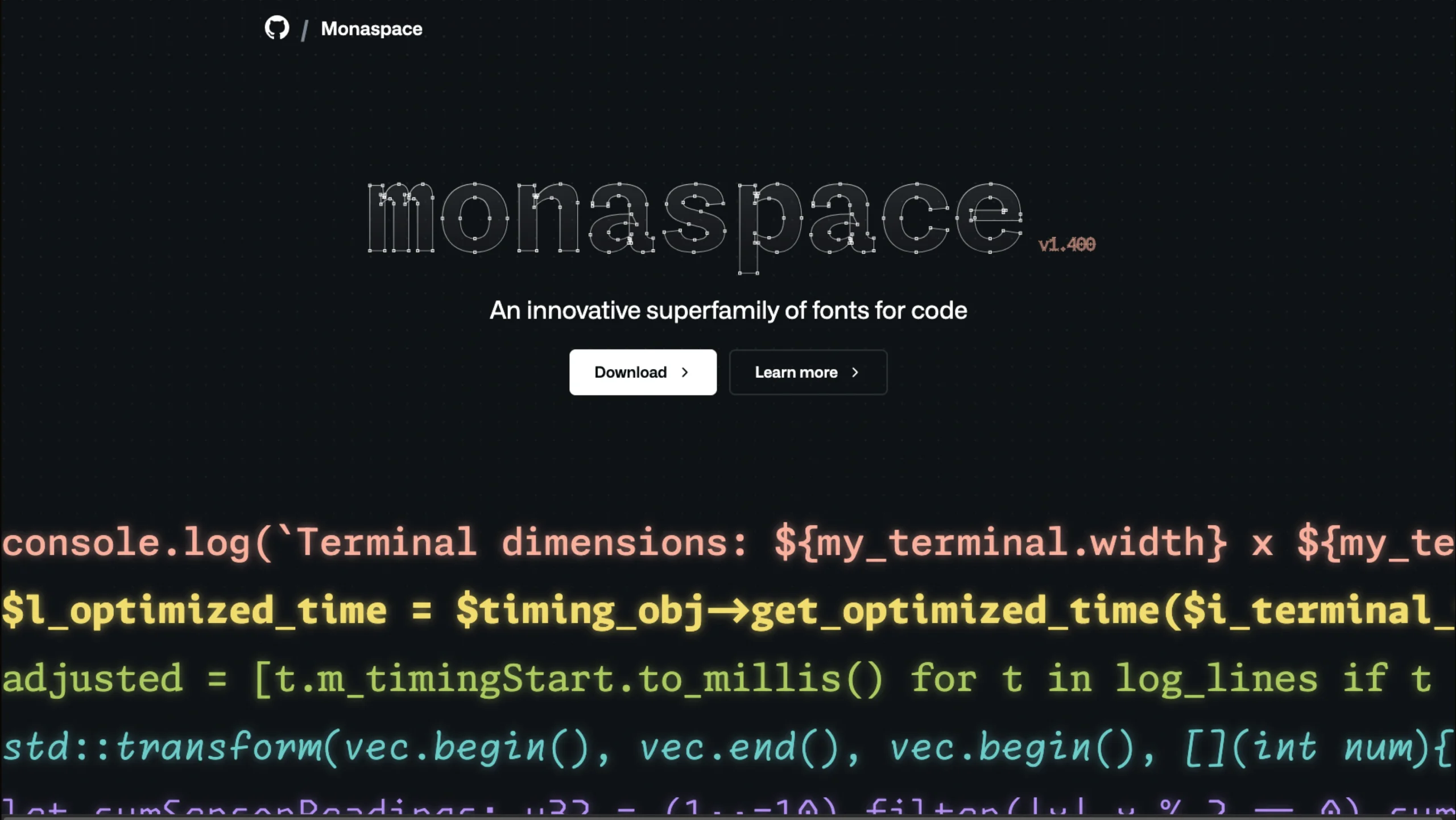
Monaspace is an open-source superfamily of monospaced coding fonts created by GitHub Next in collaboration with Lettermatic.
Monaspace: A New Take on Typography for Code
Code has had a typography problem for a very long time.
Since the days of teletype machines, developers have largely worked with monospaced fonts — every character sitting neatly inside the same fixed-width grid. It makes code alignment predictable and helps developers scan through lines of code, but it also comes with an obvious limitation.
Every letter gets the same amount of space, whether it needs it or not.
An i doesn’t need the same width as an m. A w wants more room than an l. Yet in a traditional monospace typeface, they all have to fit into the same box.
That’s where Monaspace takes an interesting approach.
Created through a collaboration between GitHub Next and type foundry Lettermatic, Monaspace is a superfamily of fonts designed specifically for code. Instead of treating monospace typography as a limitation that developers simply have to accept, the project explores how typography itself can add more meaning, hierarchy, and personality to code.
And it gets surprisingly experimental.
What is Monaspace?
Monaspace is an innovative superfamily of fonts for code.
Rather than offering just one monospace typeface, the family includes five distinct fonts, each with its own personality:
- Neon — Neo-grotesque sans
- Argon — Humanist sans
- Xenon — Slab serif
- Radon — Handwriting
- Krypton — Mechanical sans
At first, this might sound like a fairly normal type family with several styles.
It isn’t.
The interesting part is that these fonts are designed to work together.
You can mix and match them while maintaining the underlying monospace structure. That opens up an unusual possibility: using typography itself to communicate different kinds of meaning inside code.
Instead of relying entirely on syntax colors, bold text, underlines, or UI decorations, typography can become another layer of communication.
Why Does Code Need Better Typography?
If you’ve spent any time coding, you’ve probably become accustomed to syntax highlighting.
Keywords are one color. Strings are another. Comments might be grey. Functions may have their own color.
It works, but color isn’t the only way to create hierarchy.
The Monaspace project asks an interesting question:
What if typography could communicate more code information?
Think about comments, documentation, generated code, suggestions from AI assistants, or experimental ideas you’re still working through.
Today, an editor often communicates these differences through colors and interface elements.
Monaspace explores a different possibility.
What if a comment could feel different because it uses a different typographic voice?
What if AI-generated code looked subtly different from the code you wrote yourself?
What if an experimental idea looked handwritten?
The goal isn’t to make code decorative for the sake of it.
It’s about giving developers another visual language for understanding what they’re looking at.
Five Fonts, One System
The five Monaspace fonts are probably the first thing you’ll notice when exploring the project.
Monaspace Neon
Neon is the neo-grotesque sans-serif member of the family.
It’s probably the most familiar starting point if you’re coming from conventional coding fonts. The design keeps things clean and structured while fitting into the wider Monaspace system.
Monaspace Argon
Argon takes a more humanist approach.
Humanist typefaces generally introduce more variation and personality into letterforms, making Argon an interesting choice when you want your code to feel a little less mechanical.
Monaspace Xenon
Xenon brings a slab serif style into the family.
Serifs aren’t something you usually associate with coding environments, which is exactly what makes Xenon interesting.
It demonstrates that monospace typography doesn’t have to look like the stereotypical “developer font.”
Monaspace Radon
Radon is the most unexpected member of the family: a handwriting style.
That opens the door to some interesting applications.
The Monaspace project itself uses the idea of handwritten typography for tentative ideas — things that are still being explored rather than finalized.
It’s a clever example of typography carrying meaning rather than simply changing appearance.
Monaspace Krypton
Krypton is the mechanical sans-serif style.
It leans into the technical character of coding while still sharing the same underlying system as the other Monaspace fonts.
The Interesting Part: Mix and Match
Here’s where Monaspace becomes much more than a collection of five fonts.
Traditional monospaced fonts aren’t particularly friendly to mixing. Different fonts have different metrics, widths, and proportions, which can make switching between them inside the same block of code look awkward.
Monaspace was designed so its fonts can be mixed and matched seamlessly.
That means different typographic styles can potentially represent different types of information.
For example:
// What if tentative ideas looked handwritten?

/**
 * What if docstrings looked authoritative?
 */
class Terminal_Dimensions {
  constructor() {
    this.width = process.stdout.columns;
    this.height = process.stdout.rows;
  }
}
The code itself remains code.
But its visual treatment can provide another layer of context.
That idea feels particularly relevant now that development environments are becoming increasingly sophisticated and AI-generated code is becoming part of everyday programming.
Could Typography Give AI Its Own Voice?
This is one of the more interesting ideas explored by Monaspace.
Modern coding assistants can generate code directly inside an editor. The problem is that generated suggestions can sometimes be difficult to distinguish from code you’ve already written.
The project asks:
What if Copilot had its own typographical voice?
Instead of relying purely on ghost text or subtle interface differences, typography could potentially make AI-generated suggestions visually distinct.
Imagine writing code in one style while an AI suggestion temporarily appears in another.
Once accepted, it could return to the regular style.
This is a fascinating example of typography moving beyond aesthetics and becoming part of interaction design.
For UI/UX designers working on developer tools, that’s an idea worth paying attention to.
Texture Healing: Fixing an Old Monospace Problem
One of Monaspace’s most technically interesting features is called Texture Healing.
To understand why it matters, we need to look at how monospaced fonts work.
In proportional typography, each character can have a different width.
An m can be wide.
An i can be narrow.
The typeface can give each letter the amount of space it visually needs.
Monospace fonts don’t have that luxury.
Every character must occupy the same-width box.
That creates some awkward situations.
A narrow letter such as i or l may leave too much space around itself.
A wide character such as m or w can feel cramped.
The result is an uneven visual texture.
You might not consciously notice it while coding, but your eyes are constantly processing those differences.
Monaspace tries to improve this without abandoning the monospace grid.
That’s what Texture Healing is about.
How Texture Healing Works
Rather than simply changing the spacing between characters, Monaspace provides alternate versions of certain glyphs.
The system looks at neighboring characters.
If one character has excess space while the next character needs more room, alternate glyphs can be used to redistribute that visual space.
For example, a narrow l might use a slightly narrower version that gives some room to a neighboring m.
The m can then use a wider version that takes advantage of that additional space.
The characters still occupy their normal monospace positions.
But visually, the overall word becomes more balanced.
It’s a clever compromise:
Keep the grid. Improve the texture.
The Technology Behind Texture Healing
The technique uses an OpenType feature called contextual alternates, commonly known as calt.
Contextual alternates allow a typeface to choose different glyph forms depending on the surrounding characters.
This technology is already used in areas such as Arabic typography and cursive typefaces, where the shape of a character can depend on its neighbors.
Monaspace applies the idea less conventionally.
Instead of using contextual alternates to connect letters or support a writing system, they’re being used to improve the visual texture of monospaced code.
And importantly, Texture Healing is designed to work in many existing editors without requiring entirely new software or specialized plugins.
Variable Fonts: One Font, Many Possibilities
Monaspace also embraces variable font technology.
The family provides three variable axes:
- Weight
- Width
- Slant
This gives designers and developers much more control than simply choosing Regular, Medium, Bold, or Italic.
Weight
The weight axis ranges from 200 to 800.
That gives you:
- 200 — Extra Light
- 300 — Light
- 400 — Regular
- 500 — Medium
- 600 — Semibold
- 700 — Bold
- 800 — ExtraBold
So rather than jumping between a few predefined weights, you can make much finer adjustments.
Control the Width
The width axis ranges from 100 to 125.
It includes:
- 100 — Normal
- 112.5 — Semiwide
- 125 — Wide
This is particularly interesting for code because width can have a significant effect on how much information fits on screen.
A wider font can improve readability in certain situations, while a narrower setting can help when you’re dealing with long lines of code.
Having width as a variable gives users another level of control.
Add Some Slant
The slant axis ranges from 0 to -11 degrees.
At the midpoint, some characters transition from simple oblique forms to true italic letterforms.
The available points include:
- 0 — Normal
- -5.5° — Italic letterforms begin replacing obliques
- -11° — Italic
Again, this isn’t simply about making code look fancy.
Slant can become a visual signal.
You could imagine italics being used for comments, documentation, or another layer of information within a developer environment.
640,000 Styles Might Be Enough
The Monaspace website makes a playful reference to the famous “640k ought to be enough for anyone” quote when describing its style possibilities.
The point is simple.
Because the fonts are variable, you aren’t limited to a handful of predefined styles.
You can combine different values across weight, width, and slant to create a huge range of variations.
For applications that don’t support variable fonts, Monaspace also provides common named weights and styles.
So you get flexibility without completely sacrificing compatibility.
Code Ligatures
Monaspace also includes code ligatures.
If you’re unfamiliar with them, ligatures combine certain sequences of characters into a single visual glyph.
For example, a sequence such as:
!=
===
->
<>
can be displayed using specially designed forms.
Monaspace takes this further by organizing ligatures into stylistic sets.
There are eight stylistic sets, each aimed at different programming-language conventions, along with additional OpenType features.
This gives developers control over which ligatures they actually want to use rather than forcing one visual treatment on everyone.
Stylistic Sets for Different Languages
The stylistic sets are particularly interesting because programming languages have their own visual patterns.
JavaScript developers may have different preferences from F# developers.
Monaspace acknowledges this by grouping ligatures into sets that can be enabled or disabled independently.
For example, ss01 includes ligatures for character sequences commonly found in JavaScript, while ss05 focuses on operators used in F#.
You don’t have to turn everything on.
You can choose the sets that make sense for your workflow.
Monaspace in Visual Studio Code
If you’re using Visual Studio Code, Monaspace can be configured through the editor’s font settings.
The project provides configuration instructions for enabling features such as Texture Healing and the different stylistic sets.
This is important because Monaspace isn’t meant to be something you simply look at on a website.
It’s designed to become part of an actual coding environment.
Once configured, the font can become part of the everyday experience of reading and writing code.
Why Should Designers Care About a Coding Font?
At first glance, Monaspace might seem like something exclusively for developers.
But there’s a bigger design lesson here.
Typography isn’t only about choosing a beautiful font.
It’s about communication.
We already use typography to create hierarchy in interfaces:
- Larger text suggests importance.
- Bold text creates emphasis.
- Italics can indicate a different voice.
- Different typefaces can establish context.
- Spacing can separate groups of information.
Monaspace takes those familiar ideas into the coding environment.
The interesting question isn’t simply:
“Does this font look good?”
It’s:
“What can typography tell me about what I’m looking at?”
That’s a much more interesting design problem.
A New Palette for Developer Interfaces
The Monaspace project describes its goal as giving developers a more expressive palette for code.
That’s a useful way to think about it.
Most code editors already have several visual tools:
Color + icons + underlines + hover states + decorations
Typography adds another dimension.
Imagine a future development environment where:
- Human-written code uses one typographic style.
- AI-generated suggestions use another.
- Comments feel more editorial.
- Experimental code has a handwritten character.
- Documentation uses a more authoritative voice.
- Warnings have a distinct typographic treatment.
Suddenly, typography becomes part of the interface language.
For product designers working on IDEs, AI coding tools, developer platforms, and technical documentation, that’s an interesting direction.
OpenType Features Make It Possible
A lot of Monaspace’s flexibility comes from OpenType features.
The project uses features such as:
- Contextual alternates (
calt) for Texture Healing - Ligatures (
liga) for customized spacing and character sequences - Stylistic sets (
ss01–ss10) for different code-ligature preferences
This is a good reminder that modern fonts can behave more like small pieces of software than static collections of letterforms.
They can respond to context.
They can offer alternate glyphs.
They can provide multiple stylistic systems.
And they can participate in the interaction between content and interface.
That’s a pretty exciting direction for typography.
Who Is Monaspace For?
Monaspace is obviously aimed at developers, but its potential audience is a little broader.
Developers
A strong option if you spend hours every day reading and writing code and want more control over how that code looks.
UI/UX Designers
Particularly useful if you’re designing developer tools, IDEs, code editors, or AI coding products.
Design System Teams
The variable axes provide interesting opportunities for creating consistent typographic hierarchies across technical products.
Technical Writers
The different styles can potentially help distinguish code, documentation, comments, examples, and other content.
Typography Enthusiasts
If you’re interested in how type behaves inside digital interfaces, Monaspace is a fascinating project to explore.
What Makes Monaspace Different?
There are countless programming fonts available.
Some are optimized for readability.
Some are designed to look futuristic.
Others focus on ligatures, character differentiation, or aesthetics.
Monaspace approaches the problem from a slightly different angle.
It asks:
What if a coding font could communicate more?
The five-font superfamily, variable axes, contextual alternates, Texture Healing, and configurable ligatures all contribute to that larger idea.
It’s not simply trying to make code prettier.
It’s exploring how typography can become part of the language of programming interfaces.
Final Thoughts
Monaspace is one of those typography projects that becomes more interesting the more you look into it.
At first, you see five coding fonts.
Then you discover that they are designed to work together.
Then you notice the variable axes.
Then Texture Healing.
Then contextual alternates.
Then the code ligatures.
And finally, the bigger idea starts to emerge.
Typography can do more than make code readable. It can help explain code.
That’s perhaps the most compelling part of Monaspace.
As software development becomes increasingly visual — and as AI becomes another participant in the coding process — the old conventions of displaying code may not be enough forever.
Color will continue to matter. Interface controls will continue to matter. But typography could become another powerful layer for communicating context, authorship, hierarchy, and intent.
Monaspace is an interesting step in that direction.
And for anyone interested in typography, UI design, developer tools, or the future of human-AI interaction, it’s definitely worth exploring.
Made for code. Designed as a system. Built to give developers a little more typographic freedom.