


Call to Action (CTA): What It Is, Why It Matters, and How It Influences User Behaviour.
Imagine walking into a store where nobody greets you, no signs point you in the right direction, and no one tells you where to pay.
You might browse for a few minutes.
Then what?
You’d probably leave.
Websites, apps, landing pages, emails, and online stores face the same challenge. Visitors need guidance. They need direction. They need a gentle nudge that tells them what to do next.
That’s where a Call to Action comes in.
A Call to Action, commonly shortened to CTA, is one of the most important elements in digital design, marketing, ecommerce, and product development. It acts as a bridge between user interest and user action.
Without it, even a beautifully designed website can struggle to convert visitors into customers.
What Is a Call to Action?
A Call to Action (CTA) is a prompt that encourages users to take a specific action.
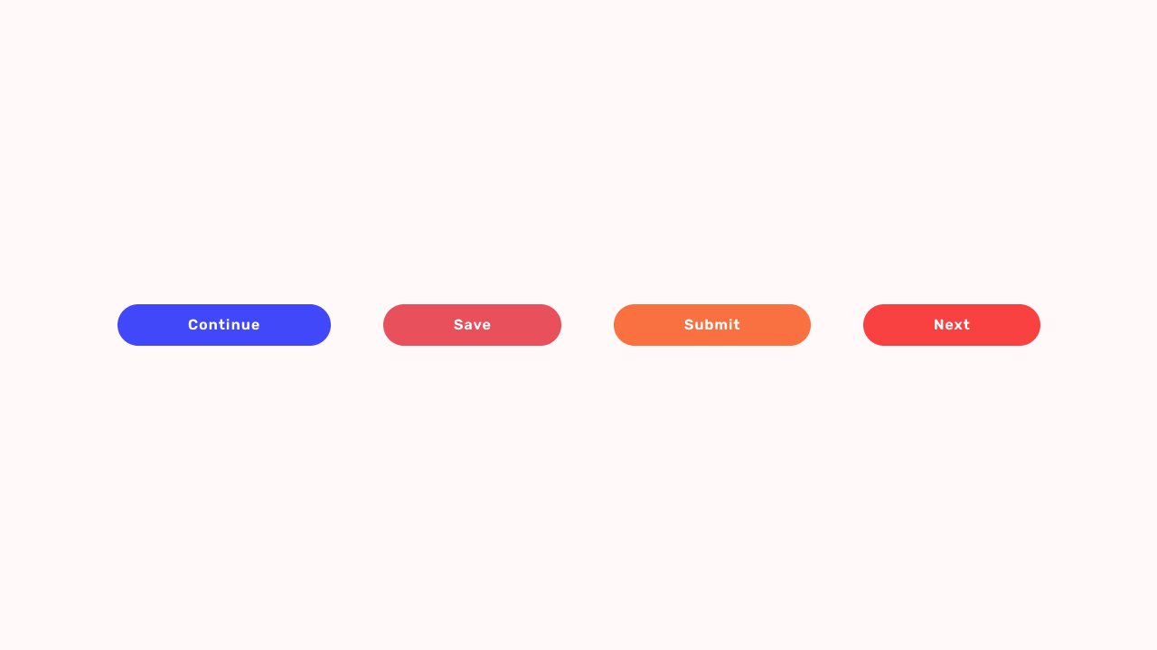
Most CTAs appear as buttons, links, banners, or short pieces of text.
Some common examples include:
- Sign Up
- Start Free Trial
- Download Now
- Learn More
- Buy Now
- Contact Us
- Get Started
- Subscribe
- Book a Demo
- Join the Community
The purpose is simple.
Guide users toward the next step.
That step might be making a purchase, creating an account, downloading a resource, scheduling a meeting, or reading another page.
Without a CTA, visitors often reach a dead end.
Why Call to Actions Matter So Much
Here’s the thing.
Many businesses spend weeks refining their design, writing content, improving page speed, and building features.
Then they place a weak CTA at the bottom of the page and wonder why conversions remain low.
A CTA often acts as the final push before a decision is made.
Think of it like a salesperson asking:
“Would you like to place the order?”
The customer may already be interested.
The customer may already trust the product.
Yet the sale doesn’t happen until someone asks for the next step.
A CTA serves that role in digital experiences.
A Simple Everyday Example
Imagine you’re hosting a dinner party.
Guests arrive.
You prepare amazing food.
The atmosphere feels warm and welcoming.
Everyone seems happy.
Yet nobody starts eating.
Why?
You never told them they could begin.
A simple statement like “Please help yourself” changes everything.
That statement acts as a call to action.
Digital products work in surprisingly similar ways.
People often need a small signal before they act.
How a CTA Works
At its core, a CTA moves users from one stage to another.
A visitor arrives.
They read.
They explore.
They develop interest.
The CTA appears and says:
“Here’s what you can do next.”
The process sounds straightforward, yet many businesses underestimate how much influence a CTA can have.
A few words can impact:
- Conversion rates
- Sign-ups
- Purchases
- Lead generation
- Engagement
- User retention
Sometimes changing a CTA from “Submit” to “Get My Free Guide” creates a noticeable increase in conversions.
Same destination.
Different wording.
Different result.
Different Types of CTAs
Not every CTA has the same purpose.
Different business goals require different calls to action.
Lead Generation CTA
These are used to collect user information.
Examples:
- Download Free Ebook
- Get the Checklist
- Join Our Newsletter
- Get Free Access
Lead generation CTAs are common on blogs, SaaS websites, and marketing campaigns.
Sales CTA
Sales-focused CTAs encourage purchases.
Examples:
- Buy Now
- Add to Cart
- Start Your Subscription
- Get Instant Access
These CTAs are often found on ecommerce websites and product landing pages.
Engagement CTA
Some CTAs focus on encouraging interaction.
Examples:
- Watch the Video
- Read the Case Study
- Explore Features
- See How It Works
These help users learn more before making a commitment.
Social CTA
Designed to grow communities and social engagement.
Examples:
- Follow Us
- Join the Community
- Share This Article
- Subscribe on YouTube
Many creators rely heavily on these CTAs.
Product CTA
Popular among SaaS businesses.
Examples:
- Start Free Trial
- Create Account
- Schedule a Demo
- Try It Free
These bridge the gap between interest and product adoption.
The Psychology Behind Effective CTAs
People often assume CTAs are about buttons.
They aren’t.
They’re about behavior.
A successful CTA works with human psychology rather than against it.
Let’s look at a few principles.
Clarity Reduces Friction
People hesitate when they’re confused.
A vague CTA like “Continue” leaves room for uncertainty.
A clearer CTA such as “Download My Template” removes guesswork.
People prefer certainty.
Action Verbs Create Momentum
Strong CTAs often begin with action-oriented words.
Examples include:
- Start
- Get
- Join
- Create
- Discover
- Download
Action words create movement.
They encourage participation.
Value Encourages Action
Users naturally ask themselves:
“What’s in it for me?”
Good CTAs answer that question immediately.
Compare these two examples:
Button A:
“Submit”
Button B:
“Get My Free Audit”
One communicates an action.
The other communicates value.
That’s a big difference.
Urgency Can Increase Response
Urgency works when used carefully.
Examples include:
- Limited Seats Available
- Register Today
- Offer Ends Friday
A little urgency can motivate action.
Too much urgency starts feeling pushy.
Users can usually tell the difference.
What Makes a Great CTA?
A strong CTA often shares a few common traits.
It Stands Out
Users should notice it quickly.
This doesn’t mean using neon colors or giant buttons.
It means creating visual contrast and clear hierarchy.
It Uses Simple Language
People scan websites rapidly.
Short phrases usually perform better than lengthy instructions.
It Feels Relevant
A CTA should match the context of the page.
A visitor reading a design article may respond well to:
“Download the Free UI Kit”
The same CTA may feel strange on a pricing page.
Context matters.
It Reduces Uncertainty
People hesitate when risk feels unclear.
CTAs that remove concerns often perform better.
Examples:
- Start Free Trial
- No Credit Card Required
- Cancel Anytime
Small details can have a surprisingly large impact.
CTA Design: It’s More Than the Words
Many discussions focus on CTA copy.
The visual presentation matters too.
A CTA button typically includes:
- Size
- Color
- Placement
- White space
- Typography
- Visual hierarchy
A fantastic CTA can still fail if users don’t notice it.
The message and design need to work together.
Think of them as teammates rather than separate elements.
Common CTA Mistakes
Even experienced teams occasionally make these mistakes.
Too Many CTAs
A page offering five different actions often creates hesitation.
Users become unsure where to focus.
One primary action generally works better.
Generic Button Text
Buttons labeled “Click Here” rarely inspire confidence.
Users prefer clarity.
Poor Placement
If users can’t find the CTA, they can’t act on it.
Simple.
Weak Visual Hierarchy
A CTA shouldn’t compete with twenty other elements for attention.
Important actions deserve visual prominence.
Asking Too Much Too Soon
Imagine meeting someone for the first time and immediately asking them for a large commitment.
That feels awkward.
The same principle applies online.
Build trust before asking users to take significant actions.
A/B Testing and CTA Optimization
Many successful companies continuously test their CTAs.
Small experiments can reveal surprising insights.
Teams commonly test:
- CTA wording
- Button color
- Placement
- Size
- Supporting text
- Page layout
Tools like Optimizely, VWO, Adobe Target, and Statsig help organizations run these experiments.
Interestingly, what works for one audience may perform poorly for another.
That’s why testing remains valuable.
Real user behavior often surprises everyone involved.
CTA Examples From Popular Brands
Netflix
“Get Started”
Short.
Clear.
Low friction.
Spotify
“Get Spotify Free”
The value appears immediately.
Users know exactly what they’re getting.
Slack
“Try for Free”
Simple language combined with low commitment.
Airbnb
“Become a Host”
Direct and highly relevant to the audience.
Canva
“Start Designing”
The CTA connects directly to the user’s goal.
No unnecessary words.
Just a clear next step.
CTAs in Modern AI Products
AI products have introduced new CTA patterns.
Instead of traditional sales language, many AI tools encourage exploration.
Examples include:
- Generate Image
- Create Project
- Ask AI
- Start Building
- Generate Design
- Create Workflow
These CTAs focus on action and curiosity.
They invite users to experience value immediately.
That’s becoming increasingly common across AI-powered products.
Final Thoughts
A Call to Action may look like a simple button.
In reality, it’s often the most important element on a page.
It’s the moment where interest becomes action.
The point where curiosity becomes commitment.
The place where a visitor decides to move forward—or leave.
Great CTAs don’t shout.
They don’t confuse.
They guide.
And sometimes, a few carefully chosen words can change the entire performance of a website, landing page, product, or marketing campaign.
That’s a lot of responsibility for a small button.
Yet that’s exactly why CTA design remains such an important part of digital experiences.
Frequently Asked Questions (FAQs)
What does CTA stand for?
CTA stands for Call to Action. It is a prompt that encourages users to take a specific action, such as signing up, purchasing a product, downloading a resource, or contacting a business.
What is an example of a Call to Action?
Common examples include “Get Started,” “Start Free Trial,” “Download Now,” “Buy Now,” “Book a Demo,” and “Subscribe.” These phrases guide users toward the next step.
Why are CTAs important in web design?
CTAs help users understand what action to take next. Without clear direction, visitors may leave a website without completing valuable actions such as purchases, sign-ups, or inquiries.
What makes a CTA effective?
An effective CTA is clear, visible, action-oriented, and relevant to the user’s needs. It communicates value while reducing uncertainty about what happens after the click.
What is the difference between a CTA and a button?
A button is a visual interface element. A CTA is the message or action being promoted. Many CTAs appear as buttons, but they can also appear as links, banners, forms, or text prompts.
How can I improve my CTA conversion rate?
You can improve CTA performance by simplifying the wording, increasing visual contrast, placing it strategically on the page, highlighting user benefits, reducing friction, and running A/B tests to identify what works best for your audience.