


Understanding How Colours Influence Design, Emotion, and User Experience.
Imagine entering two different rooms.
The first room is painted with soft blues and gentle grays.
The atmosphere feels calm.
Relaxing.
Comfortable.
Now imagine walking into another room filled with bright reds, vibrant oranges, and bold yellows.
Suddenly the energy changes.
The room feels lively.
Active.
Almost impossible to ignore.
The furniture may be identical.
The layout may be identical.
Yet the emotional experience feels completely different.
The reason?
Color.
Colors influence how people think, feel, and respond. They affect perception long before users begin reading content or interacting with products.
That’s why color theory remains one of the most important foundations of design.
What Is Color Theory?
Colour theory is a collection of principles that explains how colors interact, combine, and influence human perception.
It helps designers understand:
- Which colors work well together
- How colors create contrast
- How colors affect emotions
- How colors influence attention
- How color choices improve communication
In simple terms, color theory provides a framework for making thoughtful color decisions.
Without it, choosing colors often becomes guesswork.
With it, designers can create experiences that feel intentional and effective.
Why Color Theory Matters
Here’s the thing.
People often believe they choose products based on logic.
In reality, visual impressions play a huge role.
Color is frequently one of the first things users notice.
Before they read headlines.
Before they click buttons.
Before they understand features.
They notice color.
Color helps create:
- First impressions
- Emotional reactions
- Brand recognition
- Visual hierarchy
- User confidence
A well-chosen color palette can make a product feel trustworthy, exciting, luxurious, playful, or professional.
Sometimes within seconds.
Color Is a Language Without Words
Think about traffic lights.
You don’t need text explaining what red means.
Or green.
The colors communicate instantly.
Color works as a visual shortcut.
It conveys information quickly.
This ability makes color one of the strongest communication tools available to designers.
The Psychology Behind Color Perception
Human beings naturally associate colors with experiences and emotions.
Some associations appear across many cultures.
Others vary depending on region, traditions, and personal experiences.
For example:
- Blue often feels trustworthy and calm.
- Green frequently suggests nature and growth.
- Red often communicates urgency, passion, or importance.
- Yellow tends to feel energetic and optimistic.
- Black often conveys sophistication and authority.
These associations aren’t absolute rules.
Context matters.
Audience matters.
Culture matters.
Still, color psychology remains an important consideration during the design process.
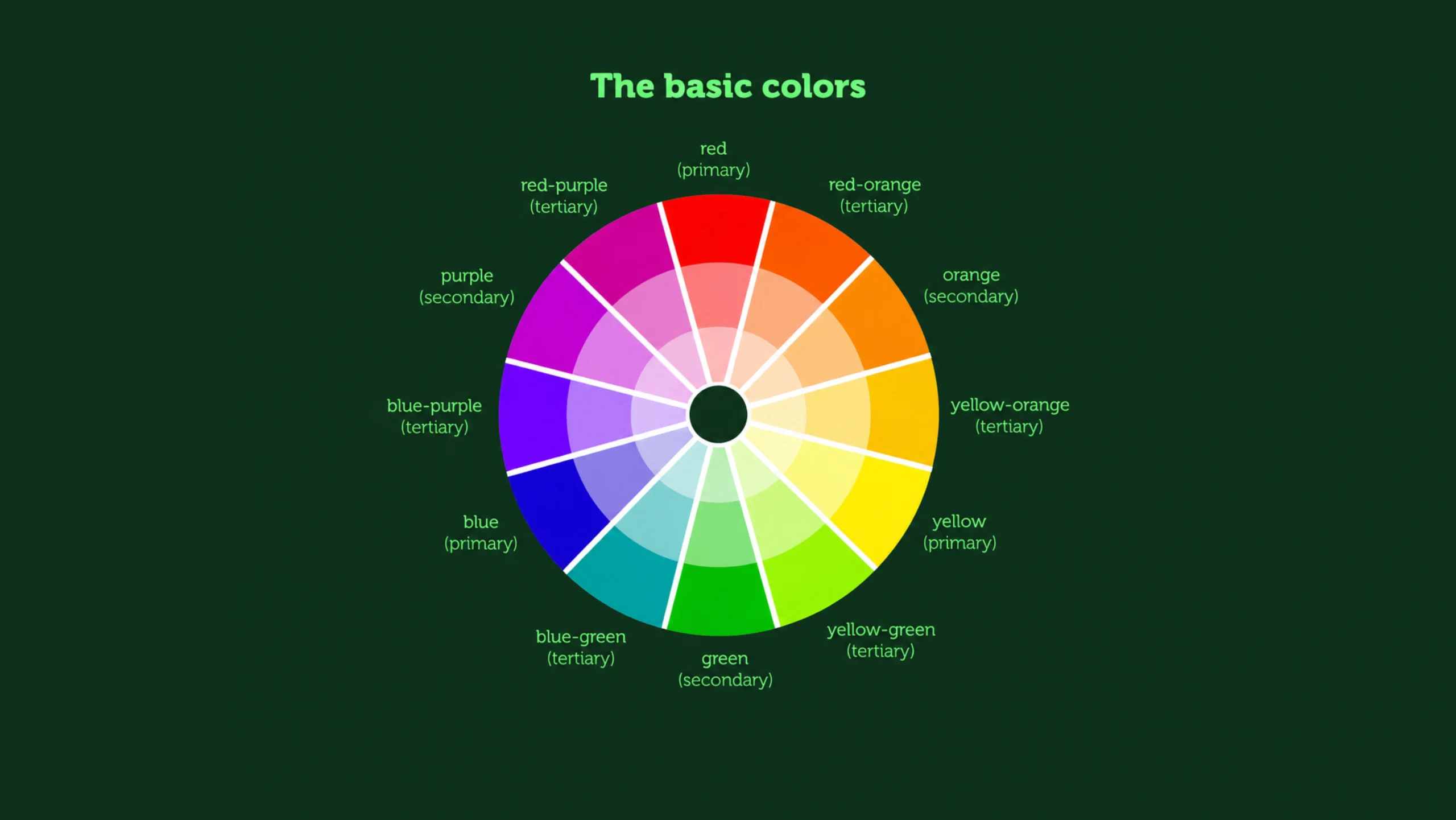
Understanding the Color Wheel
The color wheel is one of the most recognizable tools in color theory.
It organizes colors in a circular arrangement that helps designers understand relationships between colors.
Think of it as a map.
Instead of roads and cities, it shows how colors connect.
The color wheel helps designers build harmonious color combinations and create visual balance.
Primary Colors
Primary colors form the foundation of the color wheel.
They cannot be created by mixing other colors together.
Traditional primary colors include:
- Red
- Blue
- Yellow
These colors serve as the building blocks for many other color combinations.
Secondary Colors
Secondary colors are created by mixing two primary colors.
Examples include:
- Green
- Orange
- Purple
These colors add variety and flexibility to design palettes.
Tertiary Colors
Tertiary colors result from combining primary and secondary colors.
Examples include:
- Blue-green
- Yellow-orange
- Red-violet
These colors often create richer and more sophisticated color systems.
Color Harmony: Why Some Combinations Feel Better
Ever wonder why some color combinations feel balanced while others feel uncomfortable?
Color harmony helps explain that.
Color harmony refers to arrangements of colors that create visual balance and pleasant experiences.
Designers frequently use several established color relationships.
Complementary Colors
Complementary colors sit opposite each other on the color wheel.
Examples include:
- Blue and orange
- Red and green
- Yellow and purple
These combinations create strong contrast and attract attention.
They’re often used for buttons and calls to action.
Analogous Colors
Analogous colors sit next to each other on the color wheel.
Examples include:
- Blue
- Blue-green
- Green
These combinations often feel natural and cohesive.
Triadic Colors
Triadic color schemes use three evenly spaced colors from the wheel.
They create balance while maintaining visual interest.
Many playful and energetic designs rely on triadic relationships.
Monochromatic Colors
Monochromatic palettes use different shades, tints, and tones of a single color.
These systems often feel clean, elegant, and organized.
Many modern SaaS products rely heavily on monochromatic approaches.
Warm Colors vs Cool Colors
Colors are often grouped into two broad categories.
Warm Colors
Warm colors include:
- Red
- Orange
- Yellow
These colors often communicate:
- Energy
- Excitement
- Action
- Passion
Warm colors tend to attract attention quickly.
Cool Colors
Cool colors include:
- Blue
- Green
- Purple
These colors often communicate:
- Calmness
- Stability
- Trust
- Relaxation
Many financial and healthcare products rely heavily on cool color palettes.
Color Theory in UI Design
Color plays a major role in User Interface design.
Users rely on color cues constantly.
For example:
- Green often indicates success.
- Red often signals errors.
- Blue frequently represents links.
- Gray often indicates inactive elements.
These conventions help users understand interfaces quickly.
Color becomes part of communication.
Not decoration.
Color Theory in UX Design
User Experience design goes beyond visuals.
Yet color has a direct influence on experience.
Good color choices help users:
- Navigate interfaces
- Understand actions
- Prioritize information
- Build confidence
- Reduce confusion
Poor color choices create friction.
Users may struggle to understand what actions are available or which information matters most.
How Brands Use Color Strategically
Brands spend significant time choosing colors.
And for good reason.
Color influences recognition.
Think about some of the world’s largest companies.
Many become recognizable from color alone.
A brand’s color palette helps communicate personality.
For example:
- Technology companies often favor blues.
- Luxury brands frequently use black, gold, or neutral tones.
- Environmental organizations often rely on greens.
Color becomes part of brand identity.
Sometimes as memorable as a logo.
Color and Visual Hierarchy
Not everything on a screen should receive equal attention.
Color helps create hierarchy.
Designers often use color to:
- Highlight buttons
- Emphasize notifications
- Separate sections
- Guide attention
A brightly colored button on a neutral page immediately becomes more visible.
Users naturally notice it.
That’s hierarchy at work.
Common Color Mistakes in Design
Even experienced designers occasionally make color-related mistakes.
Let’s explore a few common ones.
Using Too Many Colors
A design filled with numerous competing colors can feel chaotic.
Too much variety often weakens visual clarity.
Weak Contrast
Low contrast creates readability problems.
Light gray text on a white background may look elegant but can frustrate users.
Ignoring Accessibility
Not everyone perceives color in the same way.
Designs should remain usable for people with color vision deficiencies.
Relying Only on Color
Important information shouldn’t depend entirely on color.
Icons, labels, and visual indicators should provide additional support.
Following Trends Blindly
Popular colors come and go.
User needs should always remain the priority.
Color Theory and Accessibility
Accessibility deserves special attention in color discussions.
Millions of people experience some form of color vision deficiency.
Designers should create interfaces that remain understandable without relying exclusively on color.
Several practices improve accessibility:
- Strong contrast ratios
- Text labels
- Icons alongside color indicators
- Clear hierarchy
- Multiple visual cues
Accessible design benefits everyone.
Not just specific groups of users.
Color Theory in Modern Digital Products
Color influences nearly every digital experience.
Examples include:
- Mobile apps
- SaaS platforms
- E-commerce websites
- Dashboards
- Gaming interfaces
- Streaming platforms
As products become more sophisticated, color systems become increasingly important.
Large organizations often create detailed design systems that define:
- Primary colors
- Secondary colors
- Success states
- Warning states
- Error states
- Neutral palettes
Consistency improves usability.
Color plays a major role in that consistency.
Color Theory in the Age of AI
AI-powered design tools can now generate color palettes in seconds.
They can analyze trends.
Suggest combinations.
Evaluate accessibility.
Generate branding systems.
These capabilities are useful.
Yet color selection still benefits from human judgment.
Color decisions involve context.
Audience expectations.
Brand personality.
Business goals.
Technology helps speed up the process.
Thoughtful design still matters.
A Useful Analogy
Think of color as the soundtrack of a movie.
The story may remain unchanged.
The music changes how the audience feels about it.
Color works similarly.
The content may stay the same.
The emotional response can shift dramatically.
That’s why color theory continues to play such an important role in design.
Final Thoughts
Color theory is the study of how colors interact, communicate, and influence perception.
It helps designers create visual harmony, establish hierarchy, strengthen brand identity, improve usability, and support accessibility.
From websites and mobile apps to advertising campaigns and product interfaces, color shapes countless decisions users make every day.
Good color choices create clarity.
They guide attention.
They support communication.
And they help transform ordinary designs into memorable experiences.
The strongest color systems rarely happen by accident.
They are built with intention, understanding, and a deep appreciation for how people respond to visual information.
Frequently Asked Questions (FAQs)
What is color theory?
Color theory is a collection of principles that explains how colors interact, combine, and influence perception, emotion, and communication.
Why is color theory important in design?
Color theory helps designers create harmonious color combinations, improve usability, strengthen branding, and guide user attention.
What is the color wheel?
The color wheel is a visual tool that organizes colors and shows relationships between them, helping designers create balanced color schemes.
What are complementary colors?
Complementary colors sit opposite each other on the color wheel and create strong visual contrast, such as blue and orange or red and green.
How does color affect user experience?
Color influences emotions, attention, navigation, decision-making, and overall perception of a product or interface.
Why is accessibility important in color theory?
Accessibility helps make designs usable for people with color vision deficiencies and visual impairments by providing sufficient contrast and multiple visual cues beyond color alone.