


Grid System: The Invisible Framework Behind Great Design.
Have you ever looked at a website and thought, “Everything just feels organized”?
You might not notice the reason immediately.
The text lines up neatly. Images feel balanced. Buttons appear exactly where you’d expect them to be. Nothing seems random.
Behind that sense of order is often something you never see.
A grid system.
Think of a grid as the skeleton behind a design. You don’t see the bones, but they help everything stay in place.
Without a grid, layouts can quickly become messy. Content starts drifting. Spacing becomes inconsistent. Users feel the chaos, even if they can’t explain why.
Let’s explore what grid systems are and why designers have relied on them for decades.
What Is a Grid System?
A grid system is a structure made of columns, rows, margins, and spacing rules that helps designers organize content consistently.
It acts as a guide for placing elements on a page or screen.
Rather than positioning items randomly, designers use a grid to create order and predictability.
Imagine building a city.
You could place roads, houses, and parks anywhere.
Or you could follow a planned street layout.
The second approach makes navigation much easier.
A grid works in a similar way for digital and print design.
Why Grid Systems Matter
Humans naturally look for patterns.
Our brains like structure.
We enjoy finding relationships between elements.
A grid helps create those relationships.
When content aligns properly, users can scan information faster and understand layouts more easily.
That’s why grid systems play a major role in:
- Web design
- Mobile app design
- Dashboard design
- Print design
- Editorial layouts
- Presentation design
- Design systems
The grid itself may be invisible, but its impact is visible everywhere.
A Quick Trip Through History
Grid systems aren’t new.
Long before websites existed, newspapers and magazines relied on grids to organize articles, headlines, photographs, and advertisements.
Editors needed a reliable method for arranging large amounts of content.
The grid solved that problem.
Later, graphic designers expanded the concept.
Then digital designers adopted it for websites and applications.
Today, almost every professional design tool includes grid functionality.
From Figma and Sketch to Adobe XD and Webflow, grids are everywhere.
How Does a Grid System Work?
At its core, a grid divides a space into smaller sections.
These sections help designers place content consistently.
Think about a chessboard.
Each piece sits inside a defined square.
The board creates structure.
A grid works similarly.
Designers place content within designated areas, making layouts easier to understand and maintain.
The Building Blocks of a Grid
A grid system contains several key components.
Let’s break them down.
Columns
Columns are vertical divisions within a layout.
They form the foundation of many modern grids.
For example, a website may use:
- 12 columns
- 8 columns
- 6 columns
- 4 columns
Designers can combine columns to create different content areas.
A hero section might span all 12 columns.
A sidebar might occupy only 3 columns.
Rows
Rows divide content horizontally.
They help organize sections from top to bottom.
Rows become especially useful in dashboard interfaces and data-heavy layouts.
Gutters
Gutters are the spaces between columns.
Without gutters, content would feel crowded.
Think of them as breathing room.
Small detail.
Big impact.
Margins
Margins create space around the outer edges of a layout.
They prevent content from touching the screen boundaries.
Good margins make interfaces feel comfortable and readable.
Modules
Modules are the individual units created when rows and columns intersect.
Designers often place content inside these modules.
This creates consistency across pages and screens.
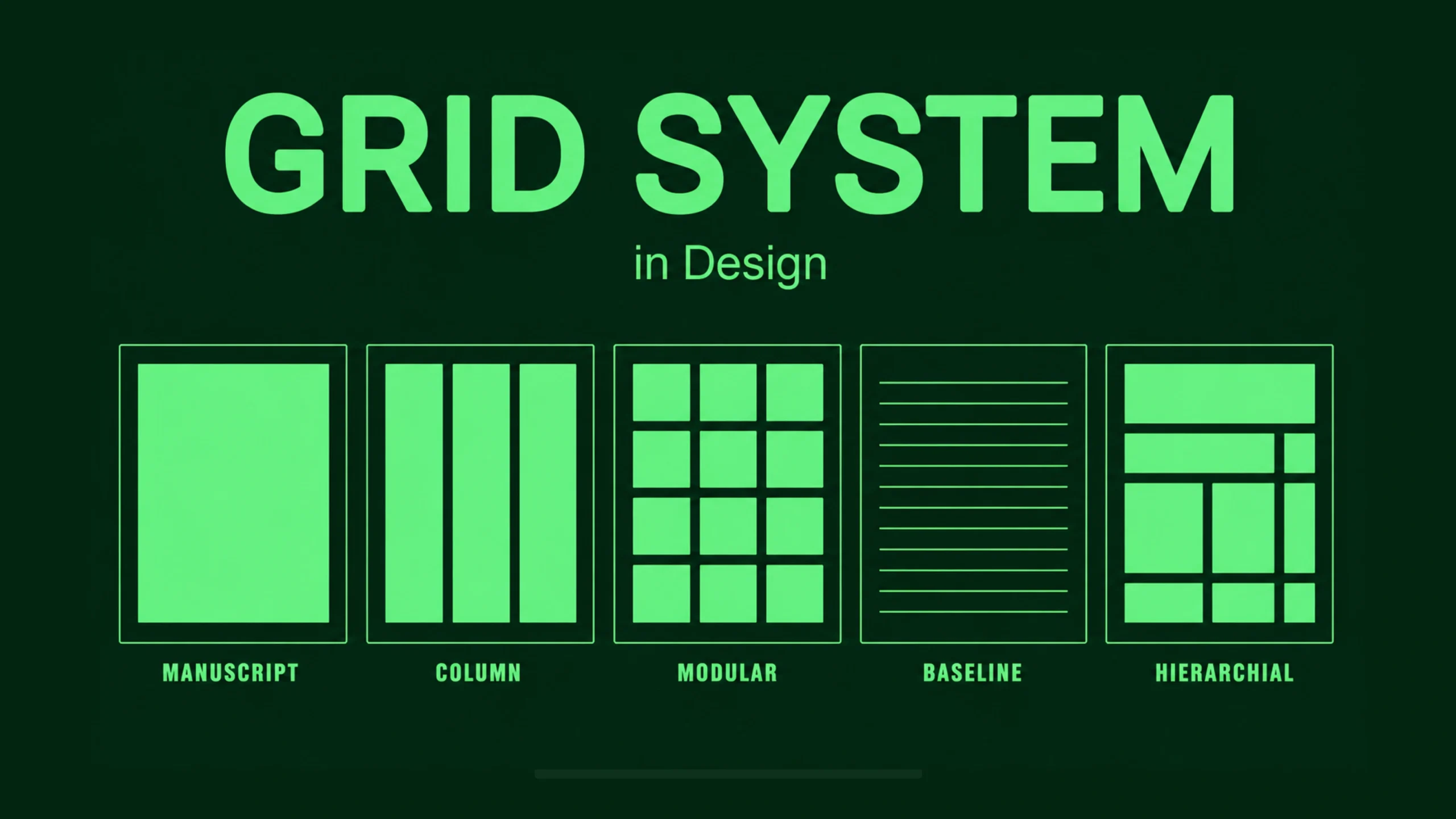
Different Types of Grid Systems
Not every project uses the same grid.
Different situations call for different approaches.
Manuscript Grid
This is the simplest grid.
It consists of a single large content area.
Books and articles often rely on manuscript grids.
The structure feels clean and straightforward.
Column Grid
Column grids use multiple vertical divisions.
They are commonly found in websites, mobile apps, and editorial layouts.
Most modern digital products rely on some form of column grid.
Modular Grid
A modular grid combines rows and columns.
This creates a series of modules or cells.
Dashboards frequently use modular grids because they contain many content blocks.
Hierarchical Grid
Hierarchical grids are more flexible.
Rather than following strict patterns, they adapt to content needs.
News websites often use hierarchical grids to highlight important stories.
Grid Systems in Web Design
Web design depends heavily on grids.
Open almost any modern website and you’ll likely find a grid underneath the interface.
Grids help designers:
- Align text
- Position images
- Organize navigation
- Maintain consistency
- Support responsive behavior
Without a grid, scaling layouts across devices becomes much harder.
Grid Systems in UI Design
User interfaces contain many moving parts.
Buttons.
Cards.
Forms.
Navigation elements.
Charts.
Notifications.
A grid provides a common structure for all these components.
This consistency helps users learn an interface more quickly.
People begin recognizing patterns.
They know where information lives.
They know where actions occur.
That’s valuable.
The Relationship Between Grids and UX
Grid systems aren’t purely visual tools.
They influence user experience too.
A structured layout reduces cognitive effort.
Users spend less time figuring out where things are.
They can focus on completing tasks.
This creates smoother experiences.
You know that feeling when an app feels intuitive from the first few minutes?
Often, a strong grid is quietly helping behind the scenes.
Responsive Grids: One Layout, Many Screens
Years ago, designers mainly worried about desktop screens.
Today, users switch constantly between devices.
Phones.
Tablets.
Laptops.
Large monitors.
Smart TVs.
Responsive grids help layouts adapt across these environments.
A 12-column desktop layout might collapse into 4 columns on tablets and a single-column layout on mobile devices.
The content remains organized even as screen sizes change.
That’s one reason responsive grids became so important.
The Famous 12-Column Grid
If you’ve worked with web design, you’ve probably heard about the 12-column grid.
Why 12?
The number divides evenly into many combinations.
Designers can split content into:
- 12 equal sections
- 6 equal sections
- 4 equal sections
- 3 equal sections
- 2 equal sections
This flexibility makes layout creation easier.
That’s why frameworks like Bootstrap popularized 12-column structures.
Many design systems still use them today.
Benefits of Using a Grid System
Let’s look at some practical advantages.
Better Consistency
Grids help create uniform layouts across pages and screens.
Users quickly become familiar with the structure.
Faster Design Decisions
Instead of constantly deciding where elements should go, designers follow an established framework.
This speeds up the design process.
Improved Collaboration
Designers and developers can work from the same layout rules.
Communication becomes clearer.
Fewer surprises appear during implementation.
Stronger Visual Balance
Grids create harmony between content elements.
Pages feel more organized and professional.
Easier Scalability
As products grow, grids help maintain consistency across hundreds of screens.
Large SaaS products rely heavily on this approach.
Common Grid Mistakes
A grid is powerful, but it can be misused.
Here are a few common mistakes.
Ignoring the Grid Entirely
Some designers create grids and then stop following them.
This leads to inconsistent spacing and alignment issues.
Being Too Rigid
Interestingly, grids shouldn’t feel restrictive.
Sometimes designers follow the grid so strictly that layouts become predictable and lifeless.
Good design balances structure and creativity.
Inconsistent Spacing
Even with a grid, inconsistent margins and gutters can create visual confusion.
Overcomplicated Grid Systems
A grid should simplify design.
If the structure becomes difficult to understand, it may create more problems than it solves.
Popular Grid Frameworks and Systems
Many frameworks provide pre-built grid structures.
Some well-known examples include:
- Bootstrap Grid
- CSS Grid
- Flexbox layouts
- Material Design Grid
- Ant Design Grid
- Tailwind CSS Grid Utilities
These systems help teams create consistent layouts without building grids from scratch.
Grid Systems and Design Systems
Modern design systems often rely heavily on grids.
Companies like Google, Microsoft, Airbnb, and Shopify maintain detailed layout frameworks.
Their products contain thousands of screens.
Without grids, consistency would become difficult to maintain.
The grid acts as a shared language between designers and developers.
Everyone works from the same structure.
Grid Systems in the Age of AI Design
AI-powered design tools can generate layouts automatically.
Some tools even suggest responsive grids based on content.
That’s impressive.
Yet grids remain relevant.
AI may create the structure, but designers still decide how information should flow and what deserves attention.
The grid remains a framework.
Human judgment still shapes the experience.
The Hidden Hero of Design
Here’s something interesting.
The best grid systems often go unnoticed.
Users rarely open a website and say, “Wow, amazing grid.”
Instead, they say:
- “This site feels easy to use.”
- “Everything is organized.”
- “I found what I needed quickly.”
Those reactions often point back to strong layout structure.
A successful grid disappears into the experience.
And that’s exactly what makes it valuable.
Final Thoughts
A grid system is a framework that helps designers organize content through columns, rows, margins, gutters, and spacing rules.
It brings order to layouts, improves consistency, supports responsive design, and creates better user experiences.
From newspaper pages to modern SaaS dashboards, grids have remained one of the most trusted tools in design.
Technology changes.
Design trends come and go.
Screen sizes continue evolving.
Yet the need for structure remains remarkably consistent.
A good grid doesn’t limit creativity.
It provides a foundation that allows creativity to flourish without descending into chaos.
That’s why grid systems continue to sit at the center of great design.
Frequently Asked Questions (FAQs)
What is a grid system in design?
A grid system is a structured framework made of columns, rows, margins, and spacing rules that helps designers organize content consistently.
Why are grid systems important?
Grid systems improve organization, consistency, readability, and usability while making layouts easier to design and maintain.
What is a 12-column grid?
A 12-column grid divides a layout into twelve equal vertical sections, allowing flexible content arrangements across different screen sizes.
What is the difference between CSS Grid and Flexbox?
CSS Grid is designed for two-dimensional layouts involving rows and columns, while Flexbox focuses primarily on one-dimensional layouts along a row or column.
Do all websites use grid systems?
Most professionally designed websites use some form of grid system, even if users never see it directly.
Can designers break the grid?
Yes. Designers often break grid rules intentionally to create emphasis or visual interest, but they usually do so selectively while maintaining overall structure.