


White Space: The Invisible Design Element That Makes Everything Easier to Use.
Imagine walking into a room packed wall-to-wall with furniture.
A sofa touches a table.
A table touches a chair.
Shelves are overflowing.
Decorations fill every corner.
You can still move around, but it feels uncomfortable. Your eyes don’t know where to settle. The room feels noisy even though nobody is speaking.
Now picture a different room.
A comfortable sofa.
A coffee table.
A few carefully placed decorations.
Space between objects.
The room suddenly feels calm, welcoming, and organized.
Interestingly, nothing magical happened.
The difference wasn’t more furniture.
The difference was space.
Design works the same way.
That “empty” area surrounding text, buttons, images, and content is called white space, and it’s one of the most powerful tools in visual design.
Ironically, many people barely notice it when it’s done well.
What Is White Space?
White space, sometimes called negative space, refers to the empty areas between design elements.
These spaces may appear:
- Between paragraphs
- Around images
- Between buttons
- Around headings
- Between menu items
- Around forms and input fields
- Along page margins
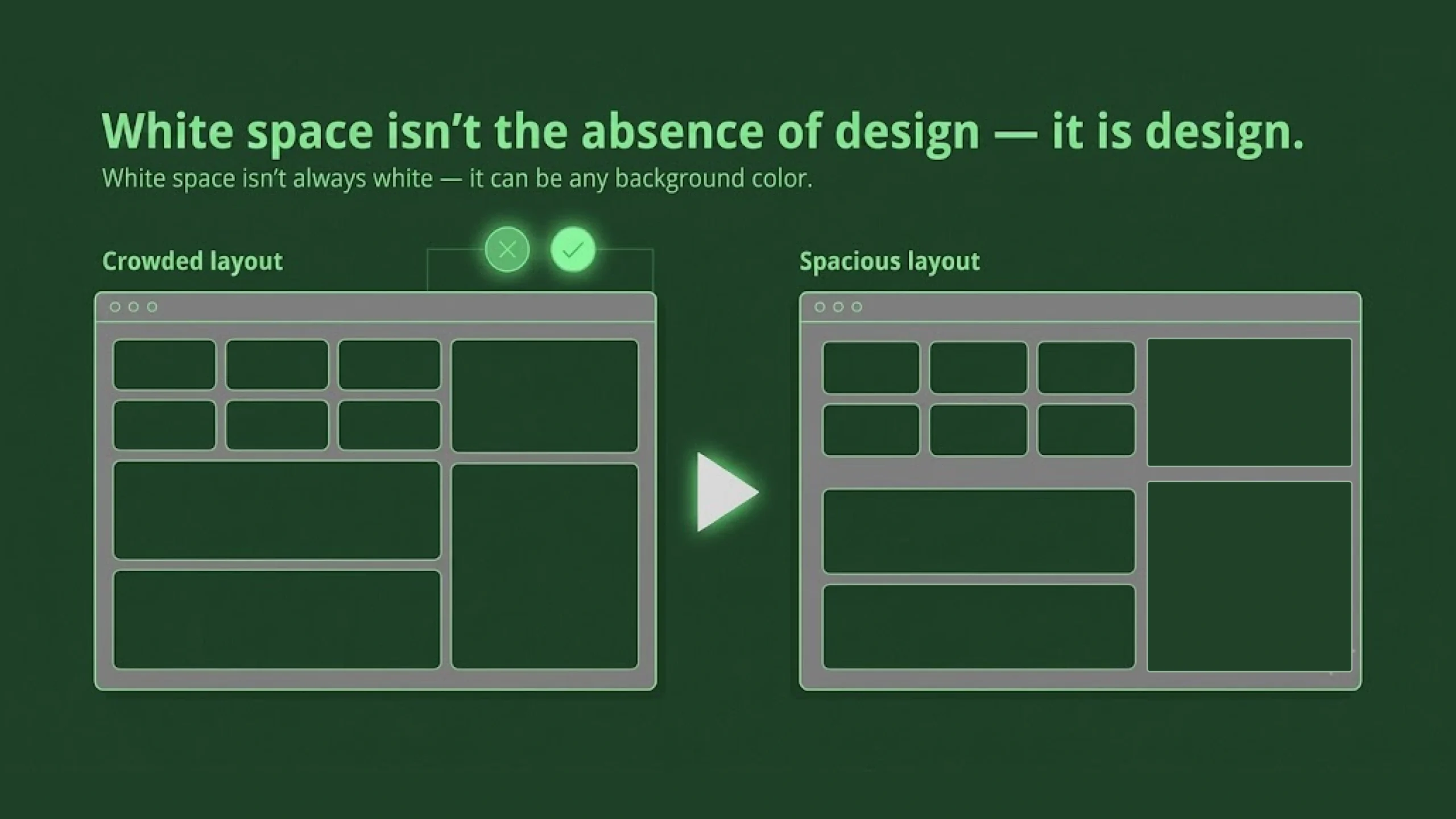
Despite the name, white space doesn’t have to be white.
It can be black.
Blue.
Gray.
Green.
Any color.
The term simply refers to unused visual space.
Why White Space Matters
Here’s the thing.
Design isn’t only about what you add.
It’s also about what you leave out.
White space helps users understand content by separating information into manageable pieces.
Without spacing, everything blends together.
Users must work harder.
Reading becomes tiring.
Navigation becomes confusing.
Important content gets buried.
White space creates breathing room.
And breathing room matters.
The Biggest Myth About White Space
Many stakeholders look at a design and say:
“There’s too much empty space.”
It’s one of the most common comments designers hear.
The assumption is understandable.
Unused space can feel wasteful.
Yet white space isn’t wasted space.
In many cases, it’s doing more work than visible content.
Think about a museum.
Paintings aren’t stacked edge-to-edge on a wall.
Space around artwork helps people focus.
The same principle applies to digital products.
Space creates emphasis.
White Space Is Not Empty
This sounds contradictory at first.
How can empty space be doing something?
Because white space communicates structure.
It separates.
Organizes.
Prioritizes.
Directs attention.
Without saying a single word, it helps users understand what belongs together and what doesn’t.
In many ways, white space acts like punctuation in writing.
Imagine reading a paragraph with no spaces between words.
It would be exhausting.
White space makes visual communication readable.
Types of White Space
Designers typically discuss two main categories.
Macro White Space
Macro white space refers to large areas of spacing across a design.
Examples include:
- Large page margins
- Space between sections
- Gaps between content blocks
- Empty areas surrounding hero sections
Macro spacing shapes the overall structure of a page.
It influences how open or crowded a design feels.
Micro White Space
Micro white space refers to smaller spacing details.
Examples include:
- Space between letters
- Space between words
- Line spacing
- Padding inside buttons
- Gaps between icons and labels
Micro spacing affects readability and usability at a more detailed level.
Often, users don’t consciously notice it.
They certainly notice when it’s wrong.
How White Space Affects User Experience
White space directly influences usability.
When information appears crowded, users must spend more effort processing it.
Good spacing reduces cognitive load.
Information becomes easier to scan.
Actions become easier to find.
Reading becomes more comfortable.
And perhaps most importantly, users feel less overwhelmed.
The interface feels calmer.
More approachable.
More trustworthy.
White Space and Human Attention
Human attention has limits.
We process information in chunks.
Our brains naturally group related items together.
This behavior is explained by Gestalt psychology, a collection of principles that describe how people perceive visual information.
One of those principles is proximity.
Objects placed close together appear related.
Objects separated by space appear distinct.
White space takes advantage of this natural tendency.
Designers use spacing to communicate relationships without adding extra visual elements.
White Space in UI Design
User Interface design depends heavily on spacing.
Consider a mobile banking app.
Users need to find:
- Account balances
- Transactions
- Transfer buttons
- Payment options
If everything appears crowded together, users slow down.
Mistakes become more likely.
Well-placed spacing creates clarity.
Important actions stand out naturally.
Navigation feels simpler.
Tasks feel easier.
White Space in Typography
Typography and white space are deeply connected.
Even beautifully chosen fonts can become difficult to read if spacing is poor.
Several spacing decisions influence readability:
Line Height
The space between lines of text.
Too little spacing creates visual clutter.
Too much spacing makes paragraphs feel disconnected.
Letter Spacing
The space between individual characters.
Proper spacing improves legibility.
Poor spacing creates reading friction.
Paragraph Spacing
The space between content blocks.
Readers use these gaps to process information.
Without them, long pages become intimidating.
White Space in Web Design
Open almost any modern website and you’ll see white space everywhere.
Popular brands often use generous spacing.
Think about technology companies.
Luxury brands.
High-end SaaS platforms.
Their interfaces frequently feel clean and focused.
A large part of that feeling comes from thoughtful spacing.
It’s easy to mistake white space for simplicity.
Yet creating a balanced layout often requires significant design effort.
White Space Creates Visual Hierarchy
Not all content deserves equal attention.
Some elements should stand out.
Others should quietly support the experience.
White space helps establish hierarchy.
For example:
- Large spacing around a headline increases emphasis.
- Extra spacing around a call-to-action button draws attention.
- Section spacing helps users understand content structure.
Sometimes adding space is more effective than adding color.
That’s a lesson many designers learn over time.
White Space and Conversion Rates
This surprises some people.
White space can influence business outcomes.
When users understand content faster, they’re more likely to take action.
Forms become easier to complete.
Products become easier to compare.
Calls to action become easier to notice.
Research across UX and conversion optimization has repeatedly shown that clarity often performs better than visual clutter.
A cleaner layout doesn’t automatically increase sales.
It often removes barriers that prevent action.
White Space and Accessibility
Accessibility benefits greatly from thoughtful spacing.
Users with cognitive challenges often find crowded layouts difficult to process.
Spacing improves:
- Readability
- Scannability
- Focus
- Content comprehension
Touch interfaces benefit too.
Buttons placed too close together increase accidental taps.
Adequate spacing helps everyone, not only users with accessibility needs.
Common White Space Mistakes
White space is powerful, yet it can be misused.
Let’s look at several common issues.
Cramming Too Much Information
Sometimes teams want every feature, message, promotion, and announcement visible immediately.
The result becomes visual overload.
Users struggle to find what matters.
Inconsistent Spacing
Random spacing creates confusion.
A design feels more polished when spacing follows predictable patterns.
Consistency creates rhythm.
Fear of Empty Areas
Many teams worry that empty areas make a page look unfinished.
Ironically, removing spacing often makes the design feel less professional.
Excessive Spacing
Yes, too much white space can create problems.
Content may become disconnected.
Users may need to scroll unnecessarily.
Balance matters.
White space should support content, not compete with it.
White Space in Mobile Design
Small screens make spacing even more important.
Every pixel matters.
Users interact using fingers rather than mouse pointers.
Buttons need room.
Content needs breathing space.
Text must remain readable.
Without thoughtful spacing, mobile experiences quickly become frustrating.
This is one reason modern mobile apps often appear cleaner than older applications.
Design standards have evolved.
Spacing plays a major role in that shift.
White Space in Modern SaaS Products
Software dashboards often contain large amounts of information.
Metrics.
Charts.
Notifications.
Reports.
Filters.
Actions.
Without spacing, dashboards become overwhelming.
Good SaaS products use white space strategically to organize complexity.
The information remains available.
It simply feels easier to process.
That distinction matters.
A lot.
White Space in the Age of AI
AI-generated interfaces are becoming more common.
Tools can now create layouts in seconds.
Yet spacing decisions still require human judgment.
AI can suggest structure.
Human designers still determine emphasis, flow, and clarity.
Interestingly, many AI-generated designs improve dramatically after spacing adjustments.
The content may remain identical.
The experience changes completely.
A Useful Analogy
Think of white space as silence in music.
A song isn’t made entirely of notes.
Pauses matter.
Rhythm depends on them.
Without moments of silence, music becomes noise.
Without white space, design becomes noise too.
The content remains present.
The experience becomes harder to enjoy.
Final Thoughts
White space is the intentional use of empty space between design elements to improve clarity, organization, readability, and usability.
Although it often goes unnoticed, it plays a major role in how users experience websites, applications, dashboards, documents, and digital products.
Good white space helps people focus.
It reduces mental effort.
It creates hierarchy.
It improves accessibility.
And perhaps most importantly, it makes information feel approachable.
The strongest designs are rarely the ones packed with the most elements.
They’re often the ones that know when to step back and let content breathe.
Frequently Asked Questions (FAQs)
What is white space in design?
White space is the empty area between design elements such as text, images, buttons, and sections. It helps organize content and improve readability.
Why is white space important in UI design?
White space improves usability by making interfaces easier to scan, understand, and interact with. It reduces visual clutter and helps users focus on important content.
Does white space have to be white?
No. White space can be any color. The term refers to unused or empty areas within a design rather than a specific color.
What is the difference between white space and negative space?
The terms are often used interchangeably. In graphic design, negative space may also refer to empty areas that create shapes or visual meaning.
Can too much white space be a problem?
Yes. Excessive spacing can make content feel disconnected and may create unnecessary scrolling. Effective design balances content and spacing.
How does white space improve accessibility?
White space improves readability, reduces cognitive strain, helps users focus on content, and makes touch targets easier to interact with on mobile devices.