


Design System: The Foundation That Keeps Digital Products Consistent.
Imagine you’re building a house.
You hire ten architects.
Each one designs a different room.
One chooses blue doors.
Another picks red doors.
A third prefers round windows.
Someone else installs square windows.
By the time construction ends, the house technically works, but it feels disconnected.
Nothing looks like it belongs together.
Digital products can suffer from the same problem.
A mobile app grows.
A website expands.
New features arrive every month.
Different designers and developers contribute along the way.
Without a shared system, the experience slowly becomes inconsistent.
Buttons look different.
Spacing changes from screen to screen.
Forms behave differently.
Navigation patterns shift.
Users notice the friction, even if they can’t explain why.
This is where design systems come in.
They bring order to growing digital products.
What Is a Design System?
A design system is a collection of standards, reusable components, guidelines, and visual rules that help teams create consistent digital products.
Think of it as a single source of truth for design and development.
Rather than reinventing buttons, forms, icons, colors, and layouts for every project, teams rely on a shared system.
The result is consistency across products, platforms, and teams.
A design system helps answer questions like:
- Which button style should we use?
- What spacing should appear between sections?
- Which typography scale should we follow?
- How should forms behave?
- What colors represent success or error states?
Instead of debating these decisions repeatedly, teams reference the system.
Why Design Systems Matter
Consistency creates trust.
When users move through an application, they expect familiar patterns.
A button should behave like a button.
Navigation should feel predictable.
Forms should follow recognizable rules.
When every screen follows the same visual language, users spend less time learning the interface.
They focus on completing tasks instead.
That’s a big win.
For businesses, design systems create another advantage.
They help teams work faster.
Much faster.
The Problem Design Systems Solve
Let’s imagine a SaaS company with:
- 20 designers
- 50 developers
- Hundreds of screens
- Multiple products
Without a design system, every new feature introduces fresh decisions.
What color should this button be?
How much spacing should this card have?
Which icon should appear here?
These questions seem small individually.
Multiply them by hundreds of screens and thousands of design decisions.
The result becomes expensive.
Design systems reduce this repetition.
Teams can focus on solving user problems instead of recreating interface patterns.
Think of It Like LEGO
A simple analogy helps.
Imagine building something with LEGO bricks.
You don’t manufacture a new brick every time you need one.
You use existing pieces.
You combine them in different ways.
A design system works similarly.
Buttons, cards, inputs, navigation menus, and other elements become reusable building blocks.
Teams assemble experiences using proven components rather than creating everything from scratch.
Core Elements of a Design System
A design system contains several interconnected parts.
Let’s look at the most important ones.
Design Principles
Design principles guide decision-making.
They explain how a company approaches design.
Examples might include:
- Simplicity
- Accessibility
- Clarity
- Efficiency
- Consistency
These principles influence every component and interaction within the system.
Think of them as the philosophy behind the design.
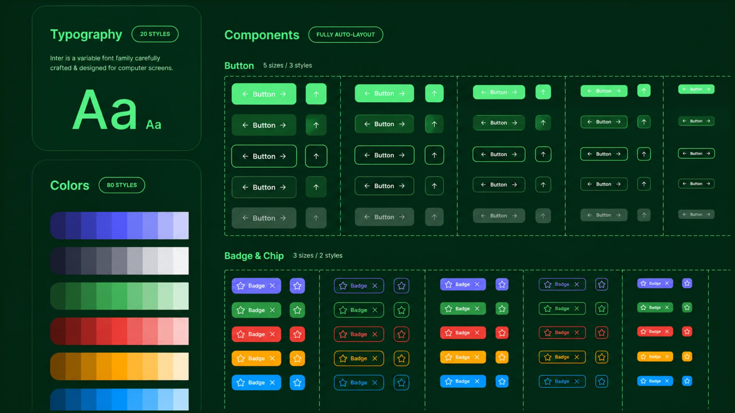
Color System
Colors play a major role in product consistency.
A design system typically defines:
- Primary colors
- Secondary colors
- Success colors
- Warning colors
- Error colors
- Background colors
- Text colors
Without clear color rules, products often become visually inconsistent.
Typography
Typography rules define how text appears throughout a product.
This usually includes:
- Font families
- Font sizes
- Font weights
- Line heights
- Heading styles
- Body text styles
Consistent typography improves readability and creates visual harmony.
Spacing Rules
Spacing often goes unnoticed until it’s inconsistent.
A design system defines standard spacing values for:
- Margins
- Padding
- Section gaps
- Component spacing
These rules help create balance across layouts.
Iconography
Icons communicate actions and concepts quickly.
Design systems establish:
- Icon styles
- Stroke widths
- Sizes
- Usage guidelines
Consistency prevents visual confusion.
Components
Components are the reusable building blocks of a design system.
Examples include:
- Buttons
- Forms
- Dropdown menus
- Checkboxes
- Cards
- Navigation bars
- Tooltips
- Modals
Each component includes design specifications and development instructions.
This allows teams to use them repeatedly without redesigning them.
Patterns
Patterns combine multiple components into complete user experiences.
Examples include:
- Login flows
- Checkout experiences
- Search interfaces
- Profile management screens
Patterns help teams solve common user tasks consistently.
Design Tokens: The Hidden Layer
Modern design systems often include design tokens.
These are reusable values that define:
- Colors
- Spacing
- Typography
- Shadows
- Border radius values
Instead of manually entering visual properties, teams reference predefined tokens.
This makes updates easier and reduces inconsistency.
Design Systems vs Style Guides
People often confuse these concepts.
They are related but different.
A style guide primarily focuses on visual rules.
It defines:
- Colors
- Typography
- Branding
- Logo usage
A design system goes much further.
It includes:
- Components
- Interaction rules
- Design patterns
- Development resources
- Documentation
A style guide is one part of a design system.
Not the entire thing.
Design Systems vs UI Kits
Another common misconception.
A UI kit is a collection of interface elements.
A design system includes those elements plus guidance on how and when to use them.
Think of it this way:
A UI kit provides ingredients.
A design system provides ingredients, recipes, cooking instructions, and quality standards.
Benefits of Using a Design System
The advantages become more noticeable as products grow.
Faster Design Work
Designers spend less time recreating common components.
Work moves more efficiently.
Faster Development
Developers reuse existing code instead of rebuilding interface elements.
This reduces duplication.
Better Consistency
Users experience a unified interface across screens and products.
Consistency builds confidence.
Easier Scaling
Growing companies often struggle with consistency.
Design systems make expansion easier.
New teams can follow existing standards.
Stronger Collaboration
Designers and developers work from the same source.
Communication becomes clearer.
Fewer misunderstandings occur.
Better Accessibility
Well-maintained design systems often include accessibility guidelines.
This helps products serve a wider audience.
Real-World Examples of Design Systems
Many well-known companies have publicly documented design systems.
Some popular examples include:
- Google’s Material Design
- IBM Carbon
- Shopify Polaris
- Microsoft’s Fluent Design
- Atlassian Design System
- Salesforce Lightning Design System
These systems support products used by millions of people.
Their scale would be difficult to manage without shared standards.
How Design Systems Support UX
Design systems aren’t purely visual tools.
They directly influence user experience.
People learn patterns quickly.
When interfaces behave consistently, users build confidence.
A familiar button placement reduces effort.
A predictable form structure reduces frustration.
Repeated interaction patterns create smoother experiences.
Users spend less time figuring out the interface and more time accomplishing their goals.
That’s exactly what good UX aims to achieve.
Design Systems and Frontend Development
One of the biggest advantages of design systems is how they connect design and development.
A well-maintained system often includes:
- Design files
- Documentation
- Code libraries
- Component repositories
Developers can implement the same components designers use.
This reduces discrepancies between mockups and final products.
The handoff process becomes much smoother.
Common Challenges
Design systems aren’t perfect.
Teams often encounter obstacles.
Keeping Documentation Updated
Products evolve.
Documentation must evolve too.
Outdated guidance can create confusion.
Adoption Resistance
Some team members may prefer creating custom solutions.
Encouraging consistent usage requires organizational support.
Overcomplication
A design system should simplify work.
If it becomes overly complicated, teams may avoid using it.
Governance
Someone must maintain the system.
Without ownership, consistency can gradually break down.
Design Systems in the AI Era
AI tools are becoming increasingly capable.
They can generate layouts, suggest components, and create interface concepts in seconds.
Yet AI still benefits from structure.
Design systems provide that structure.
Instead of producing random interfaces, AI can reference established components and design rules.
This keeps generated designs aligned with brand standards.
Many teams are already combining AI workflows with existing design systems.
The combination can accelerate production while maintaining consistency.
Do Small Teams Need Design Systems?
Absolutely.
A common misconception is that design systems are only useful for large organizations.
Small teams often gain significant value from them.
Even a lightweight system containing:
- Colors
- Typography
- Buttons
- Forms
- Spacing rules
can save time and reduce inconsistencies.
The system doesn’t need to be massive.
It simply needs to be useful.
The Invisible Advantage
Here’s something interesting.
Users rarely praise a design system directly.
They don’t open an app and say:
“Wow, this product has an excellent component library.”
Instead they say:
- “This app feels polished.”
- “Everything is easy to use.”
- “The experience feels smooth.”
Those reactions often reflect the influence of a strong design system.
The system stays behind the scenes.
Its effects appear everywhere.
Final Thoughts
A design system is a collection of reusable components, standards, guidelines, and shared rules that help teams create consistent digital experiences.
It serves as a foundation for design and development, reducing duplication while improving collaboration and product quality.
As digital products continue growing in complexity, design systems have become increasingly valuable.
They help teams move faster without sacrificing consistency.
They reduce repetitive work.
They support accessibility.
They create a shared language between designers, developers, and stakeholders.
Most importantly, they help deliver better experiences to users.
And that’s the goal that matters most.
Frequently Asked Questions (FAQs)
What is a design system?
A design system is a collection of reusable components, design standards, documentation, and guidelines used to create consistent digital products.
Why is a design system important?
A design system improves consistency, speeds up design and development work, supports collaboration, and helps products scale efficiently.
What is the difference between a design system and a style guide?
A style guide focuses mainly on visual rules such as colors and typography, while a design system includes components, patterns, documentation, and implementation guidance.
What are the main parts of a design system?
Common elements include design principles, colors, typography, spacing, icons, components, patterns, documentation, and design tokens.
Do small companies need design systems?
Yes. Even small teams can benefit from having reusable components and shared design standards.
Which companies use design systems?
Many leading companies use design systems, including Google, Microsoft, Shopify, IBM, Atlassian, Salesforce, and many others.