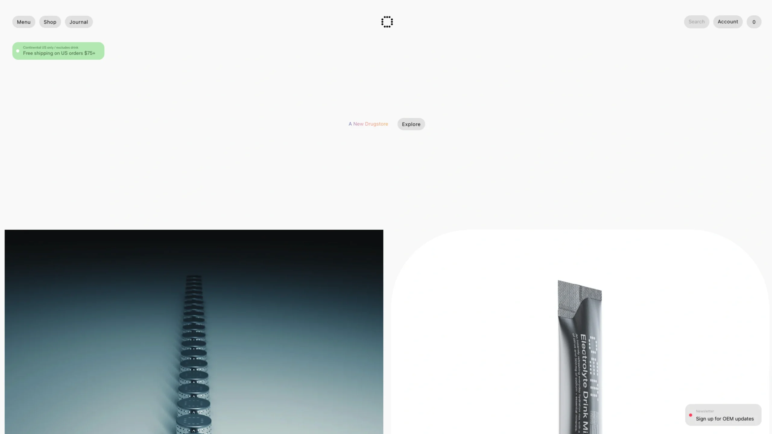
OEM is a New York-based skincare brand that focuses on Psychodermatology—the study of the relationship between the mind and the skin. The brand recognizes that stress, anxiety, and mental fatigue often manifest physically as inflammation or breakouts.
Rather than just treating the surface, OEM creates products designed to regulate the “Brain-Skin Axis,” using neuro-active ingredients that soothe both the nervous system and the skin barrier.
Design Highlights for UI/UX Enthusiasts
For designers, the OEM shopify-baed digital experience is an exercise in Editorial Minimalism:
- The “Floating” Product Layout: The website uses a generous amount of whitespace and high-quality “shadow photography,” making the product bottles appear to float on the page. This creates an ethereal, light feel that mirrors the brand’s goal of “lifting” mental weight.
- Typographic Restraint: The UI relies on a sophisticated, thin serif typeface for headers. This communicates luxury and precision, while the simple grid system ensures that the scientific data is easy to read.
- Interactive Educational UX: OEM excels at explaining complex biology. Their site features interactive sections that map out the “Stress-Skin Cycle,” using clean diagrams and icons to help users understand why their mental health matters for their complexion.
- The “Routine” Configurator: Their shop experience is designed around routines rather than individual items. The UX guides users through a simplified three-step process (Cleanse, Treat, Protect), reducing “choice paralysis”—a key UI strategy for a brand focused on reducing stress.
The “Of Earth and Mind” Philosophy
- Ingredient Transparency: OEM uses a “clean-plus” standard, combining botanical extracts with bio-identical actives. They are famous for their “Adaptogen Complex” which uses plants like Ashwagandha and Reishi to buffer the skin against environmental stressors.
- Neuro-Fragrance: The brand utilizes the science of olfaction (scent). The products are formulated with specific scent profiles designed to trigger a relaxation response in the brain during the application process.
- Eco-Luxe Packaging: The physical design uses heavy, frosted glass and minimalist labeling. It is designed to be “bedside table worthy,” treating skincare as a ritualistic object rather than a bathroom utility.
Why it belongs on uiuxshowcase.com
OEM is a perfect feature because it demonstrates Concept-Driven Design. The website isn’t just an e-commerce store; it’s a digital extension of a complex scientific philosophy. For your users, it serves as an example of how a brand can use Visual Silence (minimalism) to communicate a powerful message of Mental Wellness.