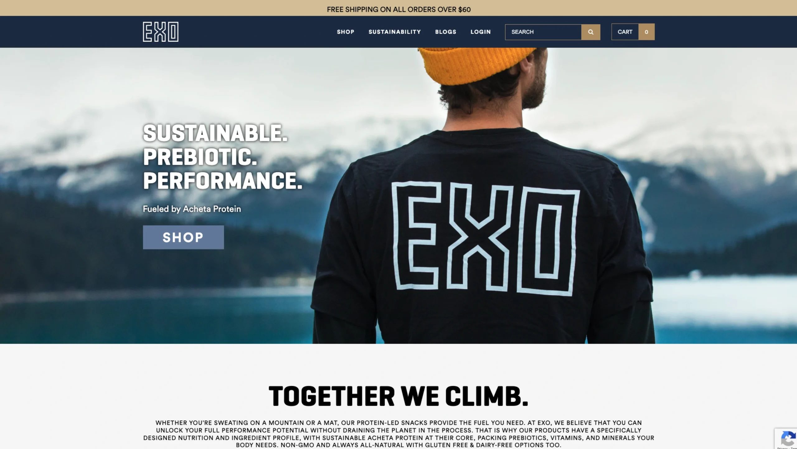
EXO was founded on a singular, visionary mission: to normalize the consumption of insects as a sustainable, resource-efficient protein source.
While 2 billion people globally already eat insects, the Western market has traditionally been hesitant. EXO overcomes this “ick factor” through a combination of culinary excellence (their recipes were co-developed by a Michelin-star chef) and cutting-edge digital branding.
Design Highlights for UI/UX Enthusiasts
For designers, the EXO digital experience is an essential study in Trust-Based Interface Design:
- Visual De-stigmatization: The UI avoids “shock factor” imagery. Instead, it uses clean, macro photography of real-food ingredients (blueberries, almonds, cocoa) alongside sleek, minimalist packaging. This shifts the focus from “eating bugs” to “eating high-performance fuel.”
- Mathematical & Scientific UI: The site utilizes a structured, grid-based layout that mirrors the scientific precision of their formulas. The use of clear infographics to compare cricket protein to beef (showing 20x more resource efficiency) is a great example of Data-Driven UX.
- Bold Typography: Relying on strong, geometric sans-serif fonts like Futura, the brand communicates a “Future-Forward” aesthetic. It feels less like a health food store and more like a high-tech performance lab.
- The “Together We Climb” Narrative: The UX is built around the persona of the “Extreme Athlete.” By using rock climbing and CrossFit imagery, the design positions the product as an elite tool for those who push boundaries, making the “unconventional” protein source feel like a competitive advantage.