


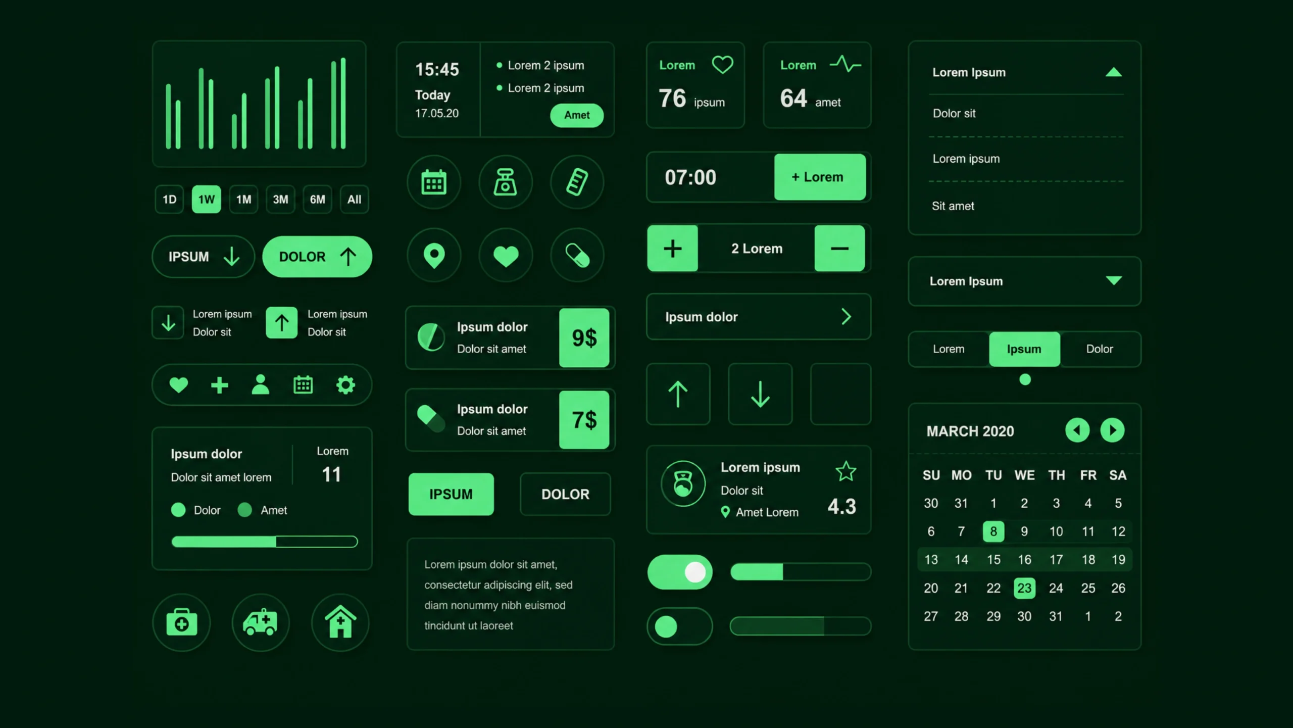
Component Library: The Building Blocks Behind Consistent Digital Products.
Imagine building a city where every construction crew creates its own version of a traffic light.
Some lights are tall.
Some are short.
Some place red on top.
Others place red at the bottom.
Technically, they’re all traffic lights, but the experience becomes confusing.
Digital products can run into the same problem.
One designer creates a button.
Another designer creates a slightly different button.
A third team creates yet another version.
Soon, the product contains dozens of similar components that all look and behave differently.
Things get messy.
This is where a component library becomes incredibly valuable.
It creates a shared collection of reusable interface elements that teams can use repeatedly across products and projects.
The result is consistency, speed, and a much smoother experience for users.
What Is a Component Library?
A component library is a centralized collection of reusable user interface elements that designers and developers use to build digital products.
These components can include:
- Buttons
- Input fields
- Cards
- Navigation menus
- Dropdowns
- Checkboxes
- Modals
- Tabs
- Alerts
- Tooltips
Instead of creating these elements from scratch every time, teams pull them from a shared library.
Think of it like a box of pre-made LEGO pieces.
You already know how each piece works.
You simply assemble them into larger experiences.
Why Component Libraries Matter
Modern products are rarely small.
Even a simple SaaS platform may contain:
- Hundreds of screens
- Thousands of interactions
- Multiple teams
- Frequent updates
Without reusable components, maintaining consistency becomes difficult.
A component library helps everyone work from the same playbook.
Designers know which button to use.
Developers know how it should function.
Product teams know what users can expect.
That consistency creates confidence.
And confidence creates better user experiences.
The Hidden Cost of Reinventing Components
At first glance, creating a new button seems harmless.
It only takes a few minutes.
The same goes for a form field or dropdown menu.
The problem appears later.
When dozens of teams create dozens of versions of the same element, maintenance becomes expensive.
A simple change may require updates across hundreds of screens.
That’s a lot of unnecessary work.
A component library reduces this repetition.
Teams build once and reuse many times.
Think of a Component Library as a Digital Toolbox
Here’s a simple analogy.
Imagine you’re a carpenter.
Every project requires:
- Hammers
- Screwdrivers
- Measuring tapes
- Saws
You wouldn’t build a new hammer every morning.
You’d use the tools you already trust.
A component library works the same way.
It provides proven interface elements that teams can use repeatedly without redesigning them.
Common Components Found in a Library
Most component libraries contain a collection of frequently used interface elements.
Let’s look at a few examples.
Buttons
Buttons are among the most commonly reused components.
Libraries often include:
- Primary buttons
- Secondary buttons
- Text buttons
- Icon buttons
- Disabled states
- Loading states
Every button follows the same styling and behavior rules.
Form Elements
Forms appear everywhere.
A library may contain:
- Text inputs
- Password fields
- Radio buttons
- Checkboxes
- Date pickers
- Text areas
Consistent forms improve usability and reduce confusion.
Navigation Components
Navigation helps users move through products.
Common examples include:
- Navigation bars
- Side menus
- Breadcrumbs
- Pagination controls
- Tabs
Reusable navigation patterns create familiarity.
Cards
Cards group information into manageable chunks.
You’ll find them in:
- Dashboards
- E-commerce websites
- Mobile applications
- Analytics platforms
Libraries often provide multiple card variations.
Feedback Components
Users need feedback after taking actions.
Examples include:
- Alerts
- Toast notifications
- Progress indicators
- Success messages
- Error messages
A component library keeps feedback patterns consistent.
Modals and Dialogs
These components appear when products need user attention.
Examples include:
- Confirmation dialogs
- Warning popups
- Login windows
- Information messages
Reusable versions save significant development time.
How Component Libraries Work
A component library typically exists in both design and development environments.
Designers may maintain components in tools like:
- Figma
- Sketch
- Adobe XD
Developers often maintain matching code components using frameworks such as:
- React
- Vue
- Angular
- Flutter
This creates a direct connection between design and implementation.
The component used in the design file often matches the component used in production.
That’s a huge advantage.
Component Library vs Design System
People frequently mix these terms together.
They’re closely related but not identical.
A component library contains reusable interface elements.
A design system includes:
- Components
- Design principles
- Typography guidelines
- Color standards
- Accessibility rules
- Documentation
- Interaction patterns
You can think of a component library as one major part of a design system.
The design system is the bigger picture.
Component Library vs UI Kit
Another common source of confusion.
A UI kit typically contains visual assets and design elements.
A component library goes further.
Components often include:
- Defined behaviors
- States
- Documentation
- Development implementations
A UI kit might show what a button looks like.
A component library explains how it behaves and provides reusable code.
Benefits of Using a Component Library
The advantages become clear very quickly.
Faster Design Work
Designers spend less time recreating common elements.
They can focus on solving user problems instead.
Faster Development
Developers reuse tested components rather than writing new code repeatedly.
This reduces duplication.
Improved Consistency
Users encounter familiar patterns throughout the product.
The experience feels cohesive.
Easier Maintenance
Updating a shared component can improve hundreds of screens simultaneously.
That’s a massive time saver.
Better Collaboration
Design and development teams work from the same foundation.
Communication becomes easier.
Misunderstandings become less common.
Higher Quality
Reusable components are often tested repeatedly.
Bugs get discovered and fixed faster.
Quality tends to improve over time.
Real-World Examples
Many large companies maintain extensive component libraries.
Popular examples include:
- Google’s Material Design Components
- Shopify Polaris Components
- IBM Carbon Components
- Microsoft’s Fluent UI
- Atlassian Components
- Salesforce Lightning Components
These organizations serve millions of users and rely heavily on reusable interface patterns.
Component Libraries and User Experience
You might wonder how a component library affects UX.
The connection is stronger than many people realize.
Users learn patterns quickly.
When buttons, forms, and navigation behave consistently, people become more confident.
They don’t need to relearn the interface every time they visit a new screen.
Consistency reduces cognitive effort.
Less effort often leads to better experiences.
Component Libraries and Accessibility
Accessibility becomes easier to manage when teams use shared components.
Imagine creating one accessible button component that includes:
- Keyboard navigation
- Focus states
- Proper labels
- Screen reader support
Every screen using that component benefits automatically.
This creates accessibility improvements at scale.
The Relationship Between Design Tokens and Components
Modern component libraries often rely on design tokens.
Design tokens store reusable values such as:
- Colors
- Typography settings
- Spacing values
- Border radius values
- Shadows
Components pull these values from a shared source.
If a brand color changes, teams can update a token rather than manually editing hundreds of components.
It’s a small detail with a big impact.
Common Challenges
Component libraries aren’t completely effortless.
Teams often encounter challenges.
Maintenance
Libraries require ongoing attention.
Products evolve.
Components evolve too.
Someone must manage updates.
Adoption
Some team members prefer creating custom solutions.
Encouraging consistent usage requires team commitment.
Overgrowth
Libraries can become cluttered.
Too many similar components create confusion.
Regular cleanup helps maintain clarity.
Documentation Gaps
A component without documentation can cause problems.
Teams need clear guidance about when and how to use components.
Component Libraries in the AI Era
AI-generated interfaces are becoming increasingly common.
Tools can now create layouts, screens, and wireframes within seconds.
Yet AI performs much better when it has structure.
Component libraries provide that structure.
Rather than generating random interface elements, AI can reference approved components.
This helps maintain consistency across human-created and AI-generated designs.
Many organizations are already integrating component libraries into AI-assisted workflows.
Do Small Teams Need Component Libraries?
Absolutely.
A common myth suggests component libraries are only useful for large enterprises.
That’s not true.
Even a startup with:
- One designer
- One developer
- One product
can benefit from reusable components.
A small collection of buttons, forms, cards, and navigation patterns can save countless hours over time.
The library doesn’t need hundreds of components.
It simply needs the right ones.
The Invisible Engine Behind Great Products
Users rarely think about component libraries.
They don’t notice the reusable button.
They don’t admire the shared dropdown menu.
What they notice is the result.
The product feels polished.
The interface feels predictable.
Interactions feel familiar.
Those qualities often come from a strong component library working quietly behind the scenes.
Final Thoughts
A component library is a collection of reusable user interface elements that help teams build digital products more consistently and efficiently.
It reduces repetitive work, improves collaboration, simplifies maintenance, and creates a more cohesive experience for users.
As products become larger and more complex, component libraries become increasingly valuable.
They give designers and developers a shared foundation.
They help organizations move faster without sacrificing quality.
Most importantly, they support the creation of digital experiences that feel familiar, polished, and easy to use.
That’s something every product team wants.
Frequently Asked Questions (FAQs)
What is a component library?
A component library is a centralized collection of reusable interface elements such as buttons, forms, navigation menus, and cards used across digital products.
Why is a component library important?
It improves consistency, reduces repetitive work, speeds up design and development, and helps teams maintain product quality.
What is the difference between a component library and a design system?
A component library focuses on reusable interface components, while a design system includes components along with design principles, guidelines, documentation, and standards.
What tools are used to create component libraries?
Designers often use Figma, Sketch, or Adobe XD, while developers commonly use React, Vue, Angular, Flutter, and similar frameworks.
Are component libraries only useful for large companies?
No. Small teams and startups can benefit significantly from reusable components and consistent interface patterns.
How do component libraries improve user experience?
They create consistency across products, making interfaces easier to learn, more predictable, and more comfortable for users to navigate.