


Responsive Design: Creating Digital Experiences That Adapt to Every Screen.
Think about how many different screens you interact with during a typical day.
You might check emails on your phone while having breakfast. Later, you browse a website on a laptop. In the evening, you stream content on a tablet or smart TV.
Now imagine if every website looked perfect on a desktop but completely fell apart on a phone.
Tiny text.
Buttons you can’t tap.
Images spilling off the screen.
Frustrating, right?
That’s exactly the problem responsive design was created to solve.
Responsive design helps websites and applications automatically adjust to different screen sizes, devices, and orientations. Instead of creating separate versions for every device, designers build one flexible experience that adapts naturally.
It sounds simple. In practice, it’s one of the most important concepts in modern digital design.
What Is Responsive Design?
Responsive design is a design and development approach that allows a website or application to adapt its layout, content, and functionality based on the size and capabilities of the user’s device.
The goal is straightforward.
Provide an enjoyable experience regardless of screen size.
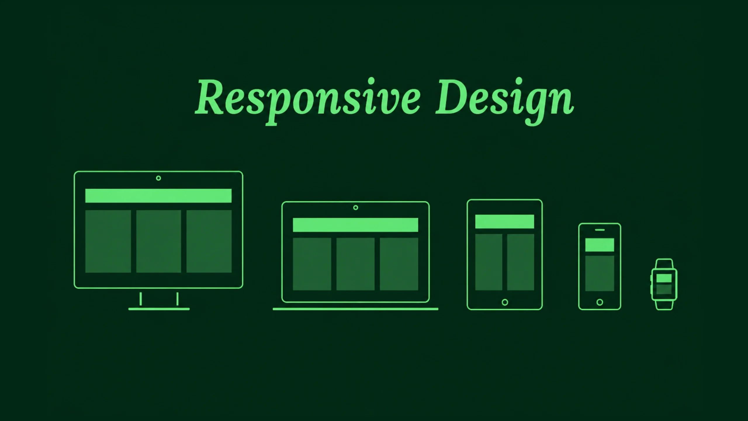
A responsive website might display three columns on a desktop monitor, two columns on a tablet, and a single-column layout on a smartphone.
The content remains the same.
The presentation changes.
Why Responsive Design Matters More Than Ever
Years ago, most people accessed websites using desktop computers.
Designers mainly worried about one screen size.
Those days are long gone.
Users now access products from:
- Smartphones
- Tablets
- Laptops
- Desktop monitors
- Foldable devices
- Smart TVs
- Wearable devices
Screen sizes continue to grow, shrink, and evolve.
Designers can’t predict every device someone might use.
Responsive design provides a practical solution by allowing layouts to adapt automatically.
A Quick Trip Back in Time
Before responsive design became popular, many companies maintained separate websites.
You may remember seeing URLs like:
m.website.com
The “m” stood for mobile.
Companies often created a desktop site and a completely separate mobile site.
This approach created many problems.
Teams had to maintain two versions.
Content became inconsistent.
Updates required extra work.
Responsive design changed that model by allowing one website to serve multiple devices effectively.
Think of Water Filling Different Containers
Here’s a simple analogy.
Imagine pouring water into different glasses.
The water doesn’t stay in one rigid shape.
It adapts to the container.
Responsive layouts behave similarly.
Content flows and adjusts based on available space.
The information remains intact, but the structure shifts to fit the screen.
That flexibility is the foundation of responsive design.
How Responsive Design Works
Responsive design relies on several technical and visual principles working together.
Let’s break them down.
Flexible Grids
Traditional layouts often used fixed widths.
Responsive layouts use flexible grids.
Instead of assigning exact pixel values everywhere, designers frequently work with percentages, relative units, and fluid containers.
This allows content to expand or shrink naturally.
A layout can grow on larger screens and contract on smaller devices without breaking.
Flexible Images
Images must adapt too.
An image that looks perfect on a desktop could overwhelm a mobile screen.
Responsive images automatically resize within their containers.
This keeps layouts balanced and prevents awkward scrolling.
Media Queries
Media queries are a key part of responsive web development.
They allow websites to apply different styles based on screen characteristics.
For example:
- Different layouts for phones
- Different spacing for tablets
- Different navigation systems for desktops
The content remains available, but presentation adjusts according to device conditions.
Breakpoints: The Decision Points
Breakpoints are screen widths where layout changes occur.
Think of them as checkpoints.
At certain widths, designers may decide to:
- Rearrange columns
- Resize text
- Change navigation
- Modify spacing
- Hide secondary elements
Common breakpoints often correspond to mobile, tablet, laptop, and desktop experiences.
The Core Principles of Responsive Design
Responsive design involves more than shrinking content.
Strong responsive experiences follow several important principles.
Content First
The content should remain accessible regardless of screen size.
Good responsive design focuses on information before decoration.
Users should always find what they need.
Flexibility
Layouts must adapt smoothly rather than snapping awkwardly between sizes.
Flexibility creates a more natural experience.
Readability
Text should remain comfortable to read on every device.
Tiny text creates frustration.
Overly large text can feel clumsy.
Finding balance matters.
Touch-Friendly Interactions
Mobile users rely on fingers rather than mouse pointers.
Buttons, links, and controls need sufficient spacing for comfortable interaction.
Performance Awareness
Mobile users may have slower network connections.
Responsive design often includes strategies that reduce unnecessary downloads and improve loading times.
Responsive Design vs Adaptive Design
People often confuse responsive and adaptive design.
They share similar goals but work differently.
Responsive design uses flexible layouts that continuously adjust.
Adaptive design relies on predefined layouts created for specific screen sizes.
Think of adaptive design as several prepared outfits.
Responsive design acts more like stretchy fabric that adjusts itself.
Both approaches can work well.
Responsive design has become the more common choice for modern websites.
Why Businesses Love Responsive Design
Responsive design benefits users, but it also creates business advantages.
Lower Maintenance Costs
Maintaining one responsive website is typically easier than managing separate versions for multiple devices.
Teams spend less time duplicating work.
Broader Reach
Users can access content from virtually any device.
This increases accessibility and audience reach.
Consistent Branding
Responsive layouts preserve visual consistency.
The experience feels familiar regardless of where users access the product.
Better Conversion Rates
When users can browse comfortably, they’re more likely to complete desired actions.
That may include:
- Making purchases
- Booking appointments
- Filling forms
- Subscribing to newsletters
Small usability improvements often create meaningful business results.
Responsive Design and User Experience
Responsive design and user experience are closely connected.
A beautiful desktop interface means little if mobile users struggle.
User experience depends on comfort, clarity, and efficiency.
Responsive design supports all three.
Imagine searching for a restaurant while walking through a busy city.
You pull out your phone and open a website.
If the menu is easy to access and the phone number is easy to tap, the experience feels smooth.
If you need to zoom repeatedly and hunt for information, frustration arrives quickly.
Good responsive design removes those obstacles.
Common Responsive Design Patterns
Over time, designers have developed patterns that work particularly well.
Stacked Layouts
Multiple desktop columns often become single-column layouts on mobile devices.
This keeps content readable.
Hamburger Navigation
Large navigation menus frequently collapse into a compact menu icon on smaller screens.
Responsive Cards
Card-based layouts adapt naturally across screen sizes.
This explains their popularity in modern interfaces.
Flexible Typography
Text scales based on screen dimensions.
Headings remain prominent without overwhelming smaller devices.
Responsive Design and Accessibility
Accessibility and responsiveness often support one another.
A responsive layout can help users by:
- Improving readability
- Supporting zoom functionality
- Reducing horizontal scrolling
- Creating clearer navigation paths
People interact with products in different ways.
Responsive design acknowledges those differences.
Responsive Design and SEO
Search engines care about user experience.
Responsive websites often perform better in search rankings because they provide a consistent experience across devices.
Search engines prefer websites that:
- Load efficiently
- Work on mobile devices
- Present content clearly
- Avoid duplicate versions
This connection between responsiveness and search visibility makes responsive design valuable from both design and marketing perspectives.
Modern Tools That Support Responsive Design
Today’s designers and developers have powerful tools available.
Popular options include:
- Figma
- Webflow
- Framer
- Adobe XD
- Sketch
- Bootstrap
- Tailwind CSS
Many of these tools include responsive features directly within their workflows.
Designers can preview layouts across multiple devices without leaving the design environment.
The Rise of Responsive Design in SaaS Products
Software platforms rely heavily on responsive design.
A project management dashboard might be used by:
- Executives on laptops
- Managers on tablets
- Team members on mobile devices
The same product must function effectively across every situation.
Responsive design helps create that continuity.
What About Foldable Devices?
Technology continues to evolve.
Foldable phones introduce new screen behaviors.
Large tablets blur the line between desktop and mobile experiences.
Smart displays continue appearing in homes and workplaces.
Responsive design remains relevant because flexibility remains relevant.
No one knows exactly what future screens will look like.
Responsive systems can adapt more easily than rigid layouts.
Common Responsive Design Mistakes
Even experienced teams make mistakes.
Some of the most common include:
- Designing only for desktop first and forgetting mobile users
- Using text that’s too small
- Creating touch targets that are difficult to tap
- Hiding important content on smaller screens
- Testing on only one device
Responsive design requires continuous testing and refinement.
Real users often reveal issues that mockups miss.
The Future of Responsive Design
Responsive design is evolving alongside technology.
Artificial intelligence, variable layouts, container queries, and adaptive interfaces are changing how products respond to user environments.
Yet the underlying goal remains unchanged.
People want experiences that feel natural regardless of device.
Responsive design continues to provide that flexibility.
It’s one of those concepts that quietly supports almost every successful digital product.
Final Thoughts
Responsive design is the practice of creating websites and applications that automatically adapt to different screen sizes and devices.
It helps users access content comfortably whether they’re using a smartphone, tablet, laptop, or desktop computer.
By combining flexible layouts, adaptable images, responsive typography, and thoughtful interactions, designers create experiences that feel consistent across platforms.
As devices continue to evolve, responsive design remains one of the most valuable skills in modern UX, UI, and web development. It helps products stay accessible, usable, and relevant—no matter where users choose to interact with them.
Frequently Asked Questions (FAQs)
What is responsive design?
Responsive design is a web and interface design approach that allows layouts and content to automatically adapt to different screen sizes and devices.
Why is responsive design important?
It improves usability, accessibility, and user satisfaction by providing a consistent experience across phones, tablets, laptops, and desktops.
What is the difference between responsive design and adaptive design?
Responsive design uses flexible layouts that adjust continuously, while adaptive design relies on predefined layouts created for specific screen sizes.
How do media queries support responsive design?
Media queries allow developers to apply different styles based on screen width, resolution, orientation, and other device characteristics.
Does responsive design improve SEO?
Yes. Responsive websites often perform better in search results because they provide a better mobile experience and avoid maintaining multiple versions of the same content.
Which tools are commonly used for responsive design?
Popular tools include Figma, Webflow, Framer, Adobe XD, Sketch, Bootstrap, Tailwind CSS, and modern front-end frameworks such as React and Vue.