Explore the product user experience (UX), from user research and problem definition to user flows, prototypes, testing, interaction design, visual hierarchy, and UX measurement for better UX design.
A product can have a clever idea, strong technology, and a beautiful interface.
Still, people can hate using it.
That sounds harsh, but it happens all the time.
A screen can look polished and still feel confusing. A workflow can contain all the right features and still take too much effort. A button can be perfectly visible and still appear at the wrong moment.
This is where User Experience (UX) becomes much bigger than visual design.
UX is the process of creating interactions between people and products. The decisions should come from research, data, and test results rather than personal taste. UX covers usability, usefulness, desirability, brand perception, and the overall experience people have with a product or website.
That last part matters.
People don’t experience your product as a collection of Figma frames.
They experience it as a sequence.
They arrive.
They look around.
They try something.
They get stuck.
They recover.
They succeed.
They return.
Or they leave.
The UX process gives designers a way to shape that sequence with intent.
And this is where the product UX/UI roadmap starts becoming practical.
Resources
- What is the design process? — and why every designer should know about it
- Universal Principles of Design
- The Design of Everyday Things
- The Best UX resources 2022
1.0 – UX Starts With a Story, Not a Screen
Before we talk about personas, user flows, wireframes, prototypes, or visual hierarchy, there’s a simple question:
What experience are we trying to create?
Every product tells a story.
Sometimes that story is obvious.
A food delivery app says:
“I’m hungry → I find something → I order → I wait → food arrives.”
A banking app might say:
“I need to know where my money is → I check my account → I understand what happened → I take action.”
A project management tool might say:
“I have work to do → I organise it → I collaborate → I track progress → I finish it.”
Good UX makes that story easier to follow.
This is where UX storytelling becomes useful. Storytelling can help teams communicate UX ideas and create a clearer narrative around how people experience a product.
A designer can show a user journey and say:
“Meet Maya. She runs a small online business. Every Friday, she spends two hours checking invoices, payments, and overdue accounts.”
Suddenly, a dry product problem has a human face.
You can see the frustration.
You can imagine the repetitive work.
You can understand why saving 90 minutes matters.
That story can become the bridge between research and design.
Resources
- How To Use Storytelling In UX
- Content Strategy & Storytelling
- Storytelling for User Experience
- 5 Ways to Become a Better Storyteller
2.0 – Content Is Part of the Interface
Here’s something designers sometimes discover late:
Words are UI.
A button saying “Submit” feels different from one saying “Create account.”
“Delete” feels different from “Remove from workspace.”
“Something went wrong” tells you very little.
“Your payment didn’t go through. Try another card or contact your bank.” gives the user somewhere to go next.
Content strategy covers the planning, creation, delivery, and management of content. The UX source stresses that content should be useful, usable, well structured, and easy to find.
That means UX designers need to think about:
- navigation labels
- button copy
- headings
- empty states
- error messages
- confirmation messages
- onboarding instructions
- help content
- tooltips
- notifications
- form labels
A gorgeous interface with poor copy can still feel broken.
Imagine walking into a beautifully designed restaurant where nobody can tell you what anything on the menu means.
The interior may look fantastic.
You still won’t know what to order.
Digital products work the same way.
Resources
- Why Content Is Such A Fundamental Part Of The Web Design Process
- Why We’re Moving From Content Strategy to Content Design
- Complete Beginner’s Guide to Content Strategy
- The top 50 UX writing resources of 2020
3.0 – Design Thinking Gives the Process a Shape
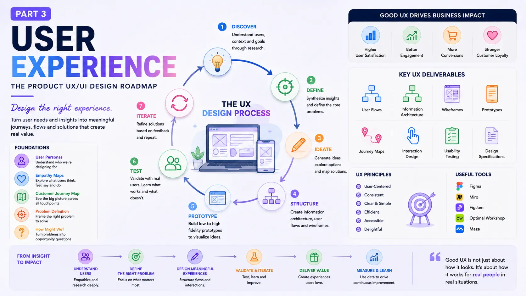
The UX roadmap in the source follows a familiar design-thinking structure:
Discover → Define → Ideate → Prototype → Test and Iterate
Design thinking is described as a human-centred approach that helps teams understand users, define problems, create ideas, prototype them, and test those ideas.
Think of this as a loop, not a conveyor belt.
You discover something.
You define the problem.
You create ideas.
You prototype one.
Testing reveals a problem.
You go back.
Maybe the problem statement needs changing.
Maybe the user flow is wrong.
Maybe the original assumption was wrong.
That’s fine.
A good UX process has room for being wrong.
In fact, finding out that you’re wrong early is one of the better things that can happen during design.
Resources
- What is Design Thinking?
- Design Thinking Defined
- What is Design Thinking and Why Is It So Popular?
- Design Thinking 101
- The Value of Design Thinking in Business
3.1 – Discover — Meet the People Behind the Data
Discovery starts with people.
Not demographics on a PowerPoint slide.
Real people with habits, frustrations, goals, shortcuts, expectations, and strange little workarounds.
The source places personas, empathy maps, and customer journey maps within the discovery stage.
Each tool looks at users from a different angle.
3.1.1 – Personas: Give the User a Face
A persona is a fictional representation of a user type.
It can describe:
- goals
- needs
- motivations
- behaviours
- frustrations
- context
- product expectations
Personas help teams keep specific user needs in mind during product and feature decisions.
A weak persona looks like this:
Rahul, 34, Marketing Manager
That’s a profile.
It’s not yet useful.
A stronger persona might say:
Rahul manages marketing for a five-person company. He uses several SaaS tools every day, has limited time for administration, and wants reporting that makes sense without building spreadsheets himself.
Now the design team has something to work with.
The persona becomes a lens.
When you’re designing a reporting screen, you can ask:
“Would Rahul understand this?”
“Does this help him finish the task faster?”
“Is this information useful at this point?”
The persona doesn’t replace research.
It helps the team keep research visible.
Resources
- Personas Make Users Memorable for Product Team Members
- A Closer Look At Personas: What They Are And How They Work
- A Guide To Personas
3.1.2 – Empathy Maps: What Is Going on in Their Head?
People don’t always say exactly what they think.
An empathy map gives teams a visual way to explore user behaviours, attitudes, and needs.
A common structure looks at things such as:
Says
What does the user say?
Thinks
What might they be thinking but not saying?
Does
What actions do they take?
Feels
What emotions appear during the experience?
This can uncover useful gaps.
A customer might say:
“I want more control.”
But their behaviour might show that they avoid advanced settings.
Why?
Maybe “control” actually means confidence.
That’s an important distinction.
UX isn’t about taking every sentence literally.
It’s about looking at what people say, do, and feel together.
Resources
- Empathy Mapping: The First Step in Design Thinking
- Empathy Mapping: A Guide to Getting Inside a User’s Head
- Empathy Map – Why and How to Use It
3.1.3 – Customer Journey Maps Show the Bigger Picture
A product rarely exists in isolation.
A customer might see an Instagram post, visit a website, read reviews, sign up, receive an email, talk to support, use the product, get a notification, and return several days later.
That’s a journey.
A customer journey map represents the relationship between a customer and an organisation over time and across channels. It helps teams see gaps between customer expectations and actual experiences.
For example:
Awareness → Research → Signup → Onboarding → First Use → Repeat Use → Support → Renewal
Now imagine the product is excellent from signup onward, but the marketing page promises something different.
There’s a gap.
Or perhaps onboarding is smooth, but the first-use experience is confusing.
Another gap.
Journey maps help reveal these gaps.
And they stop the UX team from staring at a single screen for too long.
Resources
- Customer Journey Maps
- How to Create a Customer Journey Map
- UX Mapping Methods Compared: A Cheat Sheet
3.2 – Define — Name the Real Problem
After discovery comes definition.
This is where teams turn research into a clear problem.
A problem statement is a concise description of the problem that needs solving. The source describes a strong problem statement as a guide for starting ideation in the right direction.
This sounds simple.
It isn’t.
Teams often jump from:
“Users are frustrated with reports.”
straight to:
“Let’s redesign the reports.”
That’s a solution pretending to be a problem.
A stronger definition might be:
“Small business owners struggle to understand which invoices need attention, so they spend extra time checking multiple screens and spreadsheets.”
Now the design team has room to explore different solutions.
Maybe the answer is a better dashboard.
Maybe it’s an alert.
Maybe it’s a weekly digest.
Maybe it’s a completely different workflow.
The problem statement keeps the door open.
Resources
- What are Problem Statements?
- Problem Statements in UX Discovery
- Design Problem Statements – What They Are and How to Frame Them
- User Need Statements: The ‘Define’ Stage in Design Thinking
- Using “How Might We” Questions to Ideate on the Right Problems
- What are 5 Whys?
3.2.1 – Ask “How Might We?”
One useful technique at this stage is the How Might We question.
Instead of:
“How do we redesign the invoice dashboard?”
Try:
“How might we help business owners identify overdue invoices quickly?”
That’s much broader.
Now the team can generate different ideas.
Maybe:
- a priority list
- smart filters
- a weekly summary
- automated reminders
- payment-risk indicators
- a simplified accounts view
One question can create a much wider design space.
The source includes How Might We questions and the Five Whys among its problem-definition resources.
And the Five Whys technique can be particularly useful when a problem looks obvious on the surface.
“Users don’t complete onboarding.”
Why?
“It’s too long.”
Why?
“Because we ask for too much information.”
Why?
“Because the product needs information before showing the dashboard.”
Why?
“Because the dashboard cannot work without it.”
Now you’ve reached something deeper.
Maybe the real design opportunity is not shortening the form.
Maybe the product needs to change what information it asks for, and when.
That’s a much more interesting problem.
3.3 Ideate — Now We Can Start Making Things
Once the problem is clear enough, ideas can start flowing.
This is where many people think UX design begins.
It doesn’t.
But now we’re finally ready to create.
The source places brainstorming, information architecture, user flows, and mind maps within the ideation stage.
Each technique helps the team think about the problem from another angle.
3.3.1 – Brainstorming: Get the Ideas Out
Brainstorming brings people together to generate possible solutions to a defined problem. It can involve people from different backgrounds and disciplines.
A product design workshop might include:
- product managers
- designers
- engineers
- researchers
- marketers
- customer support
- sales
- subject-matter experts
That mix can be surprisingly useful.
A support person may know a problem designers haven’t seen.
An engineer may spot a technical constraint early.
A salesperson may know what customers repeatedly ask for.
A researcher may challenge an assumption everyone else accepted.
Good brainstorming isn’t a competition to see who can produce the fanciest feature.
The goal is to generate possible answers before deciding which ones deserve attention.
Resources
- What is Brainstorming?
- 14 tips to help you run a successful product design workshop
- IDEO: Brainstorming Resources
- Affinity Diagrams: How to Cluster Your Ideas and Reveal Insights
3.3.2 – Information Architecture: Put Things Where People Expect Them
Information architecture sounds academic.
The problem it solves is very everyday:
Where should this thing go?
Information architecture focuses on organising, structuring, and labelling content so people can find information and complete tasks.
Think about a banking app.
Where should “Statements” live?
Under:
Accounts?
Documents?
Payments?
Profile?
There isn’t always one obvious answer.
The designer needs to think about the user’s mental model.
People don’t care how the company’s database is structured.
They care about finding what they need.
That’s a recurring theme in UX:
The organisation’s structure and the user’s mental model aren’t always the same thing.
Good information architecture bridges the gap.
Resources
- Information Architecture: Study Guide
- The Beginner’s Guide to Information Architecture in UX
- Information Architecture: For the Web and Beyond
3.3.3 – User Flows: Follow the User, Not the Screen
A user flow shows the path someone takes through a product to complete a goal.
For example:
Open app → Search product → View product → Add to cart → Checkout → Pay → Confirmation
Simple.
But real flows can branch:
Payment fails
→ Retry
→ Change payment method
→ Contact bank
→ Save cart
The happy path is only one part of the experience.
Good UX considers the awkward moments too.
What happens if the user enters the wrong password?
What if the network disappears?
What if a payment succeeds but the confirmation page fails?
What if the user changes their mind?
What if they leave halfway through?
User flows help teams explore these scenarios before polished UI work begins. The source describes them as useful for information architecture, individual screen design, and evaluating existing flows.
Resources
- What are User Flows?
- Wireflows: A UX Deliverable for Workflows and Apps
- UX Glossary: Task Flows, User Flows, Flowcharts and some new-ish stuff
- User flow is the new wireframe
3.3.4 – Mind Maps: Let Your Brain Spread Out a Little
A mind map is a visual thinking tool for organising ideas around a central topic.
Suppose the central topic is:
Improve SaaS onboarding
Branches might include:
User goals
Business goals
First-use experience
Permissions
Data import
Education
Activation
Support
Errors
Notifications
Now each branch can grow.
Mind maps are useful during early ideation since they allow teams to see connections between ideas rather than forcing everything into a linear list.
Sometimes a messy page of connected ideas is exactly what you need before turning them into neat product requirements.
Resources
- Everything you need to know about mind mapping creation
- Cognitive Maps, Mind Maps, and Concept Maps: Definitions
- Gray Matter: What Is a Mind Map in the Design Process?
3.4 – Prototype — Make the Idea Visible
Ideas are cheap.
Seeing an idea in action is different.
This is where prototyping enters the UX roadmap.
The source groups sketching, wireframing, and prototyping under the prototype stage.
And there’s a good reason for the order.
Start rough.
Then add detail.
Then test.
3.4.1 – Sketching: Think With Your Hands
A sketch can take 30 seconds.
That’s part of its charm.
You don’t need perfect spacing. You don’t need a design system. You don’t need a carefully chosen font.
You need an idea.
Sketching allows designers to explore different concepts quickly before committing to a more developed direction.
Draw three versions.
Cross them out.
Draw another.
Turn the page.
Try something weird.
That freedom matters.
A high-fidelity screen can create attachment.
A rough sketch feels disposable.
And disposable ideas are easier to challenge.
Resources
- Everything You Need to Know About UX Sketching
- 7 reasons for sketching in UX design
- Learn How to Use Sketching as an Ideation Method
3.4.2 – Wireframes: Structure Before Decoration
Wireframes sit between rough ideas and polished UI.
A wireframe shows the basic structure of a screen: pages, components, content areas, controls, and relationships.
The source describes wireframing as a low-fidelity way to communicate the structure of an application and how its elements interact before moving into UI work.
A wireframe might show:
Header
Search
Filters
Results
Details panel
Primary action
Secondary action
That’s enough to discuss the layout.
Now stakeholders can ask:
“Why is this here?”
“Do we need this section?”
“Should the user see this information first?”
Those questions are easier to answer before visual polish enters the room.
Resources
- Sketch, Wireframe, Mockup, and Prototype: Why, When and How
- Form and Function – A Guide to the Top Wireframe Tools
- How To Succeed In Wireframe Design
3.4.3 – Prototypes: Turn the Flow Into Something People Can Try
A prototype is an early version of a product experience that people can interact with before the final product exists.
It can help teams explore ideas, find usability problems, and test concepts.
Tools such as Figma make this much easier.
You can connect screens.
Add interactions.
Create overlays.
Simulate transitions.
Test a form.
Show a modal.
Build enough of the experience that someone can click through it.
And that’s the important part.
A prototype doesn’t need to behave like production software.
It needs to answer a question.
Can the user understand this?
Does the flow make sense?
Is the information in the right place?
Can they complete the task?
The prototype is a question made visible.
Resources
- What Is Prototyping?
- Design Thinking: Get Started with Prototyping
- UX Prototypes: Low Fidelity vs. High Fidelity
3.5 – Test and Iterate — Let Users Break Your Design
This is where humility enters the process.
You show someone your beautiful prototype.
They click the wrong thing.
They miss the button.
They don’t understand the label.
They ask:
“What’s this?”
And you realise the thing that seemed obvious to you isn’t obvious to them.
Good.
That’s useful.
Usability testing evaluates how usable, intuitive, and satisfying a product is for its users. The source recommends iterative testing during design so teams can collect user insight and reduce interface problems.
Testing can reveal:
- confusing navigation
- unclear labels
- hidden actions
- poor feedback
- unnecessary steps
- form problems
- accessibility issues
- weak information hierarchy
- unexpected user behaviour
The keyword is iterative.
Test.
Learn.
Change.
Test again.
You don’t need to wait until the product is finished.
In fact, waiting that long can make problems expensive to fix.
Resources
- Checklist for Planning Usability Studies
- A Comprehensive Guide To User Testing
- How to Conduct Usability Testing in Six Steps
- A Guide to the Art of Guerrilla UX Testing
- All You Need to Know About Iterative Usability Testing
- Turning Usability Testing Data into Action without Going Insane
Don’t Defend the Design
This is one of the harder habits for designers to build.
When someone struggles with your design, your instinct may be to explain it.
“No, you need to click here.”
“The icon means settings.”
“The button is actually quite visible.”
Stop.
If you need to explain the interface during a usability test, that’s useful evidence.
The user won’t have you standing beside them after launch.
A better question is:
“What made you expect something else?”
That answer can reveal the problem.
UX research isn’t a courtroom.
The goal isn’t to prove the designer right.
The goal is to find friction.
4.0 – Interaction Design: What Happens Between Clicks?
A product isn’t made from static screens.
It’s made from interactions.
Tap.
Swipe.
Drag.
Type.
Select.
Confirm.
Cancel.
Wait.
Recover.
That is interaction design.
The source connects interaction design with Human-Computer Interaction and cognitive psychology.
This is where a designer asks:
What happens after the user clicks?
What feedback do they receive?
What changes on screen?
What can they undo?
What happens during loading?
What happens when something fails?
A button that changes state after being clicked gives feedback.
A form that highlights the wrong field gives feedback.
A file upload that shows progress gives feedback.
These moments may seem small.
They shape trust.
4.1 – HCI: Design for Humans Using Technology
Human-Computer Interaction (HCI) is a multidisciplinary field focused on how humans interact with computer technology.
That sounds formal.
The practical question is simpler:
How does a human behave when using this system?
People have limited attention.
They make mistakes.
They forget things.
They multitask.
They get interrupted.
They skim.
They get tired.
They rush.
They misunderstand.
Good UX accounts for these realities.
A form should not assume perfect concentration.
A destructive action should not be one careless click away.
A critical status should not rely on colour alone.
A system should provide useful feedback after important actions.
The computer is predictable.
People aren’t.
Design needs to account for that difference.
Resources
- Human-Computer Interaction (HCI)
- Complete Beginner’s Guide to Interaction Design
- The Encyclopedia of Human-Computer Interaction, 2nd Ed.
- What is Interaction Design & How Does it Compare to UX?
- Interaction design is more than just user flows and clicks
4.2 – Cognitive Psychology: Your Brain Is Part of the Interface
UX designers work with human attention, memory, perception, language, reasoning, and problem-solving whether they realise it or not.
The source describes cognitive psychology as the study of mental processes such as attention, memory, perception, language, creativity, reasoning, and problem-solving.
Consider a dashboard with 30 numbers.
Every number may be correct.
The interface can still fail.
Why?
The user’s attention is being pulled in too many directions.
Or consider a menu with fifteen top-level items.
Nothing is technically broken.
But remembering where things live becomes difficult.
UX principles help designers work with human cognitive limits rather than pretending those limits don’t exist.
This is why concepts such as Miller’s Law and other UX psychology principles appear so often in product design discussions.
The point isn’t to memorise a list of psychology rules.
The point is to ask:
What mental effort am I asking the user to spend?
Resources
- What is Cognitive Psychology?
- Miller’s Law — Is there a magical number in UX design?
- Laws of UX
- 5 Cognitive Psychology Theories that Contribute to the Quality of UX Design
5.0 – Visual Design Comes After the Structure Has a Reason
Now we reach the part many people associate with UX/UI design:
Colour.
Typography.
Spacing.
Images.
Icons.
Composition.
These matter.
A lot.
But visual design works best when it supports the experience rather than trying to rescue a weak one.
The source identifies scale, visual hierarchy, balance, contrast, and Gestalt principles among the core visual design principles.
A visual designer can guide attention.
Make an important action obvious.
Separate related information.
Create rhythm.
Reduce noise.
Build a sense of hierarchy.
Think about a newspaper.
The headline is large.
The supporting information is smaller.
Images create another focal point.
Whitespace separates stories.
You understand what deserves attention before reading every word.
Digital interfaces need the same kind of visual conversation.
Resources
- Universal Principles of Design
- 5 Principles of Visual Design in UX
- The Role of Visual Design In User Experience
- 7 Practical Tips for Cheating at Design
5.1 – Gestalt: Your Brain Groups Things Automatically
Gestalt principles describe how people perceive relationships between visual elements and how they group similar objects, recognise patterns, and simplify what they see.
This matters in interface design.
Suppose you have:
Name
Phone
Then a large gap.
Then:
Billing Address
City
Postal Code
Even without a border around each group, spacing can communicate that these fields belong to different sections.
That’s visual grouping.
The same idea appears in cards, navigation, tables, dashboards, settings pages, and forms.
Design isn’t simply decoration.
It’s communication through perception.
Resources
- What are Gestalt Principles?
- Improve Your Designs With The Principles Of Closure And Figure-Ground (Part 2)
- Exploring the Gestalt Principles of Design
- Design Principles: Visual Perception And The Principles Of Gestalt
5.2 – Visual Hierarchy: Tell People Where to Look
Every screen has a visual order.
Something gets noticed first.
Something gets noticed second.
Something becomes background information.
Hierarchy can come from:
- size
- contrast
- spacing
- position
- typography
- colour
- density
- repetition
Imagine a checkout page.
The final price should be easy to find.
The primary payment action should stand out.
Secondary actions shouldn’t compete with it.
Terms and supporting information can remain available without dominating the page.
Good hierarchy quietly tells the user:
Look here first.
This matters next.
This is supporting information.
That’s visual design doing a job.
Resources
- What is Visual Hierarchy?
- Visual Hierarchy in UX: Definition
- 5 ways to establish visual hierarchy
- Key Principles of Visual Hierarchy in UX Design
6.0 – Jobs-to-be-Done: What Is the User Hiring the Product to Do?
Now let’s step away from screens again.
The Jobs-to-be-Done framework looks at the customer’s goal and the thought process that leads them to “hire” a product to accomplish that goal.
This idea can completely change how you frame a product.
People don’t buy a drill because they desperately want a drill.
They want a hole.
And perhaps they want that hole so they can hang a shelf.
And perhaps they want the shelf so the room feels organised.
The product is part of a bigger goal.
The same thing happens with digital products.
People don’t necessarily want project-management software.
They want their work under control.
They don’t necessarily want an analytics dashboard.
They want to know what is happening in their business.
They don’t necessarily want an AI assistant.
They want less repetitive work, faster answers, or better decisions.
This way of thinking can help UX teams focus on the outcome rather than the feature.
Resources
- Jobs to be Done: Theory to Practice
- 8 things to use in “Jobs-To-Be-Done” framework for product development
7.0 – User Stories Bring the User Into Agile Product Work
Once ideas become product requirements, teams need a clear way to describe what should be built.
A user story captures functionality from the user’s perspective.
A common structure is:
As a [type of user], I want [something], so that [value].
For example:
As a finance manager, I want to filter unpaid invoices by age, so that I can focus on accounts that need attention.
That sentence gives product, design, and engineering a shared starting point.
The source describes user stories as an Agile tool for describing the user, the feature they need, and the value that feature provides.
The value part matters.
Without it, user stories can become feature requests wearing a user-shaped costume.
“I want a filter.”
Why?
“To find overdue accounts faster.”
Now the design team understands the intended outcome.
Resources
- What are User Stories?
- User stories with examples and a template
- A Guide To Writing Effective User Stories
8.0 – Measure the Experience, Not Just the Interface
After launch, UX work doesn’t stop.
A product needs evidence.
The source includes UX benchmarking as a way to evaluate experience through metrics and make quantitative comparisons, such as measuring task completion time before and after a major interface change.
Since “benchmarking” can sound more technical than it needs to be, think of it as establishing a useful baseline.
For example:
Before redesign:
Task completion time: 3 minutes
Error rate: 18%
Task success: 72%
After redesign:
Task completion time: 1 minute 45 seconds
Error rate: 8%
Task success: 89%
Now the team has evidence.
The redesigned experience may be performing better.
That doesn’t mean every number must improve.
Maybe completion time fell, but satisfaction dropped.
Maybe users completed tasks faster but made more mistakes.
UX measurement works best when several signals are viewed together.
Resources
- Benchmarking UX: Tracking Metrics
- 7 Steps to Benchmark Your Product’s UX
- The Top 5 UX Benchmarking Tips for Designers
- Usability benchmarking | GitLab
The Product UX/UI Roadmap Is a Loop
Now put the pieces together.
The UX process from the source can be viewed as a connected system:
Discover
Understand people, needs, behaviours, and context.
↓
Define
Frame the problem clearly.
↓
Ideate
Generate possible solutions.
↓
Prototype
Make ideas visible and testable.
↓
Test
Watch users interact with them.
↓
Iterate
Change what isn’t working.
↓
Interaction Design
Shape how the product behaves.
↓
Visual Design
Create hierarchy, clarity, and visual structure.
↓
Measure
Check what happened after the work reached users.
Then the cycle begins again.
And that’s the important bit.
There is no magical moment where a designer says:
“Great, UX is finished.”
A product changes.
Users change.
Business priorities change.
Technology changes.
New evidence appears.
The interface has to respond.
UX Is Bigger Than UI
This distinction is worth making very clear.
UI is what people see and interact with.
UX is the broader experience created by those interactions.
A beautiful login screen doesn’t fix a confusing signup process.
A clever animation doesn’t fix poor information architecture.
A sophisticated design system doesn’t fix a product nobody understands.
A colourful dashboard doesn’t fix bad data.
A perfect button doesn’t fix the wrong workflow.
UI matters.
UX gives it context.
That’s why product designers need to think across the entire experience rather than treating each screen as a separate artwork.
A Practical UX Process for Product Designers
If you had to turn everything in this roadmap into a working product-design process, it could look like this:
1. Start with research
Talk to users.
Review existing research.
Look at analytics.
Study competitors.
Watch real workflows.
2. Build a clear picture of the user
Create personas when useful.
Map behaviours.
Capture needs and frustrations.
Create empathy maps.
3. Map the experience
Create customer journey maps.
Identify major touchpoints.
Find moments of confusion, friction, and opportunity.
4. Define the problem
Write a clear problem statement.
Ask “How Might We?”
Use Five Whys when the problem needs deeper examination.
5. Explore ideas
Run brainstorming sessions.
Create mind maps.
Think about multiple solutions.
Don’t settle on the first idea that sounds reasonable.
6. Structure the product
Define information architecture.
Create navigation models.
Map user flows.
Think through edge cases.
7. Sketch
Get ideas out quickly.
Try several approaches.
Keep them rough.
8. Wireframe
Work through layout and structure.
Review the flow.
Remove unnecessary screens and steps.
9. Prototype
Create enough interaction to test the experience.
Don’t polish what hasn’t been validated.
10. Test
Give users realistic tasks.
Watch what they do.
Listen.
Don’t rescue them too quickly.
11. Iterate
Fix the issues that matter.
Test again.
12. Apply visual design
Use typography, spacing, colour, imagery, hierarchy, contrast, and Gestalt principles to support the experience.
13. Measure
Track meaningful UX and product metrics.
Compare results with your baseline.
Keep learning after launch.
This process isn’t rigid.
A real project may move back and forth between stages.
That’s normal.
The Designer’s Most Valuable Skill May Be Knowing What to Question
There’s a subtle shift that happens as designers become more experienced.
Early on, you learn how to make screens.
Then you learn how to make flows.
Then you learn systems.
Then you start questioning the requirement itself.
“Why does this feature exist?”
“Who needs it?”
“What problem does it solve?”
“Are we solving the right problem?”
“Why do users behave this way?”
“Could the workflow be simpler?”
“Do we need this screen at all?”
Those questions can feel uncomfortable in a meeting.
They can save a product.
UX isn’t about making every requested feature look good.
Sometimes the strongest UX decision is:
Don’t build this yet.
Sometimes it’s:
Let’s test this first.
Sometimes it’s:
The problem is different from what we thought.
And sometimes it’s:
The interface isn’t the problem. The product model is.
That’s product UX thinking.
From Research to Experience
The first two parts of this roadmap focused on product thinking and design research.
Now the connection becomes clearer.
Product thinking asks:
What should we build, and why?
Design research asks:
What do we know about the people and problem?
UX design asks:
How should the product work for those people?
These aren’t three isolated activities.
They feed each other.
Research can change product strategy.
Product strategy can change the UX roadmap.
UX testing can expose a weak product assumption.
Analytics can trigger new research.
A user story can reveal a missing workflow.
A customer journey map can expose a gap outside the product itself.
That’s why a strong product designer moves between strategy, research, UX, interaction design, visual design, and measurement.
The job isn’t simply to make screens.
It’s to help turn uncertain product ideas into experiences that people can understand, use, and value.
And the work doesn’t stop when the Figma file is handed over.
The real test begins when someone who has never seen your design opens the product and tries to figure it out.
If they can move through it with confidence, complete their task, recover from mistakes, understand what happened, and come back when they need it again — that’s when the design starts doing its job.
The pixels matter.
The flow matters more.
And the thinking behind both matters most.
FAQs About Product UX/UI Design
1. What is the difference between UX and UI design?
UX focuses on how a product works and how users experience it, including research, user flows, usability, and interaction. UI focuses on the visual and interactive layer, such as typography, colour, spacing, components, and visual hierarchy.
2. What are the main stages of the UX design process?
A typical UX process includes Discover, Define, Ideate, Prototype, Test, and Iterate. The process can move back and forth between stages as new research or testing reveals better ways to solve the problem.
3. Why is UX research important before designing a product?
UX research helps teams understand users, their needs, behaviours, frustrations, and goals. It gives designers evidence for product decisions instead of relying mainly on assumptions or personal preferences.
4. What is a user flow in UX design?
A user flow shows the steps a person takes through a product to complete a specific goal. It helps designers identify unnecessary steps, confusing paths, missing states, and potential usability problems before building the final interface.
5. Why are wireframes and prototypes used in UX design?
Wireframes help teams work through the structure and layout of a product before spending time on visual polish. Prototypes make those ideas interactive, allowing designers to test workflows and discover usability issues before development.
6. How do you measure whether a UX design is successful?
UX success can be measured through factors such as task success, completion time, error rates, satisfaction, feature adoption, and other product metrics. UX benchmarking can compare these measures before and after a design change.
Part 1
Part 1: Product Thinking ─ Product Design Roadmap
Part 2
Part 2: Design Research — Product UX/UI Design Roadmap
Part 4
Part 4: User Interface — The Product UX/UI Design Roadmap
Part 5
Part 5: Communication — The Product UX/UI Design Roadmap