A UX flow can be perfect on paper.
The user knows what they want. The task is clear. The information architecture makes sense. The prototype tests well.
Then you put the experience into a real interface.
Suddenly, things change.
The typography feels cramped.
The primary button doesn’t stand out.
The dashboard looks like a spreadsheet from 2007.
Two screens use slightly different versions of the same component.
The mobile layout feels like someone squeezed a desktop website into a phone.
And somehow the designer has 47 shades of grey.
Welcome to UI design.
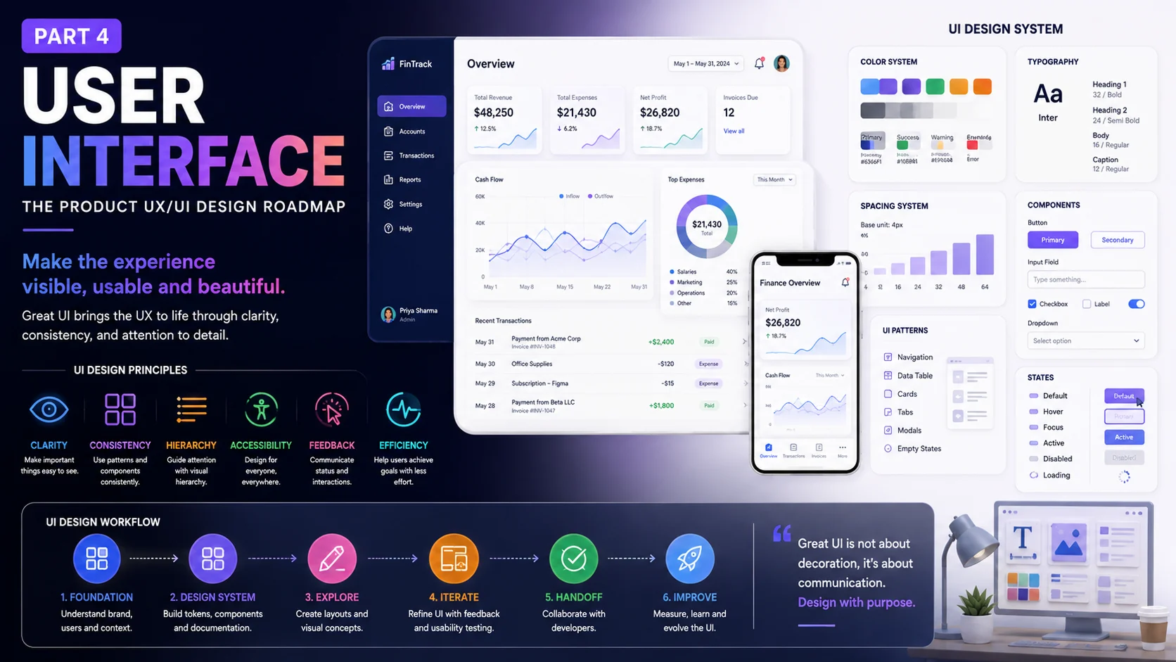
User interface design is the process of building interfaces for software and digital devices. It focuses on the look and feel of a product while supporting the broader user experience.
UI is visual, but it isn’t decoration.
Colour communicates.
Spacing creates relationships.
Components create consistency.
Motion communicates change.
Accessibility affects who can use the interface.
Responsive design determines how the experience behaves across screens.
And a design system helps all of these pieces work together.
So, once the UX structure is ready, how do we turn it into a coherent product UI?
Let’s work through the roadmap.
Resources
- What is User Interface Design?
- A Comprehensive Guide To UI Design
- 8 Best Practices For UI Card Design
- Learn UI Design Blog
- Universal Principles of Design
1.0 – UI Starts With a System, Not a Collection of Screens
Imagine opening a product and seeing this:
One blue button on the dashboard.
A slightly different blue button on the settings page.
A third shade of blue in the billing flow.
The border radius changes from 6px to 8px to 12px.
One heading uses Inter.
Another uses Roboto.
A third uses something nobody remembers adding.
Nothing is catastrophically broken.
But the product feels inconsistent.
Users may not consciously say, “The component architecture is inconsistent.”
They simply feel that something is off.
This is one reason design systems matter.
A design system is a collection of guidelines and reusable components that helps establish consistency across a product experience. The source describes it as a maintainable single source of truth that teams can use when designing and building the product.
A design system can contain:
- colour tokens
- typography
- spacing rules
- grids
- icons
- components
- patterns
- interaction rules
- accessibility guidance
- documentation
- design principles
Think of it as the product’s visual and interaction vocabulary.
Without a shared vocabulary, every screen starts speaking a slightly different language.
Resources
- What is a Design System? A simple guide to get started
- Creating a design system in Figma: a practical guide
- The Benefits of a Design System: Making Better Products, Faster
- A collection of Design Systems for Figma
- Design Systems by Alla Kholmatova (Hardcover Print + eBook)
Start With the Fundamentals
Before creating hundreds of components, establish the basic visual ingredients.
The source places colour palette, typography, grids and spacing, and iconography within UI fundamentals.
These foundations may seem simple.
They aren’t.
Small decisions here affect almost every screen that follows.
1.1 – Colour: More Than Picking a Nice Blue
Colour is one of the first things people notice.
It can create hierarchy, communicate status, support branding, separate sections, and draw attention to actions.
A colour palette is a set of colours that work together to create visual harmony and consistency within a product.
But colour systems need more thought than:
“Here are five colours I like.”
A product might need:
Brand colours
Primary and secondary brand tones.
Semantic colours
Success, warning, error, information.
Neutral colours
Backgrounds, borders, text, surfaces.
Interactive colours
Default, hover, focus, pressed, disabled.
Now consider accessibility.
If red means an error and green means success, can someone who has difficulty distinguishing those colours still understand what happened?
They should.
Use labels, icons, text, patterns, or other cues alongside colour where needed.
Colour should support meaning.
It shouldn’t carry the entire message alone.
Resources
- 48+ Best Color Tools for Designers to Improve Your Workflow
- Creating A Design System: Building a Color Palette
- Color theory for designers — a crash course (with infographic)
- Capture Attention Through Color Psychology
- A quick guide to choosing a color palette
1.2 – Typography Gives the Interface a Voice
It also determines whether people can actually read the content comfortably.
The source describes typography as a foundation for visual hierarchy and brand expression, with fonts, type scales, and weights forming part of a design system.
A typography system might define:
- font family
- heading sizes
- body sizes
- labels
- captions
- font weights
- line heights
- letter spacing
- text colours
The goal isn’t to use ten fonts.
Usually, fewer choices create more consistency.
You might have:
Display
For major page headings.
Heading
For sections.
Body
For normal reading.
Label
For controls and metadata.
Caption
For supporting information.
That hierarchy helps users scan the interface.
And scanning matters.
Most people don’t read a dashboard like a novel.
They look.
They jump.
They search.
Typography needs to support that behaviour.
Resources
- Typography in UI Design
- The typographic scale
- 10 Principles for Typography in UI Design
- Typography in Design Systems
- 12 Helpful Typography Tools
- Mastering Typography in SaaS UI Design With AI Tools
1.3 – Grids and Spacing: Give Things Room to Breathe
A screen can contain all the right information and still feel uncomfortable.
Why?
Spacing.
Grids help arrange content into a structured layout, while spatial systems define rules for sizing and spacing.
Think of spacing as invisible punctuation.
A small gap says:
“These things belong together.”
A larger gap says:
“This is a new section.”
Consistent spacing makes interfaces easier to scan.
A product might use a spacing scale such as:
4 → 8 → 12 → 16 → 24 → 32 → 48 → 64
The exact values aren’t the point.
Consistency is.
A design system should make spacing predictable enough that designers and developers aren’t inventing random values for every screen.
Resources
- Space, Grids, and Layouts
- Intro to The 8-Point Grid System
- Responsive grids and how to actually use them
- Grid Systems in Graphic Design
1.4 – Icons: Tiny Pictures With Big Responsibilities
Icons are small.
Their job isn’t.
An icon can represent an object, action, status, or idea. Used correctly, icons communicate the purpose of an interface element quickly.
But icons can be misunderstood.
A floppy disk means “save” to many designers.
Ask a teenager what it represents.
You might get a blank stare.
That’s a useful reminder: symbols aren’t universal.
Use familiar icons where possible.
Pair unclear icons with labels.
Keep stroke weight and visual style consistent.
And don’t use an icon simply because a space looks lonely.
Every visual element should have a reason.
Resources
- Icons As Part Of A Great User Experience
- A complete guide to iconography
- Design System: Icons
- Iconography by Atlassian
1.5 – Components Turn UI Into Building Blocks
Now we can move from fundamentals into reusable pieces.
A component is a reusable UI building block created to solve a particular interface need and work with other components to form patterns, templates, and pages.
Think about a button.
You probably don’t want 42 independently designed buttons across your product.
You want a button component.
It may have:
Primary
Secondary
Tertiary
Destructive
Disabled
Loading
And each state should behave predictably.
The same applies to:
- inputs
- dropdowns
- checkboxes
- radio buttons
- tabs
- cards
- modals
- alerts
- tooltips
- navigation
- tables
Once these components are reusable, the product becomes easier to maintain.
Change the component.
The change can flow through the product.
That’s far better than hunting through 80 screens looking for every copy of a button.
Resources
1.6 – UI Patterns: Don’t Reinvent Familiar Interactions
Some interface problems appear again and again.
Login.
Search.
Checkout.
Filtering.
Pagination.
Onboarding.
Navigation.
Notifications.
Account settings.
Teams have solved these problems many times.
UI patterns are established solutions for common interface problems.
This doesn’t mean copying another product blindly.
It means recognising familiar interaction models.
If people already understand how a date picker works, there’s probably a good reason to use a familiar structure.
If you create something radically different, the new pattern needs to earn that learning cost.
Familiarity can be a feature.
Resources
- User Interface Design Patterns
- UI design inspirations
- Mobbin: Collection of mobile apps for UI & UX research
1.7 – Design Principles Keep Decisions Consistent
A design system needs more than components.
It needs principles.
Design principles provide guidelines that support consistent decision-making across teams working on the same product or service.
For example:
Clarity over decoration
Feedback after meaningful actions
Progressive disclosure
Accessible by default
Content before chrome
These principles help when the design system doesn’t have an exact answer.
Suppose a designer asks:
“Should this screen have another button?”
The component library can’t answer.
A principle can.
If the product values simplicity, the team might ask whether that extra action is really needed.
Principles guide the decisions between the components.
Resources
- An open source collection of Design Principles and methods.
- Crafting Product-Specific Design Principles to Support Better Decision Making.
- Universal Principles of Design
1.8 – Documentation: The Part Nobody Wants to Write
Let’s be honest.
Documentation isn’t glamorous.
Nobody opens a design-system documentation page and thinks:
“This is going to be a thrilling afternoon.”
Yet documentation is what makes a design system usable by a team.
The source describes documentation as guidelines that help designers, developers, project managers, and other stakeholders ship consistent interfaces.
Good documentation should explain things like:
- when to use a component
- when not to use it
- available variants
- states
- spacing
- content rules
- accessibility considerations
- responsive behaviour
- implementation notes
Tools such as Storybook can help development teams document and inspect components.
A design system that only exists inside one designer’s head isn’t really a team system.
It’s tribal knowledge.
And tribal knowledge disappears when that person changes teams.
Resources
2.0 – Atomic Design: A Useful Way to Think About UI
The source includes Atomic Design, a methodology created by Brad Frost for building interface systems with a deliberate order and hierarchy.
The model commonly moves from smaller building blocks toward larger compositions.
You can think of it like this:
Atoms
Basic elements such as buttons, labels, inputs, icons.
Molecules
Small combinations of elements.
Organisms
Larger interface sections.
Templates
Page-level structures.
Pages
Real content inside those structures.
The value isn’t in obsessing over the terminology.
The useful idea is composition.
A product isn’t really a collection of unrelated screens.
It’s a system made from reusable pieces.
Once you see it that way, maintaining consistency becomes much easier.
Resources
3.0 – Now Let’s Make the Interface Move
Static UI is only part of a modern digital experience.
Things appear.
Disappear.
Expand.
Collapse.
Load.
Change state.
Confirm.
Fail.
Recover.
This is where UI animation enters the roadmap.
The source describes animation as a way to communicate state changes, reinforce hierarchy, guide attention, and enrich the user experience.
Good animation answers questions.
“What just happened?”
“Where did that object go?”
“What changed?”
“Did my action work?”
Imagine clicking “Save.”
A small state change tells you the action succeeded.
Without feedback, you may click again.
Then again.
Now you have three copies of the same action.
Motion can prevent that confusion.
Animation should support the interface.
It shouldn’t turn every button into a miniature fireworks show.
Resources
- Animation principles in UI
- Animation Principles for UX Designers
- Collection of Animation Articles & Tools
- Animation Handbook by Ryan McLeod
- Aninix · UI animation in Figma
3.1 – Micro-Interactions: Small Details, Real Feedback
A micro-interaction is a small functional animation or visual response that helps communicate a change or action.
Examples include:
- a toggle changing state
- a button showing loading
- a heart icon responding to a tap
- a password field revealing validation
- a progress indicator moving
- a notification appearing
- a copy button changing to “Copied”
These moments are tiny.
But users experience hundreds of them.
A well-designed micro-interaction can make software feel responsive.
A badly designed one can make software feel slow, noisy, or childish.
Again, restraint matters.
Resources
- Micro-interactions: why, when and how to use them to improve the user experience
- Microinteractions in User Experience
- Motion Design with Figma: Animations, Motion Graphics, UX/UI (Udemy)
- Figma: 5 ways to add animation to your designs
- 10 microinteractions that will inspire your next project
4.0 – Choose Tools That Match the Work
The design tool section of the source highlights the role of reliable tools in creating digital interfaces and managing the overall UI workflow.
For many product teams, Figma has become a central workspace for UI design, prototyping, libraries, and collaboration.
But tools aren’t the design process.
Figma won’t tell you:
“Users can’t understand this checkout flow.”
A plugin won’t tell you:
“This feature shouldn’t exist.”
AI can generate interface concepts in seconds.
That doesn’t mean those concepts are good.
The designer still needs judgment.
Tools increase speed.
They don’t replace thinking.
This distinction has become even more important as AI-assisted design and code generation become common across product teams.
Fast output is easy now.
Good decisions remain harder.
Resources
- 10 Figma Best Practices to 10X Your Workflow
- Must-Have Figma Plugins to Boost Your Design Workflow
- The 9 best prototyping tools for UI/UX designers in 2022
- 20 Design Tools Survey
5.0 Usability — What Is It and How Do You Perform It?
Usability is about how easily people can use a product to complete their tasks. A usable interface should feel clear, predictable, and easy to learn, with helpful feedback when users take an action.
To evaluate usability, start by defining the key tasks you want users to complete, then observe real users as they work through those tasks.
Watch where they hesitate, make mistakes, miss an action, or need help. You can run moderated usability tests with a small group of users, use prototypes or working products, and record task success, completion time, errors, and user feedback.
After the sessions, group the findings by severity and frequency, fix the issues that affect important tasks first, and test the revised experience again. Usability testing works best as a repeated process rather than a one-time review.
5.1 – Usability: Make the Interface Easy to Use
A beautiful interface can still fail a basic test:
Can people use it?
The source defines usability principles as guidelines or heuristics for creating interfaces that are easy to use.
Usability covers things such as:
- clarity
- consistency
- feedback
- error prevention
- recognition
- recovery
- efficiency
- learnability
The familiar Nielsen Norman Group usability heuristics are often used as a practical review framework.
You can look at a screen and ask:
Does the interface clearly show what is happening?
Does it use familiar language?
Can users undo mistakes?
Are important actions visible?
Are related things consistent?
Does the interface prevent common errors?
These questions can uncover problems before users do.
Resources
- What is Usability
- 10 Usability Heuristics for User Interface Design
- Dieter Rams: 10 Timeless Commandments for Good Design
- Bad Design vs. Good Design: 5 Examples We can Learn From
5.2 – Usability Issues Often Hide in Plain Sight
Some UI problems are obvious.
Others are annoyingly subtle.
A button looks clickable but isn’t.
A form asks for information it doesn’t really need.
A destructive action sits beside a harmless one.
A table has no clear sorting behaviour.
A mobile menu hides critical navigation.
A loading state gives no feedback.
An error message appears at the top while the problematic field is halfway down the page.
None of these problems requires fancy technology to fix.
They require attention.
The source highlights usability issues as common mistakes that can negatively affect the overall user experience.
A usability review can catch many of these before they become expensive development fixes.
Resources
- 10 Common Mistakes UI Designers Make
- The Impact of Usability on the Cost of Quality
- 10 Key Mobile Usability Issues
- 7 Usability Mistakes That Are Hurting Your Brand
6.0 – Accessibility
It includes considerations such as readable text, sufficient colour contrast, clear focus states, keyboard access, meaningful labels, and support for assistive technologies.
Good accessibility is built into the interface from the start rather than treated as a final check.
6.1 – Accessibility Isn’t a Checkbox at the End
Here’s a point worth taking seriously.
Accessibility isn’t a special version of UI.
It’s part of UI.
Accessible design means creating products, services, and facilities that can be independently used by people with different disabilities.
That can include people with:
- visual disabilities
- hearing disabilities
- motor disabilities
- cognitive disabilities
- temporary impairments
- age-related limitations
Think about a person using a screen reader.
A beautifully designed visual hierarchy means little if the semantic structure is poor.
Think about someone using only a keyboard.
A perfect hover interaction means little if there is no usable focus state.
Think about colour contrast.
A light grey text on a white background might look elegant on a designer’s monitor.
For many people, it can be difficult to read.
Accessibility asks designers to look beyond the ideal user.
And that’s good design.
Resources
- What is Accessibility?
- A guide to color accessibility in product design
- Color Contrast for Better Readability
- How to Design an Accessible Color Scheme
6.2 – Inclusive Design Goes Wider
Inclusive design looks at creating products that can be understood and used by people with different backgrounds and abilities. The source notes areas such as accessibility, age, economic situation, geography, language, race, and more.
Consider a product used globally.
A layout that works beautifully for a desktop user with fast internet may not work well for someone on an older phone and limited data.
A colour scheme that makes sense in one cultural context may carry another meaning elsewhere.
A form that asks for a surname can create problems in regions where naming conventions differ.
Inclusive design asks:
Who might struggle with this experience, and why?
That question is useful even if you’re designing for a small audience.
Resources
- Inclusive Design
- Accessible Design vs. Inclusive Design (with Infographic)
- 6 Principles for Inclusive Design
- Inclusive Design: An Overview of Current Thinking
- Inclusive Design by Microsoft
6.3 – Accessibility Tools Help, But Human Review Still Matters
Accessibility tools can scan interfaces and websites for potential issues.
The source points to accessibility evaluation tools and checklists as useful resources for designers and developers.
Tools can help detect:
- contrast problems
- missing labels
- heading issues
- keyboard problems
- missing alternative text
- structural issues
But automated testing has limits.
A tool can tell you that an image has alt text.
It may not tell you that the alt text is useless.
“Image123.jpg” technically describes nothing useful.
Accessibility needs tools plus human judgment.
And, where possible, feedback from people who actually use assistive technologies.
Resources
- Accessibility tools for designers and developers
- WCAG Compliance Checklist by A11Y
- 8 tools that make accessible design easier
7.0 – Mobile Design Is Its Own Design Problem
Desktop UI gives you space.
Mobile takes it away.
Fast.
A desktop dashboard might comfortably display a sidebar, filters, table, charts, actions, and secondary information.
On a phone?
Good luck.
The source defines mobile app design as creating interfaces for mobile devices while considering user needs, constraints, and platform guidelines.
Mobile introduces constraints such as:
- smaller screens
- touch input
- one-handed use
- variable connectivity
- device orientation
- interruptions
- system gestures
- battery constraints
- platform conventions
This means mobile design isn’t simply “desktop but narrower.”
The interaction model changes.
Resources
- A Comprehensive Guide To Mobile App Design
- Mobile UX Design Constraints, Best Practices, and Working With Developers
- Principles of Mobile App Design: Engage Users and Drive Conversions
- Mobile app design – Invision
7.1 – iOS and Android Aren’t the Same Thing
Apple and Google have their own platform conventions.
The source specifically points to Apple’s Human Interface Guidelines and Google’s Material Design among the resources for iOS and Android UI design.
That doesn’t mean every product must look identical to Apple’s apps or Google’s apps.
It means users bring expectations with them.
Navigation behaviour.
System controls.
Gestures.
Typography.
Permissions.
Dialogs.
Accessibility.
Platform patterns.
Ignoring these conventions can create unnecessary learning for users.
A good cross-platform product can maintain its brand identity while respecting the platform it lives on.
Resources
- iOS vs. Android App UI Design: The Complete Guide
- Human Interface Guidelines – Design – Apple Developer
- 2022 winners and finalists – Apple Design Awards
- Material Design
- UX best practices for apps on Google Play Instant
- Accessibility in iOS design
- SwiftUI Accessibility: Semantic Views
- Checklist: How to make your iOS app more accessible
7.2 – Mobile UI Patterns Save Time — If Used With Judgment
Mobile products have recurring patterns:
Bottom navigation.
Tab bars.
Search.
Filters.
Sheets.
Dialogs.
Swipe actions.
Pull-to-refresh.
Lists.
Cards.
The source points to resources such as Mobbin and UXArchive for studying mobile UI patterns and flows.
Studying existing patterns can be useful during design.
You can see how other products solve similar problems.
But inspiration isn’t a substitute for user research.
Copying another app because it looks nice is easy.
Knowing why that pattern works is harder.
Learn the pattern.
Understand the reason.
Then decide if it belongs in your product.
Resources
- Mobbin: Collection of mobile apps for UI & UX research
- UXArchive: Library of mobile user flows
- 13 basic mobile UI patterns to know about
8.0 – Web Design: Know What the Browser Is Actually Doing
Product designers don’t need to become full-time frontend developers.
But knowing how the web works can make design and engineering collaboration much better.
The source highlights HTML and CSS as foundations of web pages: HTML defines structure, while CSS controls presentation. It also notes that this knowledge helps designers communicate with developers around terminology, layer naming, responsiveness, and frontend implementation.
A designer who understands:
<button>
is different from a clickable <div>.
A designer who understands CSS knows why some layouts behave differently at different widths.
A designer who understands responsive behaviour won’t hand developers a desktop screen and say:
“Make this work on mobile.”
They’ll think about the layout rules.
That’s a big difference.
Resources
Build Responsive Real-World Websites with HTML and CSS (Udemy)
8.1 – Responsive Layouts: Design Rules, Not Just Screenshots
Responsive design means creating interfaces that adjust across different screen sizes. The source places responsibility on designers to consider usability and accessibility across devices.
A common mistake is designing:
Desktop 1440px.
Tablet 768px.
Mobile 375px.
Then assuming everything between those widths will magically work.
Real devices don’t care about your three Figma frames.
A responsive layout needs rules.
What happens when the screen becomes narrower?
Does the sidebar collapse?
Do cards stack?
Does the table become horizontally scrollable?
Do buttons become full width?
Does the navigation change?
Does typography scale?
Does content disappear?
And, perhaps most importantly:
What should never disappear?
Responsive design is about behaviour across a range of conditions.
Resources
9.0 – Design Handoff Isn’t “Here You Go, Good Luck”
Eventually, the UI has to become working software.
That’s where design handoff comes in.
The source defines design handoff as the process of passing designs to developers when the UI reaches the development stage, with close designer-developer collaboration helping create a smoother implementation workflow.
A good handoff isn’t a Figma link thrown over a Slack message.
It should communicate:
- component behaviour
- responsive rules
- interaction states
- spacing
- typography
- assets
- accessibility requirements
- edge cases
- animation
- error states
- loading states
And then designers should stay available.
Because developers will ask questions.
“What happens if this field is empty?”
“What happens at 320px?”
“Does this modal scroll?”
“What should the disabled state look like?”
“Is this animation required?”
These aren’t interruptions.
They’re part of product design.
Resources
- How to Ensure a Smooth Design Handoff
- Design Handoff Guide: What Makes Good Designer-Developer Collaboration?
- Design & Engineering Collaboration with Uber Engineer Faraz Ahmad
Designers and Developers Should Build Together
The best handoffs feel less like handoffs.
They feel like collaboration.
A developer might say:
“This interaction will be expensive to implement.”
The designer might say:
“Okay. What simpler interaction gives us the same user outcome?”
Or engineering might point out:
“This data isn’t available at that stage.”
Now design can adjust the experience before implementation gets stuck.
This is why design systems, documentation, component libraries, and shared terminology matter.
They reduce unnecessary translation between design and engineering.
The goal isn’t for designers and developers to do the same job.
It’s for both teams to understand enough of the product that they can make good decisions together.
The Modern UI Designer Has More Tools Than Ever
The UI toolkit has changed dramatically.
Figma.
Design systems.
Component libraries.
Prototyping tools.
AI-assisted design.
Code generation.
Accessibility scanners.
Analytics.
Session recording.
Design tokens.
Storybook.
Browser developer tools.
There is no shortage of technology.
The risk is confusing tool fluency with design skill.
A designer can know every Figma shortcut and still create a confusing interface.
A designer can generate ten UI concepts with AI and still not know which one solves the user’s problem.
A designer can build a beautiful component library and still miss a basic accessibility issue.
Tools are useful.
Judgment is the multiplier.
A Practical Product UI Roadmap
So, how does all of this fit into a real product UX/UI design roadmap?
Think of it like this.
1. Establish the UI foundations
Define:
- colour
- typography
- spacing
- grids
- iconography
2. Build reusable components
Create:
- buttons
- inputs
- cards
- tables
- navigation
- dialogs
- alerts
- form elements
3. Define UI patterns
Document common solutions for recurring product problems.
4. Set design principles
Create a small set of rules that help designers make consistent decisions.
5. Document the system
Give designers and developers enough information to use components correctly.
6. Structure the system
Use a methodology such as Atomic Design when it makes sense for the product and team.
7. Design interactions
Define:
- hover
- focus
- active
- loading
- success
- error
- disabled
- empty
- transition states
8. Add motion with purpose
Use animation and micro-interactions to communicate change and feedback.
9. Review usability
Run heuristic reviews and usability tests.
10. Check accessibility
Review contrast, keyboard access, focus, semantics, labels, text, touch targets, and assistive technology support.
11. Design mobile experiences
Account for touch, small screens, platform conventions, and mobile-specific workflows.
12. Design responsive web layouts
Create rules for different viewport sizes rather than relying on isolated screenshots.
13. Prepare implementation
Document behaviour, states, assets, responsive rules, and component usage.
14. Collaborate during development
Stay involved during implementation.
Compare the built product with the intended design.
Fix the gaps.
A UI Is a Living System
Here’s the part that’s easy to forget.
A UI isn’t finished when the designer marks the Figma page “Ready for development.”
Real products keep changing.
New features arrive.
Old features disappear.
New devices appear.
Browsers change.
Accessibility standards develop.
Design systems grow.
Brand identities evolve.
User expectations shift.
AI is changing interaction models too.
We’re seeing interfaces move beyond traditional pages and forms into conversational experiences, generative interfaces, adaptive workflows, and agent-style interactions.
That creates a new question for UI designers:
What does an interface look like when the system itself can take action?
A traditional interface waits for a user to click.
An AI system might suggest.
It might ask for clarification.
It might perform several actions.
It might show uncertainty.
It might need approval.
The UI now has to communicate system state and human control clearly.
That makes the fundamentals even more relevant.
Hierarchy.
Feedback.
Accessibility.
Consistency.
Clarity.
Good UI principles don’t become obsolete just because the technology changes.
The Best UI Doesn’t Beg for Attention
There’s a strange contradiction in UI design.
Designers often want their work to be noticed.
Users usually want to finish their task.
Those aren’t always the same thing.
A beautiful interface can be visually impressive.
A good interface can feel almost invisible.
The user knows where to look.
They understand what to do.
They know what happened.
They can recover from mistakes.
They don’t have to think about the interface itself.
That’s a high bar.
And it requires much more than colour palettes and rounded cards.
UI Is Where Product Thinking Becomes Visible
Think back to the earlier parts of this roadmap.
Product thinking asks what should be built and why.
Design research helps the team learn about users and their problems.
UX design shapes the structure, flows, interactions, and experience.
UI design turns that structure into a visual and interactive product.
The four areas are connected.
A product decision affects the UX.
UX affects the UI.
UI affects how easily users understand the product.
User behaviour then creates new evidence.
That evidence goes back into product thinking.
And the loop starts again.
This is why UI shouldn’t be treated as the final coat of paint.
It’s where many product decisions become visible.
A priority becomes visual hierarchy.
A brand becomes typography and colour.
A workflow becomes components and states.
A usability decision becomes spacing and interaction.
An accessibility requirement becomes focus states, contrast, semantics, and keyboard behaviour.
A product principle becomes a pattern repeated across hundreds of screens.
That’s the real power of a UI system.
The Goal Isn’t More UI. It’s Better UI.
More components don’t automatically create a better product.
More animation doesn’t create a better experience.
More colour doesn’t create clarity.
More screens don’t create more value.
The strongest product UI is usually selective.
It gives important things attention.
It hides complexity when the user doesn’t need it.
It provides feedback.
It respects platform conventions.
It works across screen sizes.
It considers accessibility.
It stays consistent.
And it gives designers and developers a shared language for building the product.
That’s why the UI stage of the product UX/UI design roadmap is much bigger than making high-fidelity screens.
It’s about creating a coherent visual and interactive system that can survive contact with real users, real devices, real content, real data, and real development constraints.
And yes, the interface should look good.
Of course it should.
But the real question is simpler:
Does the UI help the user understand what to do, why to do it, and what happened after they did it?
If the answer is yes, you’re getting somewhere.
The colours can come next.
FAQs About User Interface Design
1. What is User Interface (UI) design?
UI design is the process of creating the visual and interactive interface of a digital product. It covers elements such as colour, typography, spacing, icons, components, layouts, interactions, and visual hierarchy while supporting the overall UX.
2. What is a design system, and why is it important?
A design system is a collection of reusable components, visual rules, and guidelines that helps teams create a consistent product experience. It can include colours, typography, spacing, icons, components, patterns, principles, and documentation.
3. What are the most important UI design fundamentals?
The main UI foundations include colour, typography, grids and spacing, and iconography. These elements create visual hierarchy, structure, consistency, and clearer communication throughout a product.
4. How do you improve the usability of a UI?
Start by identifying the important tasks users need to complete, then observe users performing those tasks. Look for confusion, errors, unnecessary steps, and unclear feedback. Fix the most significant problems and test the revised interface again. Usability principles and heuristic reviews can support this process.
5. How does accessibility affect UI design?
Accessibility helps people with different disabilities use a product independently. UI designers should consider colour contrast, readable content, keyboard access, focus states, meaningful labels, and compatibility with assistive technologies. Accessibility should be considered throughout the design process.
6. What is responsive UI design?
Responsive UI design creates layouts that adapt to different screen sizes and devices. Designers need to define how content, navigation, components, typography, and interactions behave across desktop, tablet, and mobile rather than designing isolated screen sizes.
7. What is the difference between UI patterns and UI components?
A UI component is a reusable interface building block, such as a button, input, card, or modal. A UI pattern is a reusable solution for a common design problem, such as search, checkout, filtering, or navigation.
8. Why are micro-interactions important in UI design?
Micro-interactions provide small visual responses to user actions, such as showing a loading state, confirming a successful action, or changing a toggle. They help users understand what happened and make interfaces feel more responsive.
Part 1
Part 1: Product Thinking ─ Product Design Roadmap

Part 2
Part 2: Design Research — Product UX/UI Design Roadmap

Part 3
Part 3: User Experience — The Product UX/UI Design Roadmap

Part 5
Part 5: Communication — The Product UX/UI Design Roadmap