Product thinking starts before UI design. Learn how vision, strategy, user needs, market fit, launch, analytics, retention, and metrics help teams create products people value.
Open Figma. Create a frame. Pick a grid. Start moving rectangles around.
It feels productive.
Sometimes it’s exactly the wrong place to start.
A good digital product begins much earlier than wireframes, components, typography, or polished UI. Before deciding where a button belongs, a product team needs to understand why that button needs to exist in the first place.
That’s where product thinking enters the UI/UX design process.
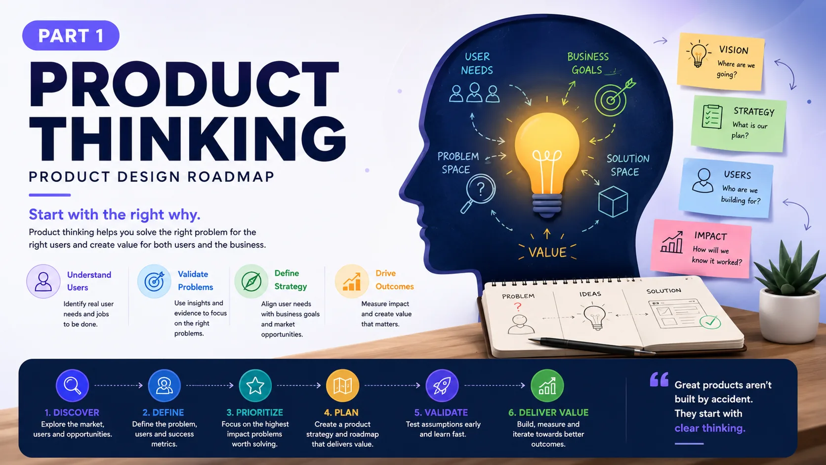
Product thinking means looking beyond individual screens and asking broader questions about users, business goals, market demand, behaviour, technology, and value.
Who has this problem?
How painful is it?
What are people doing today instead?
Why would they switch?
What should the product help them accomplish?
And, perhaps the uncomfortable question: should we build this at all?
These questions can save weeks of design and development work.
A beautifully designed product that solves a weak problem is still weak.
Product Thinking Changes the Designer’s Job
UI/UX designers were once commonly brought into projects after many product decisions had already been made.
“Here are the requirements. Can you design the screens?”
That model still exists, but strong product teams increasingly involve designers much earlier.
The designer may participate in customer interviews, competitor research, feature discussions, product strategy sessions, analytics reviews, prioritisation meetings, experiments, and launch planning.
That changes the nature of design.
You’re no longer asking:
“How should this screen work?”
You’re asking:
“What should we build, who needs it, and what evidence tells us this is worth building?”
The second question tends to produce better answers to the first.
Product thinking looks at functional needs, but it also considers human behaviour and emotional response. A finance dashboard, for instance, isn’t valuable simply because it displays numbers correctly.
A business owner opening that dashboard might be anxious.
“Can I make payroll?”
“Why did revenue drop?”
“Which invoices are overdue?”
Good product design recognises that context. Information hierarchy, language, alerts, charts, actions, and navigation should help the person make sense of the situation.
That’s product thinking expressed through UX.
Resources
- Product Thinking 101
- The Power of Product Thinking
- Business Thinking for Designers Handbook, by Ryan Rumsey
- 7 Things Every Designer Should Know About Business
1: Pre-launch 🎢
Before the Product Exists, Give It a Direction
Early product conversations can become messy surprisingly fast.
One person imagines a simple tool.
Another imagines an enterprise platform.
Someone wants AI everywhere.
Sales wants twelve features for one potential customer.
Engineering sees six months of infrastructure work.
The founder wants everything shipped next Tuesday.
A product vision gives these conversations a reference point.
A product vision describes the long-term outcome the team wants the product to create. It gives people something more useful than a growing backlog of features.
Think about Google Maps.
Its value isn’t the collection of buttons for directions, saved places, traffic, transit, restaurants, or street imagery. The broader idea is helping people understand places and get where they need to go.
Features can change.
The direction remains clearer.
For UI/UX designers, product vision matters since design decisions constantly involve trade-offs. There’s rarely enough time, budget, engineering capacity, or screen space for everything.
A clear vision helps answer a simple question:
Does this decision move the product closer to what it wants to become?
If the answer is no, perhaps that feature can wait.
Resources
Then Comes Product Strategy — Where Ideas Meet Reality
Vision gives the destination.
Strategy deals with the awkward middle.
Who are we building for? What market are we entering? Which problem should we tackle first? What can we offer that existing products don’t? How will people discover the product? What might they pay for?
This is where product thinking becomes more grounded.
Imagine a team creating an AI meeting assistant.
The broad idea sounds promising:
“AI that makes meetings more productive.”
Nice sentence. Still too broad.
Is it for remote software teams?
Sales calls?
Doctors documenting patient conversations?
Recruiters conducting interviews?
Students recording lectures?
Each group has different needs, risks, workflows, language, privacy expectations, and buying behaviour.
The interface changes when the strategy changes.
A sales team might care about CRM sync, follow-up actions, objections, deal signals, and coaching.
A student might care about summaries, revision notes, searchable transcripts, and quizzes.
Same underlying technology. Very different product.
That’s why product strategy belongs inside the UI/UX conversation rather than sitting somewhere in a forgotten slide deck.
Resources
Your Value Proposition Should Survive the “So What?” Test
Products often describe themselves through features.
“AI-powered analytics.”
“Automated workflows.”
“Real-time collaboration.”
“Advanced reporting.”
Fine.
But users are silently asking something else.
So what?
A value proposition answers that question.
It explains the useful change a person gets from using the product.
Dropbox didn’t become interesting simply because cloud storage technology existed. The everyday value was easier to understand: your files could follow you across devices without the usual headache of emailing files to yourself or carrying USB drives around.
For a UX designer, the value proposition influences much more than marketing copy.
It affects:
- onboarding
- information hierarchy
- feature priority
- empty states
- dashboard structure
- calls to action
- upgrade moments
- product messaging
If a product promises to help freelancers get paid faster, the dashboard probably shouldn’t make invoice collection feel like a side feature hidden three levels deep.
The interface should reflect the promise.
That sounds obvious. Oddly enough, plenty of products miss it.
Resources
- How to Write a Great Value Proposition [5 Top Examples + Template]
- What Is a Value Proposition? (+ 8 Winning Examples)
Product-Market Fit: Does Anyone Care Enough?
Here’s where things get less comfortable.
You can have strong branding, polished UI, clever interactions, a technically impressive backend — and still struggle.
People may simply not need the product enough.
Product-market fit describes how well a product satisfies real demand within its target market.
For designers, this idea is valuable because we can easily mistake usability problems for product problems.
Suppose users abandon an onboarding flow.
The immediate reaction might be:
“Let’s shorten onboarding.”
Maybe.
But what if the real issue is that users don’t see enough value to finish?
A cleaner onboarding experience can reduce friction. It cannot manufacture demand.
This distinction matters.
UX research needs to look beyond questions such as:
“Could you complete this task?”
We need questions closer to:
“Why would you use this?”
“What are you using now?”
“How often does this problem happen?”
“What happens if you don’t solve it?”
“Would you be disappointed if this product disappeared?”
Those conversations reveal motivation, not merely usability.
And motivation is where product thinking gets interesting.
Resources
A Product Roadmap Isn’t a Shopping List
Roadmaps often start sensibly and slowly become enormous wish lists.
Dashboard redesign.
Mobile app.
Integrations.
New onboarding.
Custom reports.
Somebody mentions gamification. Now that’s on there too.
A useful product roadmap communicates direction and priority across time. It helps teams connect planned work with user needs and product goals.
For designers, the roadmap provides context.
Instead of receiving isolated tickets, designers can see relationships between initiatives.
Maybe onboarding improvements need to happen before a new paid plan launches.
Perhaps the design system needs attention before three product teams build overlapping features.
Maybe user research should happen before engineering spends two months on something customers barely requested.
A roadmap shouldn’t become a promise carved into stone.
Products learn.
Markets shift.
Users surprise us.
Technology changes quickly — generative AI has made that painfully clear over the past few years.
A useful roadmap leaves room for evidence to change the plan.
Resources
Can You Explain the Product Without a 47-Slide Deck?
Eventually, someone needs to explain the product.
That might be to an investor, stakeholder, client, executive, early customer, or new team member.
Enter the product pitch.
A strong pitch communicates the problem, target user, product idea, value, differentiation, and opportunity without burying the listener under feature descriptions.
Designers can contribute far more here than making the slides pretty.
We understand user problems.
We understand workflows.
We often have research quotes, prototypes, behavioural observations, and visual stories that make an abstract product idea concrete.
A prototype can sometimes explain in 30 seconds what ten slides struggle to communicate.
There’s a useful test here.
Try explaining your product to someone outside your industry.
If the explanation needs five minutes of background before they understand why anyone needs it, the product positioning may still be fuzzy.
Clear products tend to produce clearer stories.
Resources
- Pitching your early-stage startup
- Want a Better Pitch? Watch This.
- What do I look for in a pitch?
- 10 Steps to Perfect Your Startup Pitch
2: Launch 🚀
Build Less First. Learn More.
Eventually, strategy needs to become something people can actually use.
This is where teams usually discuss the first workable version of the product.
The idea is simple: build enough of the core experience to test whether the underlying assumption holds.
Yet “small” gets misunderstood.
Teams sometimes remove random features until a large product becomes a slightly broken smaller product.
That isn’t the goal.
The first release still needs to complete a meaningful user outcome.
Imagine building a food delivery service.
A first version doesn’t need restaurant loyalty programmes, social profiles, group ordering, animated driver avatars, personalised recommendations, and fourteen payment methods.
But users need to find food, place an order, pay, and understand what happens next.
That loop needs to work.
For designers, the question becomes:
What is the smallest complete experience that can test our biggest assumption?
That question is much more useful than:
“How many screens can we remove?”
Resources
- Minimum Viable Product (MVP) and Design – Balancing Risk to Gain Reward
- The Efficient Approach: How to Design a Lean UX MVP
Launch Day Is the Beginning of Evidence
There’s a funny thing about product launches.
Teams work for months to reach launch day, so launch naturally feels like the finish line.
Then real users arrive.
And suddenly the product starts teaching you things.
People click areas nobody expected.
They ignore the feature everyone loved internally.
They misunderstand a label that seemed perfectly obvious.
They use a feature for a purpose nobody discussed.
Welcome to real product design.
A product launch introduces the product to its intended market through channels such as communities, social media, direct outreach, email, product platforms, advertising, partnerships, events, and press coverage.
For UX teams, launch preparation needs to cover the experience around the product too.
What happens when someone arrives from a campaign?
Does the landing page match the product promise?
Can a new user understand the first step?
What happens after signup?
What does an empty account look like?
Where can users ask for help?
What happens when something fails?
These details can look small on a roadmap. To a new user, they are the product.
Resources
- Product Launch Plan: 17 Tips to Ensure a Seamless Launch
- How to plan a successful product market launch
3: Post-Launch 📈
Then the Numbers Start Talking
Once people begin using the product, assumptions can finally meet behaviour.
Product usage analytics helps teams understand what people actually do.
Tools such as Google Analytics, Mixpanel, Amplitude, Hotjar, Microsoft Clarity, and PostHog can reveal patterns across acquisition, onboarding, feature usage, funnels, retention, and conversion.
Say 10,000 people visit a signup page.
3,000 create an account.
1,800 start onboarding.
700 finish.
120 use the main feature twice.
Now the conversation changes.
Instead of saying:
“Users don’t like the dashboard.”
You can ask:
“Why are so many people disappearing between onboarding and their second meaningful action?”
That’s a much sharper UX question.
Analytics tells us what is happening.
Research helps explain why.
You need both.
Numbers without context can mislead. Interviews without behavioural data can do the same.
Put them together and patterns become far more useful.
Resources
- The Guide to Product Metrics
- Metrics for Product Management
- Lean Analytics: Use Data to Build a Better Startup Faster
Retention Tells a Deeper Story Than Downloads
Acquisition gets attention.
Retention often tells the better story.
A product can attract thousands of signups through advertising, launch campaigns, influencer coverage, or a viral post. If most users disappear after a week, those signup numbers don’t mean much.
Customer retention assesses a product’s ability to continue delivering enough value for people to return.
This brings designers back to the product’s core loop.
What makes someone come back?
For Spotify, it may be music discovery, playlists, habits, and personal recommendations.
In Slack, communication happens inside the workspace.
For a finance product, it could be recurring reports, transactions, reconciliation, invoices, or cash-flow monitoring.
Good retention design isn’t about sending another notification every six hours.
It comes from recurring value.
The product needs a reason to return before the notification has a reason to exist.
Resources
- Designing for User Retention That Works
- How Do the Best Companies Retain Customers?
- How to measure and improve customer retention using qualitative data
Sometimes the Right Design Decision Is a Product Pivot
Teams become emotionally attached to products.
Fair enough. People may spend months — sometimes years — building them.
Yet evidence occasionally points somewhere unexpected.
Customers might love one secondary feature and ignore the main product.
A different audience might show far greater interest than the original target group.
Users may repeatedly invent a workflow the team never planned.
That can lead to a product pivot: a meaningful change in target audience, positioning, business model, feature focus, or product direction.
Instagram is a famous example. Its predecessor, Burbn, contained several features around location, plans, and photo sharing. The team noticed photo sharing had stronger appeal and narrowed the product around that behaviour.
Product thinking requires enough conviction to make decisions — and enough humility to change them.
That balance is hard.
It’s also part of the job.
Resources
4: Success Metrics 📊
If You Don’t Measure It, Design Becomes Opinion
Eventually someone asks:
“Did the redesign work?”
“We think users like it” isn’t a great answer.
This is where business metrics and design metrics meet.
Business metrics may include revenue, conversion, activation, retention, churn, customer acquisition cost, lifetime value, paid upgrades, or repeat purchases.
Design metrics may examine task success, error rate, completion time, satisfaction, usability, feature adoption, abandonment, or perceived ease.
The right metrics depend on the product and the question being tested.
A redesigned checkout could track:
- checkout completion rate
- cart abandonment
- payment errors
- time to complete checkout
- support requests related to payment
A SaaS onboarding redesign might track activation rate, completion rate, time to first useful action, skipped steps, and early retention.
This changes design conversations.
Instead of debating which version “feels cleaner,” the team can define what improvement means before shipping.
Then test it.
That’s a healthier conversation.
Resources
Adora Cheung – How to Set KPIs and Goals
- Top 10 Product Metrics
- Choosing the Right Metrics for User Experience
- A Quick Guide to UX Metrics
- How to estimate the ROI of design work
- The HEART Framework
Product Thinking Makes UI/UX Design Bigger Than Screens
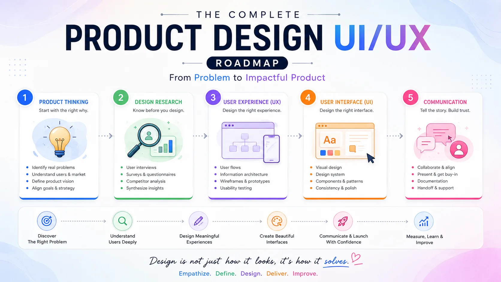
The product UI/UX design process doesn’t begin with wireframes.
It begins with questions.
What problem are we solving?
Who experiences it?
How are they solving it now?
What value can we create?
Why would someone choose this product?
What should we build first?
How will we know it worked?
And what will we do when the evidence challenges our assumptions?
Product vision gives direction. Strategy turns that direction into choices. The value proposition clarifies why the product matters. Product-market fit tests demand. Roadmaps organise priorities. Early releases test assumptions. Launches bring real users into the picture. Analytics and research reveal behaviour. Retention exposes recurring value. Metrics tell us if our decisions made a difference.
Then the cycle starts again.
That’s the part people sometimes miss.
Product design is rarely a straight line from research → wireframe → UI → development → done.
It loops.
You learn. You change something. You ship. You watch. You talk to users. You discover that one assumption was wrong and another was surprisingly accurate. Then you make the next decision with slightly better information.
Figma matters.
Beautiful interfaces matter.
But they work much harder when they sit on top of clear product thinking.
Before designing the screen, understand the product.
Before designing the product, understand the problem.
That’s where a stronger UI/UX design process really begins.
Part 2
Part 2: Design Research — Product UX/UI Design Roadmap
Part 3
Part 3: User Experience — The Product UX/UI Design Roadmap
Part 4
Part 4: User Interface — The Product UX/UI Design Roadmap

Part 5
Part 5: Communication — The Product UX/UI Design Roadmap